Lesson 2. An Example of Creating Modular Code in R - Efficient Scientific Programming
Learning Objectives
After completing this tutorial, you will be able to:
- Access data from a remote URL (http or https) using
read.table()function. - Explain the difference between accessing data using
download.file()compared toread.table()orread.csv(). - Plot tabular data using
ggplot(). - Create a plot with data subsetted by a particular variable using facets.
What You Need
You will need a computer with internet access to complete this lesson and the data that you already downloaded for week 13 of the course.
library(dplyr)
library(ggplot2)
library(RCurl)
Direct Data Access
In this lesson, you will learn how to access data via a direct download in R. You downloaded data in the first week of this class using download.file() When you used download.file(), you were literally downloading that file, which happened to be in .csv (comma separated value) text format to your computer.
You specified the location where that file would download to, using the destfile= argument. Notice below, I specified week 13 as the download location given that is your current class week.
# download text file to a specified location on your computer
download.file(url = "https://ndownloader.figshare.com/files/7010681",
              destfile = "data/week-13/boulder-precip-aug-oct-2013.csv")
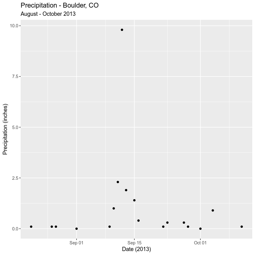
If R is able to communicate with the server (in this case Figshare) and download the file, you can then open up the file and plot the data within it.
# read data into R
boulder_precip <- read.csv("data/week-13/boulder-precip-aug-oct-2013.csv")

# fix date
boulder_precip$DATE <- as.Date(boulder_precip$DATE)
# plot data with ggplot
ggplot(boulder_precip, aes(x = DATE, y = PRECIP)) +
  geom_point() +
      labs(x = "Date (2013)",
           y = "Precipitation (inches)",
          title = "Precipitation - Boulder, CO ",
          subtitle = "August - October 2013")
Download Data via Human Readable url
The file that you downloaded above is stored using a .csv or comma separated value format. This is a format that is human readable and structured using a simple, non hierarchical (no nesting involved) format compared to JSON which can be hierarchical and thus efficiently support more complex data. The download.file() function allows us to store a copy of the file on your computer. Given the data are small and they could be moved over time, this is a good idea as now you have a backup of the data.
Data Tip: If you have a secure url (secure transfer protocols - i.e., https) you may not be able to use read.csv(). Instead, you need to use functions in the RCurl package. With that said read.csv() may work for some if not all computers now given upgrades to the base R code.
Directly Access & Import Data Into R
You can import data directly into R rather than downloading it using the read.csv() and/or read.table() functions. This solution will may have some problems when the data are stored on a secure server. However, let’s have a look at how you use read.csv() to directly import data stored on a website or server, into R. The read.csv() function is ideal for data that are separated by commas (.csv) files whereas read.table() is ideal for data in other formats - separated by spaces, tabs and other delimiters.
boulder_precip2 <- read.csv("https://ndownloader.figshare.com/files/7010681")
# fix date
boulder_precip2$DATE <- as.Date(boulder_precip2$DATE)
# plot data with ggplot
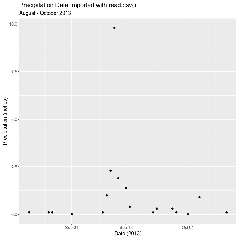
ggplot(boulder_precip2, aes(x = DATE, y = PRECIP)) +
  geom_point() +
      labs(x = "Date (2013)",
           y = "Precipitation (inches)",
          title = "Precipitation Data Imported with read.csv()",
          subtitle = "August - October 2013")
read.csv() vs RCurl
While using read.csv() to get data directly works, it may fail sometimes if:
- You are trying to access data from a secure (https or ftps server) or
- You are trying to access data from an API that requires authentication (more on that later)
Access Birthrate Data
Birth rate data for several countries are available via a Princeton University data website. The birth rate data show how much effort went into considering family planning efforts that were in place to attempt to reduce birth rates in various countries. The outcome variable is the associated percent decline in birth rate by country over 10 years. An excerpt from the website where you are getting the data is below.
Here are the famous program effort data from Mauldin and Berelson. These data consist of observations on an index of social setting, an index of family planning effort, and the percent decline in the crude birth rate (CBR) between 1965 and 1975, for 20 countries in Latin America.
The data have 3 variables:
- Birth rate
- Index of social setting
- Index of family planning effort
You can read these data in R using the read.table() function.
Data Tip: Note that you are using read.table() rather than read.csv() because in this instance, the data are not stored in a .csv (comma separated value) format. Rather, they are stored in a .dat format.
the_url <- "http://data.princeton.edu/wws509/datasets/effort.dat"
the_data <- read.table(the_url)
head(the_data)
##           setting effort change
## Bolivia        46      0      1
## Brazil         74      0     10
## Chile          89     16     29
## Colombia       77     16     25
## CostaRica      84     21     29
## Cuba           89     15     40
the_url <- "http://data.princeton.edu/wws509/datasets/effort.dat"
# read in the data
birth_rates <- read.table(the_url)
Work with Web Data
The birth_rates data that you just accessed were imported into R as a data.frame, which you are used to working with. You can analyze and visualize the data using ggplot() just like you did with the precipitation data earlier. For example:
Here’s the top 6 rows (or head()) of the data.frame:
str(birth_rates)
## 'data.frame':	20 obs. of  3 variables:
##  $ setting: int  46 74 89 77 84 89 68 70 60 55 ...
##  $ effort : int  0 0 16 16 21 15 14 6 13 9 ...
##  $ change : int  1 10 29 25 29 40 21 0 13 4 ...
head(birth_rates)
##           setting effort change
## Bolivia        46      0      1
## Brazil         74      0     10
## Chile          89     16     29
## Colombia       77     16     25
## CostaRica      84     21     29
## Cuba           89     15     40
You can plot these data to see the relationships between effort and percent change in birth rates.
ggplot(birth_rates, aes(x = effort, y = change)) +
  geom_point() +
      labs(x = "Effort",
           y = "Percent Change",
           title = "Decline in birth rate vs. planning effort",
           subtitle = "For 20 Latin America Countries")
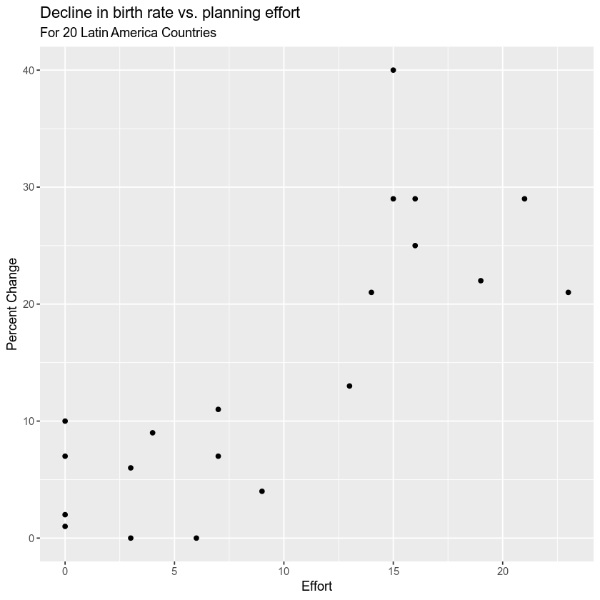
Remember that here you’ve imported a tabular dataset directly from the Princeton University website. The data file itself is NOT on your computer so you do not have a backup in the event that the data are removed from the Princeton website - your code would not run.
Data Tip: Consider when you directly access a dataset via an API that - that data may not always be available. It is often a good idea to save backup copies of certain datasets on your computer if the data are not too large. For example, what happens if the data API or server goes down, is taken away, etc? Many data repositories have documented terms of data longevity - or explicit provisions that specify how long the data will be available on the repository and available for (public) use. Look into this before assuming the data will always be there!
Optional Challenge
Using the tools that you learned above, import the Princeton salary data below.
Learn more about the Princeton salary data
As described on the website:
These are the salary data used in Weisberg’s book, consisting of observations on six variables for 52 tenure-track professors in a small college. The variables are:
- sx Sex, coded 1 for female and 0 for male
- rk Rank, coded
- 1 for assistant professor,
- 2 for associate professor, and
- 3 for full professor
- yr Number of years in current rank
- dg Highest degree, coded 1 if doctorate, 0 if masters
- yd Number of years since highest degree was earned
- sl Academic year salary, in dollars.
HINT: these data have a header. You will have to look up the appropriate argument to ensure that the data import properly using read.table().
HINT2: You can add facets or individual plots for particular subsets of data ( in this case rank) using the facet_wrap() argument in a ggplot() plot. For example + facet_wrap(~dg) will create a f plot with sub plots filtered by highest degree.)
Plot the following:
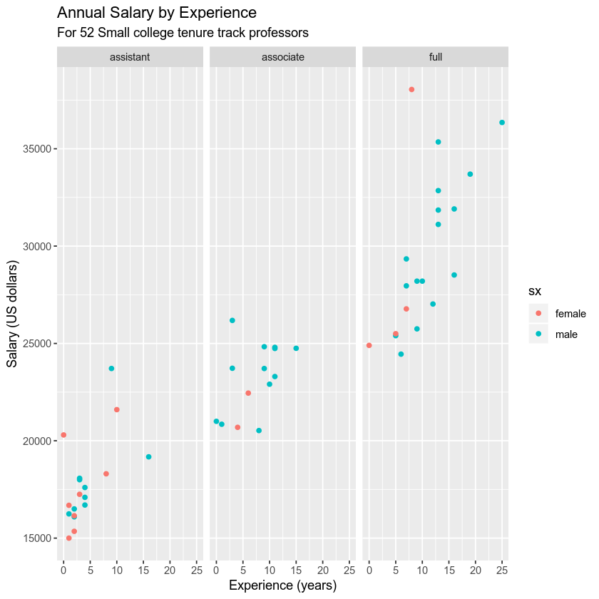
Experience (x axis) vs. salary (y axis). Color your points by SEX and use facets to add a facet for each of the three ranks.
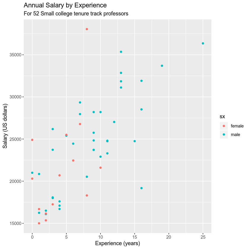
Example Homework Plot
Data faceted by rank. You can add the argument + facet_wrap(~variableHere) to create a faceted plot like the one below.
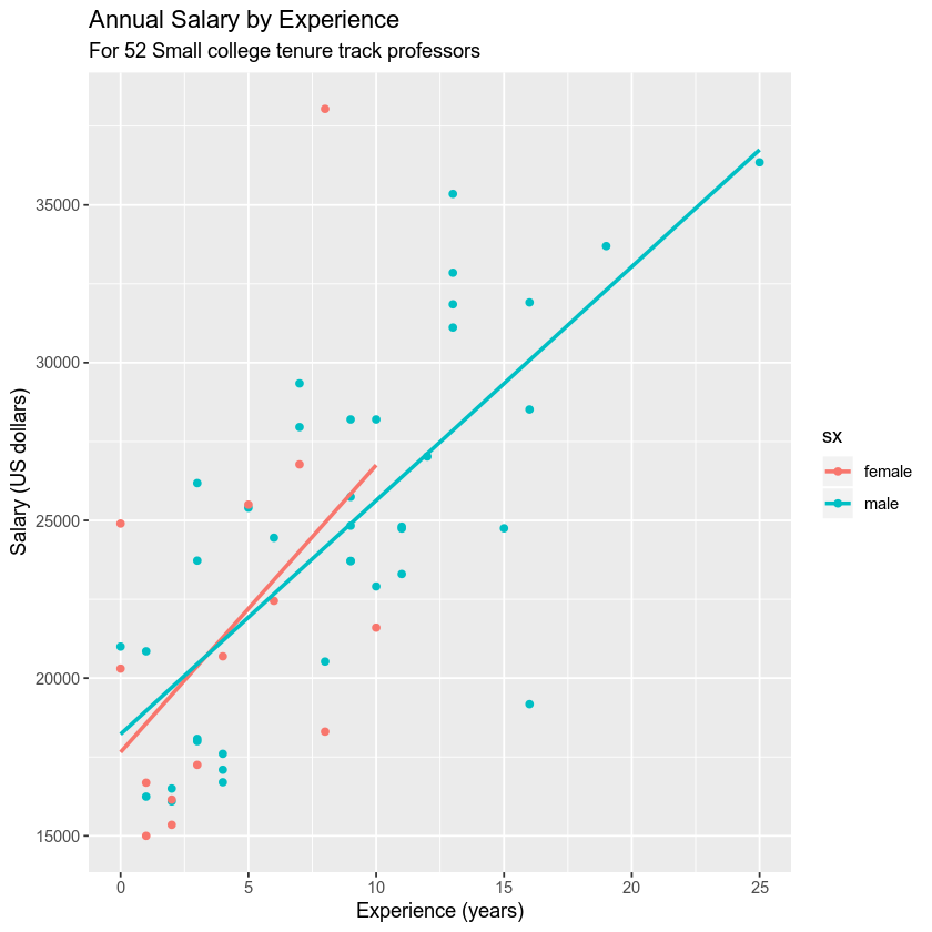
You can also ad a linear model regression to the data if you want using geom_smooth().
Share on
Twitter Facebook Google+ LinkedIn
Leave a Comment