Lidar Raster Data in R
Welcome to Week 3!
Welcome to week 3 of Earth Analytics! In week 3 you will learn about Light Detection and Ranging (LiDAR) data. You will learn to use point cloud data and lidar rasters in R and explore using QGIS - a free, open-source GIS tool.
Your final 2013 Colorado flood report assignment is below. Read the assignment carefully and make sure you’ve completed all of the steps and followed all of the guidelines. Use all of the class and homework lessons that you’ve learned in the first few weeks to help you complete the assignment.
Class Schedule
| time | topic | speaker | ||
|---|---|---|---|---|
| 9:30 am | Review r studio / r markdown / questions | Leah | ||
| 9:50 - 10:30 | Using data and models to understand the boulder floods | Dr. Matthew Rossi | ||
| 10:45 - 12:20 | R coding session - Intro to Lidar data & raster data in R | Leah |
1. Readings
First - review ALL of the lessons for this week. We did not cover them all in class. This includes the in class and homework lessons.
Read the following articles. They will help you write your report.
- Wehr, A., and U. Lohr (1999). Airborne Laser Scanning - An Introduction and Overview. ISPRS Journal of Photogrammetry and Remote Sensing 54:68–92. doi: 10.1016/S0924-2716(99)00011-8 : PDF
- Intro to Lidar
- Active remote sensing
Homework (10 points): Due Monday Sept 25 @ 8AM
Produce a Final Report on the 2013 Floods
Create a new R markdown document. Name it: lastName-firstInitial-floodreport.Rmd Within your .Rmd document, carefully compose a report that summarizes what you have learned about the 2013 Colorado flood event. Use all of the plots that you have created in the first 3 weeks of the class in your report as listed below.
When you are done with your report, use knitr to convert it to html format (note: if you did not get knitr working it is ok if you create an html document and export it to html as demonstrated in class). You will submit both the .Rmd file and the .html file. Be sure to name your files as instructed above!
Include the following parts in your report:
Background / Overview of the Flood
Include the following background in your report:
- Description of where and when the disturbance event occurred.
- Discussion of the drivers that yielded the flooding in Boulder and discussion of the impacts of the flood.
Your Report Should Include 9 Plots
Your report should include the following plots (in whatever order you think best describes the events of the flood):
Basemap Plot:
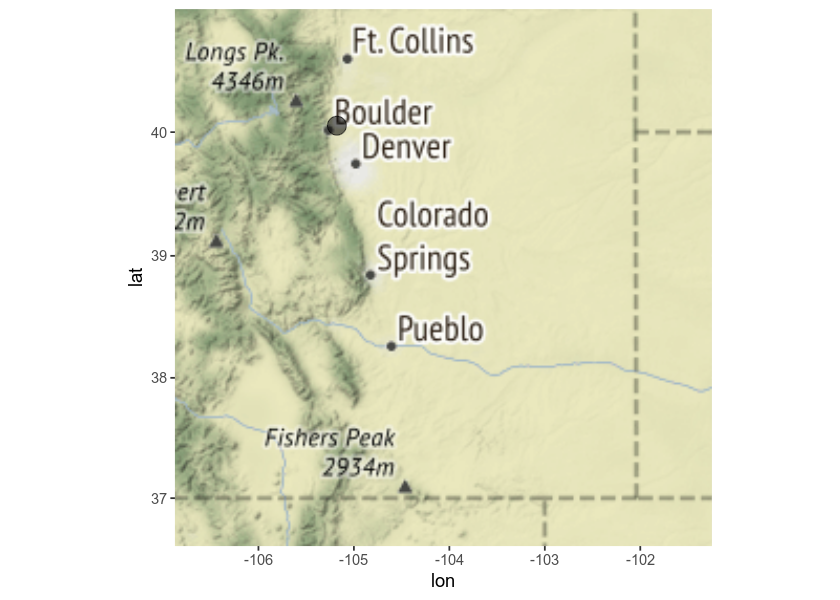
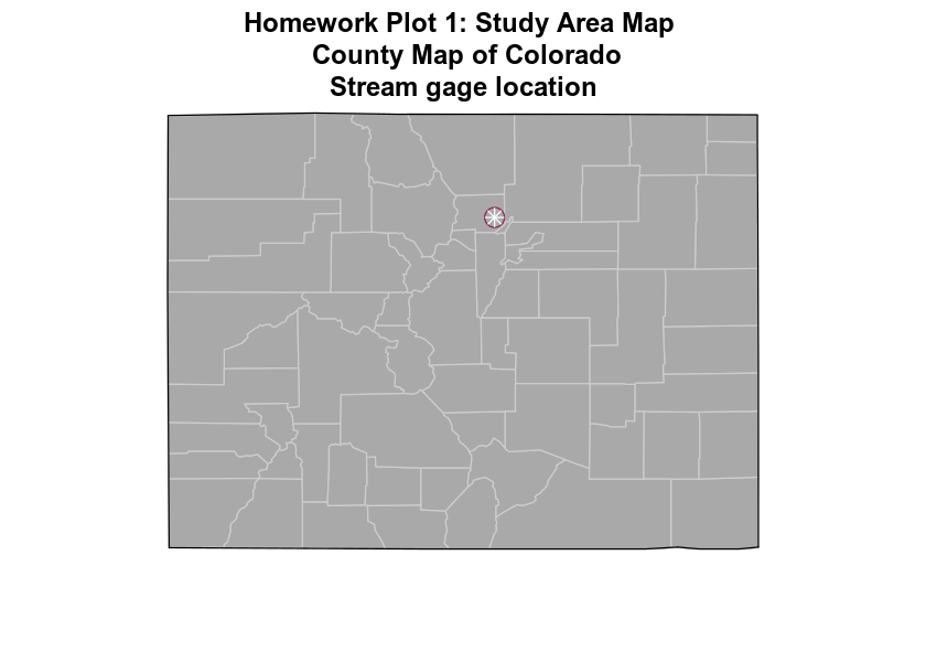
- PLOT 1: A basemap showing the location of the stream gage / study area created using
ggmap()(or the maps package ifggmapdoesn’t work on your computer). Use the ggmap / maps lesson to guide creating this plot.
Precip & Discharge Plots from Week 2:
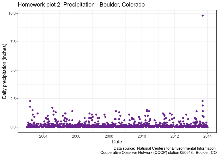
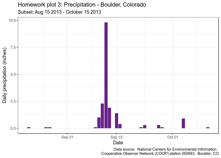
Use the data/week-02/precipitation/805325-precip-dailysum-2003-2013.csvfile to create:
- PLOT 2: a plot of precipitation from 2003 to 2013 using
ggplot(). - PLOT 3: a plot that shows precipitation SUBSETTED from Aug 15 - Oct 15 2013 using
ggplot().
Use the data/week-02/discharge/06730200-discharge-daily-1986-2013.csv file to create:
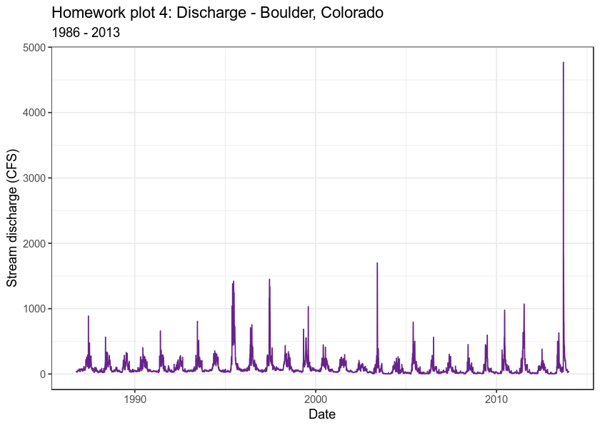
- PLOT 4: a plot of stream discharge from 1986 to 2016 using
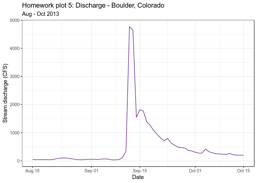
ggplot(). - PLOT 5: a plot that shows stream discharge SUBSETTED from Aug 15 - Oct 15 2013 using
ggplot().
Raster & Histogram Plots from Week 3:
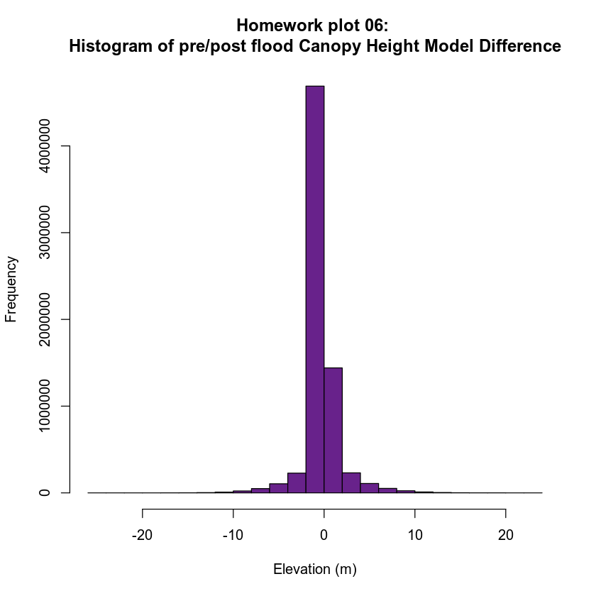
- PLOT 6: pre/post CHM difference raster histogram Create a cropped raster map that shows positive and negative change in the canopy height model before and after the flood. To do this:
- Subtract the post-flood CHM from the pre-flood CHM (pre_flood_CHM - post_flood_CHM).
- Crop the data using the
data/week-03/BLDR_LeeHill/clip-extent.shpcrop_extent shapefile. - Plot a histogram of the cropped data.
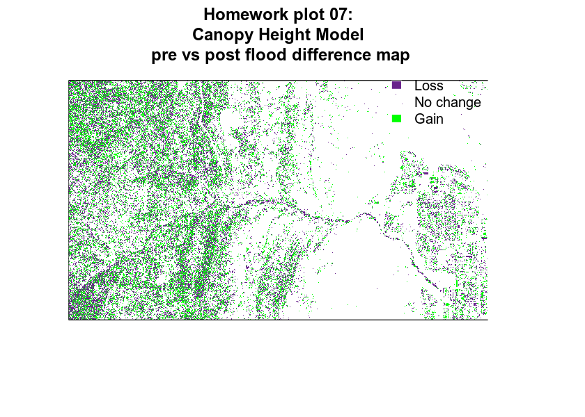
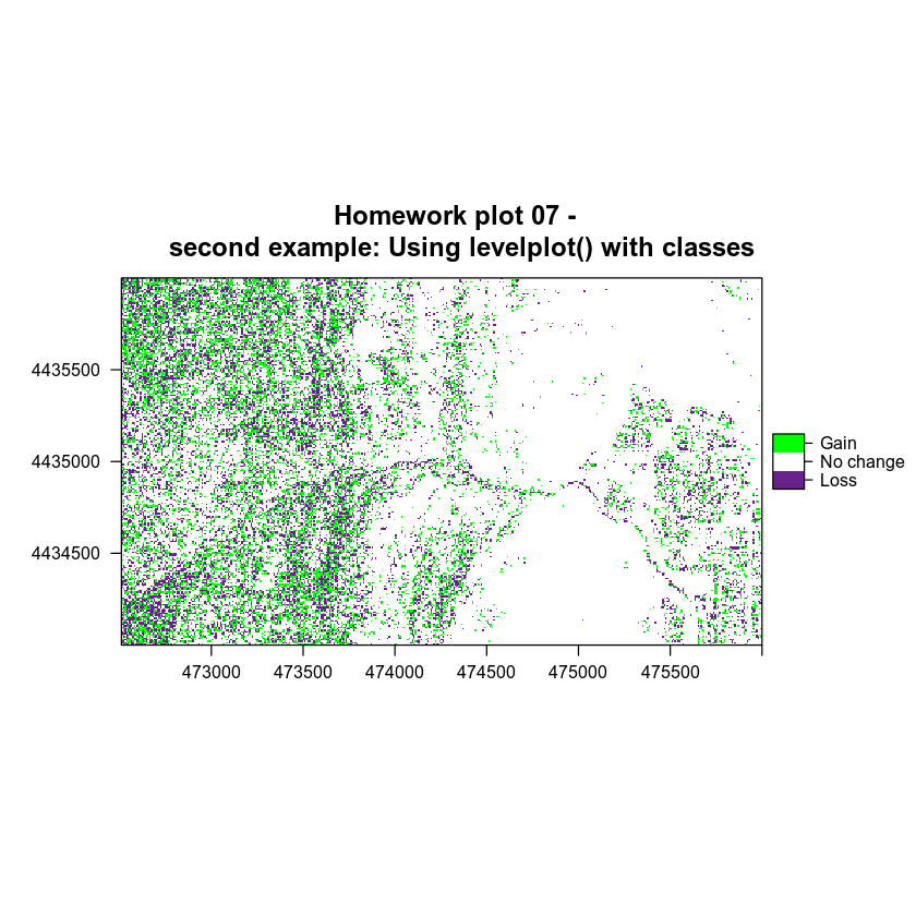
PLOT 7: Classified pre/post CHM difference raster Use the difference raster that you created above and the histogram as a guide to classify your difference canopy height model. Use values that make sense after reviewing the histogram.
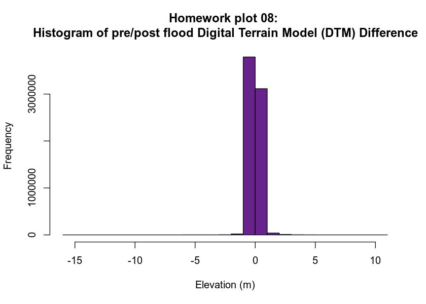
- PLOT 8: pre/post DTM difference raster histogram Create a cropped raster map that shows positive and negative change in the digital terrain model before and after the flood. To do this:
- Subtract the post-flood DTM from the pre-flood DTM (pre_flood_DTM - post_flood_DTM).
- Crop the data using the
data/week-03/BLDR_LeeHill/clip-extent.shpcrop_extent shapefile. - Plot a histogram of the cropped data.
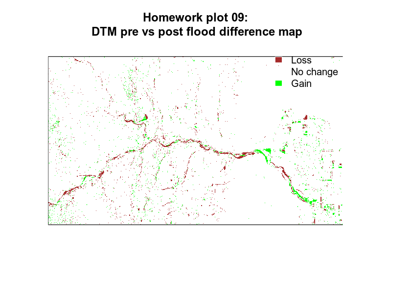
- PLOT 9: Classified pre/post DTM difference raster Use the difference raster that you created above and the histogram as a guide to classify your difference digital terrain model. Use values that make sense after reviewing the histogram.
Graduate Students Only - Use Bookdown to Add Citations
- Use
bookdownandknitrto add citations to your report. This tutorial will help you complete this part of the assignment.
For all plots use the readings from the last 3 weeks to discuss:
- Where the data came from and what the data shows.
- Discuss patterns that are evident in the data and potential relationships between what you see in the lidar data compared to precipitation and discharge.
Summary / Discussion
End your report with a summary discussion of the flood events. Be sure to discuss how the data help you better understand the 2013 Colorado floods as they impacted Boulder, Colorado.
Important:
- Clearly state the source of each dataset that you use to create the plot in your report text.
- Make sure each plot has a clear TITLE and, where appropriate, label the x and y axes. Be sure to include UNITS in your labels!
- Analyze / interpret each plot that you produce in your report. State what the source of the data are and what the plot shows as a driver or impact of the 2013 flood events.
- Clearly document that steps that you took to process the data by commenting your code or in the text of your report itself as it makes sense.
- All students must cite at least 3 articles that you read or other sources of information that you used to write your report. (grad students will use
bookdownto do this, undergrads can choose how they want to include citations). - Use clean coding practices - this includes comments, variable names that are informative, clean code spacing, following Hadley Wickham’s code style guide.
- Make sure all of the libraries that you use in the report are listed in a code chunk at the TOP of your document.
- Spell check your report and check grammar.
- All plots should be clearly labeled with titles, and x and y axis labels are it makes sense. (Your map of lidar data doesn’t need x and y labels).
- Be sure to discuss how you selected the classification values used in the raster plots referencing the histograms of the data that you create.
- OPTIONAL BONUS: Include images as they make sense. Be sure to cite any graphics that you use that are not yours.
Submissions
Submit your report in both .Rmd and .html format to the D2L dropbox. NOTE: if you want to create .pdf formatted reports that is fine as well! You may need to google formatting associated with pdfs!
Homework Plots
The plots below are examples of what your plots might look like. Your plot does not need to look exactly like these! You may use different classes for your different maps for example which will change your rasters! Feel free to customize colors, labels, layers, etc are you’d like to create nice plots.
To specify the data source in the ggplot maps below, I’ve used the caption = argument in the labs() function:
labs(title = "your title here",
     caption = "data source text here")
You could also add the data source in your figure cation by adding the following code to your code chunk:
{r chunk-name, fig.cap = "caption here that could include the data source"}
How you approach adding captions to your report is up to you!
If You Use the ggmap Package
## Google's Terms of Service: https://cloud.google.com/maps-platform/terms/.
## Please cite ggmap if you use it! See citation("ggmap") for details.
##
## Attaching package: 'ggmap'
## The following object is masked from 'package:plotly':
##
##     wind
## Source : http://tile.stamen.com/terrain/6/13/24.png
If You Use the Maps Package
Raster Related Plots
## Linking to GEOS 3.7.2dev, GDAL 2.4.1, PROJ 5.2.0
## WARNING: different compile-time and runtime versions for GEOS found:
## Linked against: 3.7.2dev-CAPI-1.11.2 0 compiled against: 3.7.1-CAPI-1.11.1
## It is probably a good idea to reinstall sf, and maybe rgeos and rgdal too
## Reading layer `clip-extent' from data source `/root/earth-analytics/data/week-03/BLDR_LeeHill/clip-extent.shp' using driver `ESRI Shapefile'
## Simple feature collection with 1 feature and 1 field
## geometry type:  POLYGON
## dimension:      XY
## bbox:           xmin: 472510.5 ymin: 4434000 xmax: 476010.5 ymax: 4436000
## epsg (SRID):    32613
## proj4string:    +proj=utm +zone=13 +datum=WGS84 +units=m +no_defs
DTM Difference Plots
Homework Grades & Rubric
This homework is worth 10 points as it represents a culmination of the things you have learned during the first 3 weeks of class. The grading rubric that you will use to grade the assignment is below.
Report Content - Text Writeup: 30%
| Full Credit | No Credit | |
|---|---|---|
.html and .Rmd files submitted | ||
| Summary text is provided for each plot | ||
| Grammar & spelling are accurate throughout the report | ||
| File is named with last name-first initial week 3 | ||
| Report contains all 9 plots described in the assignment | ||
| References are made to the assigned class readings in the text of your report in the form of properly formatted citations. References are listed using proper format guidelines at the bottom of the report. (Graduate students should add these using bookdown) | ||
| There is a thoughtful discussion of the relationship between precipitation, discharge and patterns seen in the lidar pre-post flood data. |
Report Code Structure - Code Format: 30%
| Full Credit | No Credit |
|---|---|
| Code is written using “clean” code practices following the Hadley Wickham style guide | |
| YAML contains a title, author and date | |
| Code chunk contains code and runs | |
| All required R packages are listed at the top of the document in a code chunk |
Plots - Previously Produced Plots and Basemap (New plot but code is provided) - 10%
Plot 1 - ggmap() or maps() basemap study area base map
| Full Credit | No Credit |
|---|---|
PLOT 1 - Study area map using ggmap() or maps() is included and the study area location is clearly identified |
Plots 2-5
- PLOT 2: a plot of precipitation from 2003 to 2013 using
ggplot(). - PLOT 3: a plot that shows precipitation SUBSETTED from Aug 15 - Oct 15 2013 using
ggplot(). - PLOT 4: a plot of stream discharge from 1986 to 2013 using
ggplot(). - PLOT 5: a plot that shows stream discharge SUBSETTED from Aug 15 - Oct 15 2013 using
ggplot().
| Full Credit | No Credit |
|---|---|
| PLOT 2: contains appropriate titles, axis labels and colors. Plot data source is clearly described in the text. & the plot data are interpreted relative to the boulder flood. | |
| PLOT 3: contains appropriate titles, axis labels and colors. Plot data source is clearly described in the text & the plot data are interpreted relative to the boulder flood. | |
| PLOT 4: contains appropriate titles, axis labels and colors. Plot data source is clearly described in the text & the plot data are interpreted relative to the boulder flood. | |
| PLOT 5: contains appropriate titles, axis labels and colors. Plot data source is clearly described in the text & the plot data are interpreted relative to the boulder flood. |
Raster Plots - 30%
- Plot 6: A classified raster map that shows positive and negative change in the canopy height model before vs after the flood.
- Plot 8: A classified raster map that shows positive and negative change in the digital terrain model before vs after the flood.
| Full Credit | No Credit |
|---|---|
| Plot is customized with appropriate titles, axis labels and colors | |
| Data are CROPPED using the crop_extent shapefile | |
| Plot data source is described in the text caption. Plot data are interpreted / discussed relative to the boulder flood | |
| Raster data are classified into discrete values | |
| The colors and classes selected to process the data and display the plot, clearly show changes in terrain | |
| There is discussion of how the classification values used in the raster plots were selected referencing the histograms |
Plots 7 & 9 - Histograms
- Plot 7: A histogram raster map that shows positive and negative change in CHM derived from the pre and post flood Canopy Height Models.
- Plot 9: A histogram raster map that shows positive and negative change in terrain derived from the pre and post flood Digital Terrain Models.
A histogram of the classified raster layer that shows positive and negative change in canopy height derived from the pre and post flood Digital Terrain Models before and after the flood
| Full Credit | No Credit | |||
|---|---|---|---|---|
| Plot is customized with appropriate titles, axis labels and colors | ||||
| Histogram breaks were selected to clearly show positive and negative changes | ||||
| There is discussion of how the histogram was used to select classification ranges |
BONUS: Opportunities
- Add at least 2 images to your report. Be sure to include proper image citation if you do this! (.5 points)
- Add an interactive plot or map to your report. (.5 points)
Share on
Twitter Facebook Google+ LinkedIn