Lesson 1. Time Series Data: Work with Dates in R
Work with Sensor Network Derived Time Series Data in R - Earth analytics course module
Welcome to the first lesson in the Work with Sensor Network Derived Time Series Data in R module. This module covers how to work with, plot and subset data with date fields in R. It also covers how to plot data using ggplot.Get Started with Date Formats in R
In this tutorial, you will look at the date time format - which is important for plotting and working with time series data in R.
Learning Objectives
At the end of this activity, you will be able to:
- Convert a column in a
data.framecontaining dates and times to a date/time object that can be used inR. - Be able to describe how you can use the data class ‘date’ to create easier to read time series plots in
R.
What You Need
You need R and RStudio to complete this tutorial. Also we recommend that you have an earth-analytics directory set up on your computer with a /data directory within it.
In this tutorial, you will learn how to convert data that contain dates and times into a date / time format in R.
First let’s revisit the boulder_precip data variable that you’ve been working with in this module.
# load the ggplot2 library for plotting
library(ggplot2)
options(stringsAsFactors = FALSE)
# download data from figshare
# note that you already downloaded the data in the previous exercises so this line
# is commented out. If you want to redownload the data, umcomment the line below.
download.file("https://ndownloader.figshare.com/files/9282364",
              "data/boulder-precip.csv",
              method = "libcurl")

# import data
boulder_precip <- read.csv(file = "data/boulder-precip.csv")

# view first few rows of the data
head(boulder_precip)
##    ID    DATE PRECIP TEMP
## 1 756 8/21/13    0.1   55
## 2 757 8/26/13    0.1   25
## 3 758 8/27/13    0.1   NA
## 4 759  9/1/13    0.0 -999
## 5 760  9/9/13    0.1   15
## 6 761 9/10/13    1.0   25
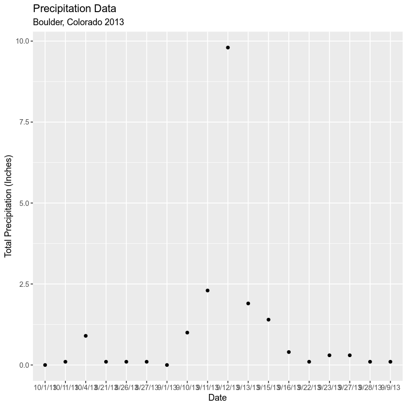
Next, plot the data using ggplot().
# plot the data using ggplot
ggplot(data = boulder_precip, aes(x = DATE, y = PRECIP)) +
  geom_point() +
  labs(x = "Date",
    y = "Total Precipitation (Inches)",
    title = "Precipitation Data",
    subtitle = "Boulder, Colorado 2013")

Notice when you plot the data, the x axis is “messy”. It would be easier to read if you only had ticks on the x axis for dates incrementally - every few weeks. Or once a month even.
Let’s look closely at the structure of the data to understand why R is placing so many labels on the x axis.
str(boulder_precip)
## 'data.frame':	18 obs. of  4 variables:
##  $ ID    : int  756 757 758 759 760 761 762 763 764 765 ...
##  $ DATE  : chr  "8/21/13" "8/26/13" "8/27/13" "9/1/13" ...
##  $ PRECIP: num  0.1 0.1 0.1 0 0.1 1 2.3 9.8 1.9 1.4 ...
##  $ TEMP  : int  55 25 NA -999 15 25 65 NA 95 -999 ...
Data Types (Classes) in R
The structure results above tell us that the data columns in your data.frame are stored as several different data types or classes as follows:
- chr - Character: It holds strings that are composed of letters and words. Character class data cannot be interpreted numerically - that is to say you can not perform math on these values even if they contain only numbers.
- int - Integer: It holds numbers that are whole integers without decimals. Mathematical operations can be performed on integers.
- num - Numeric: It accepts data that are a wide variety of numeric formats including decimals (floating point values) and integers. Numeric also accept larger numbers than int will.
Data Frame Columns Can Only Contain One Data Class
A data.frame column can only store one type. This means that a column cannot store both numbers and strings. If a column contains a list of numbers and one letter, then the entire column will be stored as a chr (character).
Storing variables using different classes is a strategic decision by R (and other programming languages) that optimizes processing and storage. It allows:
- data to be processed more quickly & efficiently.
- the program (
R) to minimize the storage size.
Remember, that you also learned about classes during class in these lessons: vectors in R - data classes
Dates Stored as Characters
Note that the Date column in your data.frame is of class character (chr). This means that R is reading it as letters and numbers rather than dates that contain a value that is sequential.
# View data class for each column that you wish to plot
class(boulder_precip$DATE)
## [1] "character"

class(boulder_precip$PRECIP)
## [1] "numeric"
Thus, when you plot, R tries to plot EVERY date value in your data, on the x-axis. This makes it hard to read. But also it makes it hard to work with the data. For instance - what if you wanted to subset out a particular time period from your data? You can’t do that if the data are stored as characters.
The PRECIP data is numeric so that variable plots just fine.
Convert Date to an R Date Class
You need to convert your date column, which is currently stored as a character to a date class that can be displayed as a continuous variable. Lucky for us, R has a date class. You can convert the date field to a date class using the function as.Date().
When you convert, you need to tell R how the date is formatted - where it can find the month, day and year and what format each element is in.
For example: 1/1/10 vs 1-1-2010
Looking at the results above, you see that your data are stored in the format: Year-Month-Day (2003-08-21). Each part of the date is separated in this case with a -. You can use this information to populate your format string using the following designations for the components of the date-time data:
%Y- 4 digit year%y- 2 digit year%m- month%d- day
Your format string will look like this: %m/%d/%y. Notice that you are telling R where to find the year (%y), month (%m) and day (%d). Also notice that you include the dashes that separate each component in each date cell of your data.
NOTE: look up ?strptime to see all of the date “elements” that you can use to describe the format of a date string in R.
# convert date column to date class
boulder_precip$DATE <- as.Date(boulder_precip$DATE,
                        format = "%m/%d/%y")

# view R class of data
class(boulder_precip$DATE)
## [1] "Date"

# view results
head(boulder_precip$DATE)
## [1] "2013-08-21" "2013-08-26" "2013-08-27" "2013-09-01" "2013-09-09"
## [6] "2013-09-10"
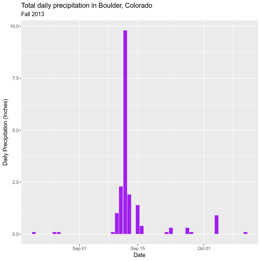
Now that you have adjusted the date, let’s plot again. Notice that it plots much quicker now that R recognizes date as a date class. R can aggregate ticks on the x-axis by year instead of trying to plot every day!
# quickly plot the data and include a title using main = ""
# use '\n' to force the string to wrap onto a new line

ggplot(data = boulder_precip, aes(x = DATE, y = PRECIP)) +
      geom_bar(stat = "identity", fill = "purple") +
      labs(title = "Total daily precipitation in Boulder, Colorado",
           subtitle = "Fall 2013",
           x = "Date", y = "Daily Precipitation (Inches)")

Now, your plot looks a lot nicer!
Share on
Twitter Facebook Google+ LinkedIn
Leave a Comment