Lesson 2. Use Tidyverse Pipes to Subset Time Series Data in R
In this lesson, you will learn how to import a larger dataset, and test your skills cleaning and plotting the data.
Learning Objectives
After completing this tutorial, you will be able to:
- Subset data using the dplyr
filter()function. - Use
dplyrpipes to manipulate data inR. - Describe what a pipe does and how it is used to manipulate data in
R
What You Need
You need R and RStudio to complete this tutorial. Also we recommend that you
have an earth-analytics directory set up on your computer with a /data
directory within it.
R Libraries to Install:
- ggplot2:
install.packages("ggplot2") - dplyr:
install.packages("dplyr") - lubridate:
install.packages("lubridate")
Important - Data Organization
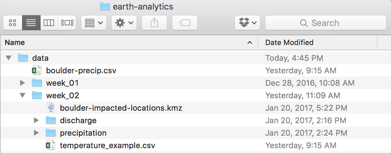
Before you begin this lesson, be sure that you’ve downloaded the dataset above. You will need to UNZIP the zip file. When you do this, be sure that your directory looks like the image below: note that all of the data are within the week2 directory. They are not nested within another directory. You may have to copy and paste your files to make this look right.
Get Started with Time Series Data
To begin, load the ggplot2 and dplyr libraries. Also, set your
working directory. Finally, set stringsAsFactors to FALSE globally using
options(stringsAsFactors = FALSE).
# set your working directory to the earth-analytics directory
# setwd("working-dir-path-here")

# load packages
library(ggplot2)
library(lubridate)
library(dplyr)

# set strings as factors to false
options(stringsAsFactors = FALSE)
Import Precipitation Time Series
You will use a precipitation dataset collected by the National Centers for Environmental Information (formerly National Climate Data Center) Cooperative Observer Network (COOP) station 050843 in Boulder, CO. The data cover the time span between 1 January 2003 through 31 December 2013.
To begin, use read.csv() to import the .csv file.
# download the data
# download.file(url = "https://ndownloader.figshare.com/files/7283285",
#              destfile = "data/week-02/805325-precip-dailysum_2003-2013.csv")

# import the data
boulder_daily_precip <- read.csv("data/week-02/precipitation/805325-precip-dailysum-2003-2013.csv",
         header = TRUE)


# view first 6 lines of the data
head(boulder_daily_precip)
##     DATE DAILY_PRECIP     STATION    STATION_NAME ELEVATION LATITUDE
## 1 1/1/03         0.00 COOP:050843 BOULDER 2 CO US    1650.5 40.03389
## 2 1/5/03       999.99 COOP:050843 BOULDER 2 CO US    1650.5 40.03389
## 3 2/1/03         0.00 COOP:050843 BOULDER 2 CO US    1650.5 40.03389
## 4 2/2/03       999.99 COOP:050843 BOULDER 2 CO US    1650.5 40.03389
## 5 2/3/03         0.40 COOP:050843 BOULDER 2 CO US    1650.5 40.03389
## 6 2/5/03         0.20 COOP:050843 BOULDER 2 CO US    1650.5 40.03389
##   LONGITUDE YEAR JULIAN
## 1 -105.2811 2003      1
## 2 -105.2811 2003      5
## 3 -105.2811 2003     32
## 4 -105.2811 2003     33
## 5 -105.2811 2003     34
## 6 -105.2811 2003     36

# view structure of data
str(boulder_daily_precip)
## 'data.frame':	792 obs. of  9 variables:
##  $ DATE        : chr  "1/1/03" "1/5/03" "2/1/03" "2/2/03" ...
##  $ DAILY_PRECIP: num  0e+00 1e+03 0e+00 1e+03 4e-01 ...
##  $ STATION     : chr  "COOP:050843" "COOP:050843" "COOP:050843" "COOP:050843" ...
##  $ STATION_NAME: chr  "BOULDER 2 CO US" "BOULDER 2 CO US" "BOULDER 2 CO US" "BOULDER 2 CO US" ...
##  $ ELEVATION   : num  1650 1650 1650 1650 1650 ...
##  $ LATITUDE    : num  40 40 40 40 40 ...
##  $ LONGITUDE   : num  -105 -105 -105 -105 -105 ...
##  $ YEAR        : int  2003 2003 2003 2003 2003 2003 2003 2003 2003 2003 ...
##  $ JULIAN      : int  1 5 32 33 34 36 37 38 41 49 ...

# are there any unusual / No data values?
summary(boulder_daily_precip$DAILY_PRECIP)
##     Min.  1st Qu.   Median     Mean  3rd Qu.     Max.
##    0.000    0.100    0.100    5.297    0.300  999.990
max(boulder_daily_precip$DAILY_PRECIP)
## [1] 999.99
About the Data
Viewing the structure of these data, you can see that different types of data are included in this file:
- STATION and STATION_NAME: Identification of the COOP station.
- ELEVATION, LATITUDE and LONGITUDE: The spatial location of the station.
- DATE: The date when the data were collected in the format: YYYYMMDD. Notice that DATE is
currently class
chr, meaning the data is interpreted as a character class and not as a date. - DAILY_PRECIP: The total precipitation in inches. Important: the metadata notes that the value 999.99 indicates missing data. Also important, hours with no precipitation are not recorded.
- YEAR: The year the data were collected.
- JULIAN: The JULIAN DAY the data were collected.
Additional information about the data, known as metadata, is available in the PRECIP_HLY_documentation.pdf. The metadata tell us that the noData value for these data is 999.99. IMPORTANT: You have modified these data a bit for ease of teaching and learning. Specifically, you’ve aggregated the data to represent daily sum values and added some noData values to ensure you learn how to clean them!
You can download the original complete data subset with additional documentation here.
Optional Challenge
Using everything you’ve learned in the previous lessons:
- Import the dataset:
data/week-02/precipitation/805325-precip-dailysum-2003-2013.csv. - Clean the data by assigning noData values to
NA. - Make sure the date column is a date class.
- When you are done, plot it using
ggplot().- Be sure to include a TITLE, and label the X and Y axes.
- Change the color of the plotted points.
Some notes to help you along:
- Date: Be sure to take off the date format when you import the data.
- NoData Values: You know that the no data value = 999.99. You can account for this when you read in the data. Remember how?
Your final plot should look something like the plot below.
Import Data and Reassign na Values
To begin, import the data. Be sure to use the na.strings argument to remove NA values.
Also your data have a header (the first row represents column names) so set header = TRUE
# import data
boulder_daily_precip <- read.csv("data/week-02/precipitation/805325-precip-dailysum-2003-2013.csv",
         header = TRUE,
         na.strings = 999.99)
Next, take care of the date field. In this case you have month/day/year. You can
use ?strptime to figure out which letters you need to use in the format = argument
to ensure your data elements (month, day and year) are understood by R.
In this case you want to use
- %m - for month
- %d - for day
- %y - for year
Also take note of the format of your date. In this case, each date element is
separated by a /.
# format date field
boulder_daily_precip$DATE <- as.Date(boulder_daily_precip$DATE,
                                     format = "%m/%d/%y")
Finally, you can plot the data using ggplot(). Notice that when you plot, you first
populate the data and aes (aesthetics).
- data = contain the data frame that you want to plot
- aes = contain the x and y variables that you want to plot
Finally geom_point() represents the geometry that you want to plot. In this case
you are creating a scatter plot (using points).
# plot the data using ggplot2
ggplot(data=boulder_daily_precip, aes(x = DATE, y = DAILY_PRECIP)) +
      geom_point() +
      labs(title = "Precipitation - Boulder, Colorado")

NA Values and Warnings
When you plot the data, you get a warning that says:
## Warning: Removed 4 rows containing missing values (geom_point).
You can get rid of this warning by removing NA or missing data values from your
data. A warning is just R’s way of letting you know that something may be wrong.
In this case, it can’t plot 4 data points because there are missing data values
there.
Let’s remove the missing data value rows using a dplyr pipe and the na.omit() function.
You will learn about pipes in just a minute!
boulder_daily_precip <- boulder_daily_precip %>%
  na.omit()
Now you can plot the data without a warning!
# plot the data using ggplot2
ggplot(data=boulder_daily_precip, aes(x = DATE, y = DAILY_PRECIP)) +
      geom_point(color = "darkorchid4") +
      labs(title = "Precipitation - Boulder, Colorado")

Don’t forget to add x and y axis labels to your plot!
Use the labs() function to add a title, x and y label (and subtitle if you’d like) to your plot.
labs(title = "Hourly Precipitation - Boulder Station\n 2003-2013",
     x = "Date",
     y = "Precipitation (Inches)")
ggplot(data = boulder_daily_precip, aes(DATE, DAILY_PRECIP)) +
      geom_point(color = "darkorchid4") +
      labs(title = "Hourly Precipitation - Boulder Station\n 2003-2013",
           x = "Date",
           y = "Precipitation (Inches)")

You can add a ggplot theme to adjust the look of your plot quickly too. Below
you use theme_bw(). Below you also adjust the base font size to make the labels
a bit larger base_size = 11.
Data Tip: Learn more about built in ggplot themes
ggplot(data = boulder_daily_precip, aes(DATE, DAILY_PRECIP)) +
      geom_point(color = "darkorchid4") +
      labs(title = "Hourly Precipitation - Boulder Station\n 2003-2013",
           x = "Date",
           y = "Precipitation (Inches)") + theme_bw(base_size = 11)

Optional Challenge
Take a close look at the plot:
- What does each point represent?
- Use the
min()andmax()functions to determine the minimum and maximum precipitation values for the 10 year span?
Introduction to the Pipe %>%
Above you used pipes to manipulate your data. Specifically you removed NA values
in a pipe with na.omit().
Pipes let you take the output of one function and send it directly to the next,
which is useful when you need to do many things to the same data set. Pipes in R
look like %>% and are made available via the magrittr package, installed
automatically with dplyr.
boulder_daily_precip <- boulder_daily_precip %>%
  na.omit()
Pipes are nice to use when coding because:
- they remove intermediately created variables (keeping your environment cleaner / fewer variables are saved memory)
- they combine multiple steps of processing into a clean set of steps that is easy to read once you become familiar with the pipes syntax
You can do all of the same things that you did above with one pipe. Let’s see how:
# format date field without pipes
boulder_daily_precip$DATE <- as.Date(boulder_daily_precip$DATE,
                                     format = "%m/%d/%y")
With pipes you can use the mutate function to either create a new column or modify the format or contents of an existing column.
boulder_daily_precip <- boulder_daily_precip %>%
  mutate(DATE = as.Date(DATE, format = "%m/%d/%y"))
You can then add the na.omit() function to the above code
boulder_daily_precip <- boulder_daily_precip %>%
  mutate(DATE = as.Date(DATE, format = "%m/%d/%y")) %>%
  na.omit()
Notice that each time you assign the pipe to a variable, you are overwriting that variable.
boulder_daily_precip <- boulder_daily_precip
In this case you are just updating your current boulder_daily_precip variable.
The process above avoids processing the data in separate steps, and potentially
creating new variables each time. You can even send the output to ggplot().
When you send output to ggplot() in a pipe, you don’t need the use the
data argument (data = boulder_daily_precip) because you send the data throught
the pipe. Like this:
Note: that because you are creating a plot with the code below, you don’t need to assign the pipe to a variable. Thus you leave out the
boulder_daily_precip <-
assignment.
boulder_daily_precip %>%
  mutate(DATE = as.Date(boulder_daily_precip$DATE, format = "%m/%d/%y")) %>%
  na.omit() %>%
ggplot(aes(DATE, DAILY_PRECIP)) +
      geom_point(color = "darkorchid4") +
      labs(title = "Hourly Precipitation - Boulder Station\n 2003-2013",
           subtitle = "plotted using pipes",
           x = "Date",
           y = "Precipitation (Inches)") + theme_bw()

Subset the Data
You may want to only work with a subset of your time series data. Let’s create a subset of data for the time period around the flood between 15
August to 15 October 2013. You use the filter() function in the dplyr package
to do this and pipes!
# subset 2 months around flood
precip_boulder_AugOct <- boulder_daily_precip %>%
                        filter(DATE >= as.Date('2013-08-15') & DATE <= as.Date('2013-10-15'))
In the code above, you use the pipe to send the boulder_daily_precip data through
a filter step. In that filter step, you filter out only the rows within the
date range that you specified. Since %>% takes the object on its left and passes
it as the first argument to the function on its right, you don’t need to explicitly include it as an argument to the filter() function.
# check the first & last dates
min(precip_boulder_AugOct$DATE)
## [1] "2013-08-21"
max(precip_boulder_AugOct$DATE)
## [1] "2013-10-11"

# create new plot
ggplot(data = precip_boulder_AugOct, aes(DATE,DAILY_PRECIP)) +
  geom_bar(stat = "identity", fill = "darkorchid4") +
  xlab("Date") + ylab("Precipitation (inches)") +
  ggtitle("Daily Total Precipitation Aug - Oct 2013 for Boulder Creek") +
  theme_bw()

Optional Challenge
Create a subset from the same dates in 2012 to compare to the 2013 plot.
Use the ylim() argument to ensure the y axis range is the SAME as the previous
plot - from 0 to 10”.
How different was the rainfall in 2012?
HINT: type ?lims in the console to see how the xlim and ylim arguments work.

Share on
Twitter Facebook Google+ LinkedIn
Leave a Comment