Lesson 4. How to Open and Process NetCDF 4 Data Format in Open Source Python
Open NETCDF 4 Climate Data in Open Source Python Using Xarray
In this chapter, you will learn how to work with Climate Data Sets (MACA v2 for the United states) stored in netcdf 4 format using open source Python.
Learning Objectives
After completing this chapter, you will be able to:
- Download MACA v2 climate data in
netcdf 4format - Open and process netcdf4 data using
xarray - Export climate data in tabular format to
.csvformat
What You Need
OPTIONAL: If you want to explore the netcdf 4 files in a graphics based tool, you can download th free HDF viewer from the HDF Group website.
import os

import numpy as np
import pandas as pd
import matplotlib.pyplot as plt
# netCDF4 needs to be installed in your environment for this to work
import xarray as xr
import rioxarray as rxr
import cartopy.crs as ccrs
import cartopy.feature as cfeature
import seaborn as sns
import geopandas as gpd
import earthpy as et

# Plotting options
sns.set(font_scale=1.3)
sns.set_style("white")

# Optional - set your working directory if you wish to use the data
# accessed lower down in this notebook (the USA state boundary data)
os.chdir(os.path.join(et.io.HOME,
                      'earth-analytics',
                      'data'))
Get Started wtih MACA Version 2 Data Using Open Source Python
In this lesson you will work with historic projected MACA 2 data that represents maximum monthly temperature for the Continental United States (CONUS).
agg_macav2metdata_tasmax_BNU-ESM_r1i1p1_historical_1950_2005_CONUS_monthly
The file name itself tells you a lot about the data.
- macav2metdata: the data are the MACA version two data which are downsampled to the extent of the continental United S tates
- tasmax: Max temperature is the parameter contained within the data
- BNU-ESM: This is the climate (CLM) model used to generate the data
- historical: these data are the modeled historical values for the years 1950 - 2005
- CONUS: These data are for the CONtinental United States boundary
- monthly: These data are aggregated monthly (rather than daily)
Below, you will learn how to open and work with MACA 2 data using open source Python tools.
You will use the xarray package which requires the netcdf4 package to work with netcdf data.
The most current earth-analytics-python environment contains all of the
packages that you need to complete this tutorial.
To begin, you open up the data using xarray.open_dataset.
# The (online) url for a MACAv2 dataset for max monthly temperature
data_path = "http://thredds.northwestknowledge.net:8080/thredds/dodsC/agg_macav2metdata_tasmax_BNU-ESM_r1i1p1_historical_1950_2005_CONUS_monthly.nc"

max_temp_xr  = xr.open_dataset(data_path)
# View xarray object
max_temp_xr
<xarray.Dataset>
Dimensions:          (lat: 585, crs: 1, lon: 1386, time: 672)
Coordinates:
  * lat              (lat) float64 25.06 25.1 25.15 25.19 ... 49.31 49.35 49.4
  * crs              (crs) int32 1
  * lon              (lon) float64 235.2 235.3 235.3 235.4 ... 292.9 292.9 292.9
  * time             (time) object 1950-01-15 00:00:00 ... 2005-12-15 00:00:00
Data variables:
    air_temperature  (time, lat, lon) float32 ...
Attributes: (12/46)
    description:                     Multivariate Adaptive Constructed Analog...
    id:                              MACAv2-METDATA
    naming_authority:                edu.uidaho.reacch
    Metadata_Conventions:            Unidata Dataset Discovery v1.0
    Metadata_Link:
    cdm_data_type:                   FLOAT
    ...                              ...
    contributor_role:                Postdoctoral Fellow
    publisher_name:                  REACCH
    publisher_email:                 reacch@uidaho.edu
    publisher_url:                   http://www.reacchpna.org/
    license:                         Creative Commons CC0 1.0 Universal Dedic...
coordinate_system: WGS84,EPSG:4326- lat: 585
- crs: 1
- lon: 1386
- time: 672
- lat(lat)float6425.06 25.1 25.15 ... 49.35 49.4
- long_name :
- latitude
- standard_name :
- latitude
- units :
- degrees_north
- axis :
- Y
- description :
- Latitude of the center of the grid cell
array([25.063078, 25.104744, 25.14641 , ..., 49.312691, 49.354359, 49.396023])
- crs(crs)int321
- grid_mapping_name :
- latitude_longitude
- longitude_of_prime_meridian :
- 0.0
- semi_major_axis :
- 6378137.0
- inverse_flattening :
- 298.257223563
array([1], dtype=int32)
- lon(lon)float64235.2 235.3 235.3 ... 292.9 292.9
- units :
- degrees_east
- description :
- Longitude of the center of the grid cell
- long_name :
- longitude
- standard_name :
- longitude
- axis :
- X
array([235.227844, 235.269501, 235.311157, ..., 292.851929, 292.893585, 292.935242]) - time(time)object1950-01-15 00:00:00 ... 2005-12-...
- description :
- days since 1900-01-01
array([cftime.DatetimeNoLeap(1950, 1, 15, 0, 0, 0, 0, has_year_zero=True),
       cftime.DatetimeNoLeap(1950, 2, 15, 0, 0, 0, 0, has_year_zero=True),
       cftime.DatetimeNoLeap(1950, 3, 15, 0, 0, 0, 0, has_year_zero=True), ...,
       cftime.DatetimeNoLeap(2005, 10, 15, 0, 0, 0, 0, has_year_zero=True),
       cftime.DatetimeNoLeap(2005, 11, 15, 0, 0, 0, 0, has_year_zero=True),
       cftime.DatetimeNoLeap(2005, 12, 15, 0, 0, 0, 0, has_year_zero=True)],
      dtype=object)
- air_temperature(time, lat, lon)float32...
- long_name :
- Monthly Average of Daily Maximum Near-Surface Air Temperature
- units :
- K
- grid_mapping :
- crs
- standard_name :
- air_temperature
- height :
- 2 m
- cell_methods :
- time: maximum(interval: 24 hours);mean over days
- _ChunkSizes :
- [ 10 44 107]
[544864320 values with dtype=float32]
- description :
- Multivariate Adaptive Constructed Analogs (MACA) method, version 2.3,Dec 2013.
- id :
- MACAv2-METDATA
- naming_authority :
- edu.uidaho.reacch
- Metadata_Conventions :
- Unidata Dataset Discovery v1.0
- Metadata_Link :
- cdm_data_type :
- FLOAT
- title :
- Monthly aggregation of downscaled daily meteorological data of Monthly Average of Daily Maximum Near-Surface Air Temperature from College of Global Change and Earth System Science, Beijing Normal University (BNU-ESM) using the run r1i1p1 of the historical scenario.
- summary :
- This archive contains monthly downscaled meteorological and hydrological projections for the Conterminous United States at 1/24-deg resolution. These monthly values are obtained by aggregating the daily values obtained from the downscaling using the Multivariate Adaptive Constructed Analogs (MACA, Abatzoglou, 2012) statistical downscaling method with the METDATA (Abatzoglou,2013) training dataset. The downscaled meteorological variables are maximum/minimum temperature(tasmax/tasmin), maximum/minimum relative humidity (rhsmax/rhsmin),precipitation amount(pr), downward shortwave solar radiation(rsds), eastward wind(uas), northward wind(vas), and specific humidity(huss). The downscaling is based on the 365-day model outputs from different global climate models (GCMs) from Phase 5 of the Coupled Model Inter-comparison Project (CMIP3) utlizing the historical (1950-2005) and future RCP4.5/8.5(2006-2099) scenarios.
- keywords :
- monthly, precipitation, maximum temperature, minimum temperature, downward shortwave solar radiation, specific humidity, wind velocity, CMIP5, Gridded Meteorological Data
- keywords_vocabulary :
- standard_name_vocabulary :
- CF-1.0
- history :
- No revisions.
- comment :
- geospatial_bounds :
- POLYGON((-124.7722 25.0631,-124.7722 49.3960, -67.0648 49.3960,-67.0648, 25.0631, -124.7722,25.0631))
- geospatial_lat_min :
- 25.0631
- geospatial_lat_max :
- 49.3960
- geospatial_lon_min :
- -124.7722
- geospatial_lon_max :
- -67.0648
- geospatial_lat_units :
- decimal degrees north
- geospatial_lon_units :
- decimal degrees east
- geospatial_lat_resolution :
- 0.0417
- geospatial_lon_resolution :
- 0.0417
- geospatial_vertical_min :
- 0.0
- geospatial_vertical_max :
- 0.0
- geospatial_vertical_resolution :
- 0.0
- geospatial_vertical_positive :
- up
- time_coverage_start :
- 2000-01-01T00:0
- time_coverage_end :
- 2004-12-31T00:00
- time_coverage_duration :
- P5Y
- time_coverage_resolution :
- P1M
- date_created :
- 2014-05-15
- date_modified :
- 2014-05-15
- date_issued :
- 2014-05-15
- creator_name :
- John Abatzoglou
- creator_url :
- http://maca.northwestknowledge.net
- creator_email :
- jabatzoglou@uidaho.edu
- institution :
- University of Idaho
- processing_level :
- GRID
- project :
- contributor_name :
- Katherine C. Hegewisch
- contributor_role :
- Postdoctoral Fellow
- publisher_name :
- REACCH
- publisher_email :
- reacch@uidaho.edu
- publisher_url :
- http://www.reacchpna.org/
- license :
- Creative Commons CC0 1.0 Universal Dedication(http://creativecommons.org/publicdomain/zero/1.0/legalcode)
- coordinate_system :
- WGS84,EPSG:4326
By default xarray does not handle spatial operations. However, if you
load rioxarray it adds additional spatial functionality (supported by
rasterio) that supports handling:
- coordinate reference systems
- reprojection
- clipping
and more.
These data are spatial and thus have a coordinate reference system
associated with them. Below you grab the coordinate reference system of the
climate data using the .rio.crs method that is available
because you have rioxarray loaded in this notebook.
Data Tip: max_temp_xr["crs"] will also support accesing the CRS of this dataset however we suggest that you get in the habit of using rioxarray for spatial operations given the native lack of support for spatial data in xarray. Rioxarray wraps around xarray to provide spatial support and is well maintained and supported.
# For later - grab the crs of the data using rioxarray
climate_crs = max_temp_xr.rio.crs
climate_crs
CRS.from_wkt('GEOGCS["undefined",DATUM["undefined",SPHEROID["undefined",6378137,298.257223563]],PRIMEM["undefined",0],UNIT["degree",0.0174532925199433,AUTHORITY["EPSG","9122"]],AXIS["Longitude",EAST],AXIS["Latitude",NORTH]]')
Work With the NetCDF Data Structure - A Hierarchical Data Format
The object above is hierarchical and contains metadata making it self-describing. There are three dimensions to consider when working with this data which represent the x,y and z dimensions of the data:
- latitude
- longitude
- time
The latitude and longitude dimension values represent an array containing the point location value of each pixel in decimal degrees. This information represents the location of each pixel in your data. The time array similarly represents the time location for each array in the data cube. This particular dataset contains historical modeleled monthly max temperature values for the Continental United States (CONUS).
Begin by exploring your data. What are the min and maximum lat/lon values in the data?
# View first 5 latitude values
max_temp_xr["air_temperature"]["lat"].values[:5]

print("The min and max latitude values in the data is:",
      max_temp_xr["air_temperature"]["lat"].values.min(),
      max_temp_xr["air_temperature"]["lat"].values.max())
print("The min and max longitude values in the data is:",
      max_temp_xr["air_temperature"]["lon"].values.min(),
      max_temp_xr["air_temperature"]["lon"].values.max())
The min and max latitude values in the data is: 25.063077926635742 49.39602279663086
The min and max longitude values in the data is: 235.22784423828125 292.93524169921875
What is the date range?
# View first 5 and last. 5 time values - notice the span of
# dates range from 1950 to 2005
print("The earliest date in the data is:", max_temp_xr["air_temperature"]["time"].values.min())
print("The latest date in the data is:", max_temp_xr["air_temperature"]["time"].values.max())
The earliest date in the data is: 1950-01-15 00:00:00
The latest date in the data is: 2005-12-15 00:00:00
What is the shape of the time values in data?
max_temp_xr["air_temperature"]["time"].values.shape
(672,)
Time is an additional dimension of this dataset. The value returned above tells you that you have 672 months worth of data.
Hierarchical Formats Are Self Describing
Hierarchical data formats are self-describing. This means that the
metadata for the data are contained within the file itself. xarray
stores metadata in the .attrs part of the file structure using a
Python dictionary structure. You can view the metadata using .attrs.
# View metadata
metadata = max_temp_xr.attrs
metadata
{'description': 'Multivariate Adaptive Constructed Analogs (MACA) method, version 2.3,Dec 2013.',
 'id': 'MACAv2-METDATA',
 'naming_authority': 'edu.uidaho.reacch',
 'Metadata_Conventions': 'Unidata Dataset Discovery v1.0',
 'Metadata_Link': '',
 'cdm_data_type': 'FLOAT',
 'title': 'Monthly aggregation of downscaled daily meteorological data of Monthly Average of Daily Maximum Near-Surface Air Temperature from College of Global Change and Earth System Science, Beijing Normal University (BNU-ESM) using the run r1i1p1 of the historical scenario.',
 'summary': 'This archive contains monthly downscaled meteorological and hydrological projections for the Conterminous United States at 1/24-deg resolution. These monthly values are obtained by aggregating the daily values obtained from the downscaling using the Multivariate Adaptive Constructed Analogs (MACA, Abatzoglou, 2012) statistical downscaling method with the METDATA (Abatzoglou,2013) training dataset. The downscaled meteorological variables are maximum/minimum temperature(tasmax/tasmin), maximum/minimum relative humidity (rhsmax/rhsmin),precipitation amount(pr), downward shortwave solar radiation(rsds), eastward wind(uas), northward wind(vas), and specific humidity(huss). The downscaling is based on the 365-day model outputs from different global climate models (GCMs) from Phase 5 of the Coupled Model Inter-comparison Project (CMIP3) utlizing the historical (1950-2005) and future RCP4.5/8.5(2006-2099) scenarios. ',
 'keywords': 'monthly, precipitation, maximum temperature, minimum temperature, downward shortwave solar radiation, specific humidity, wind velocity, CMIP5, Gridded Meteorological Data',
 'keywords_vocabulary': '',
 'standard_name_vocabulary': 'CF-1.0',
 'history': 'No revisions.',
 'comment': '',
 'geospatial_bounds': 'POLYGON((-124.7722 25.0631,-124.7722 49.3960, -67.0648 49.3960,-67.0648, 25.0631, -124.7722,25.0631))',
 'geospatial_lat_min': '25.0631',
 'geospatial_lat_max': '49.3960',
 'geospatial_lon_min': '-124.7722',
 'geospatial_lon_max': '-67.0648',
 'geospatial_lat_units': 'decimal degrees north',
 'geospatial_lon_units': 'decimal degrees east',
 'geospatial_lat_resolution': '0.0417',
 'geospatial_lon_resolution': '0.0417',
 'geospatial_vertical_min': 0.0,
 'geospatial_vertical_max': 0.0,
 'geospatial_vertical_resolution': 0.0,
 'geospatial_vertical_positive': 'up',
 'time_coverage_start': '2000-01-01T00:0',
 'time_coverage_end': '2004-12-31T00:00',
 'time_coverage_duration': 'P5Y',
 'time_coverage_resolution': 'P1M',
 'date_created': '2014-05-15',
 'date_modified': '2014-05-15',
 'date_issued': '2014-05-15',
 'creator_name': 'John Abatzoglou',
 'creator_url': 'http://maca.northwestknowledge.net',
 'creator_email': 'jabatzoglou@uidaho.edu',
 'institution': 'University of Idaho',
 'processing_level': 'GRID',
 'project': '',
 'contributor_name': 'Katherine C. Hegewisch',
 'contributor_role': 'Postdoctoral Fellow',
 'publisher_name': 'REACCH',
 'publisher_email': 'reacch@uidaho.edu',
 'publisher_url': 'http://www.reacchpna.org/',
 'license': 'Creative Commons CC0 1.0 Universal Dedication(http://creativecommons.org/publicdomain/zero/1.0/legalcode)',
 'coordinate_system': 'WGS84,EPSG:4326'}
Above you grabbed the metadata for this data which is returned in a Python dictionary format.
Below you view the “title” of the dataset by grabbing the title key from the dictionary.
# View data title
metadata["title"]
'Monthly aggregation of downscaled daily meteorological data of Monthly Average of Daily Maximum Near-Surface Air Temperature from College of Global Change and Earth System Science, Beijing Normal University (BNU-ESM) using the run r1i1p1 of the historical scenario.'
Subsetting or “Slicing” Your Data
You can quickly and efficiently slice and subset your data using
xarray. Below, you will learn how to slice the data using the .sel() method.
This will return exactly two data points at the location - the temperature value for each day in your temporal slice.
# Select a single x,y combination from the data
key=400
longitude = max_temp_xr["air_temperature"]["lon"].values[key]
latitude = max_temp_xr["air_temperature"]["lat"].values[key]

print("Long, Lat values:", longitude, latitude)
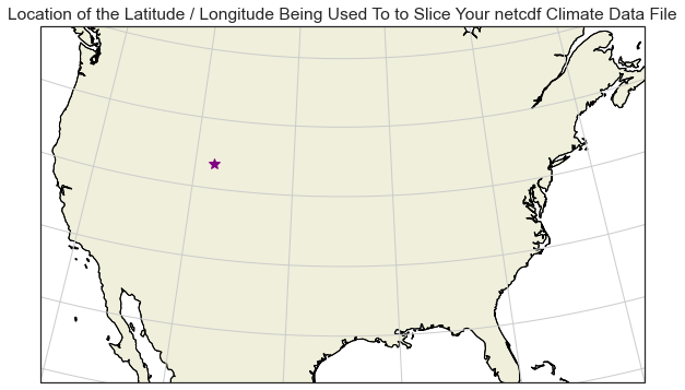
Long, Lat values: 251.89422607421875 41.72947692871094
This step is optional.
Below, you can see the x, y location that for the latitude/longitude
location that you will use to slice the data above plotted on a map.
The code below is an example of creating a spatial plot using
the cartopy package that shows the location that you selected.
Notie that you need to subtract 360 from the longitude value. This is because the range of values in this data are 0-360 rather than +/- 0-180 given the CRS of the data.
# Create a spatial map of your selected location with cartopy

# Set the spatial extent to cover the CONUS (Continental United States)
extent = [-120, -70, 24, 50.5]
central_lon = np.mean(extent[:2])
central_lat = np.mean(extent[2:])

# Create your figure and axis object
# Albers equal area is a common CRS used to make maps of the United States
f, ax = plt.subplots(figsize=(12, 6),
                     subplot_kw={'projection': ccrs.AlbersEqualArea(central_lon, central_lat)})
ax.coastlines()
# Plot the selected location
ax.plot(longitude-360, latitude,
        '*',
        transform=ccrs.PlateCarree(),
        color="purple",
        markersize=10)

ax.set_extent(extent)
ax.set(title="Location of the Latitude / Longitude Being Used To to Slice Your netcdf Climate Data File")

# Adds continent boundaries to the map
ax.add_feature(cfeature.LAND, edgecolor='black')

ax.gridlines()
plt.show()
/opt/conda/envs/EDS/lib/python3.8/site-packages/cartopy/io/__init__.py:241: DownloadWarning: Downloading: https://naturalearth.s3.amazonaws.com/50m_physical/ne_50m_land.zip
  warnings.warn(f'Downloading: {url}', DownloadWarning)
/opt/conda/envs/EDS/lib/python3.8/site-packages/cartopy/io/__init__.py:241: DownloadWarning: Downloading: https://naturalearth.s3.amazonaws.com/50m_physical/ne_50m_coastline.zip
  warnings.warn(f'Downloading: {url}', DownloadWarning)
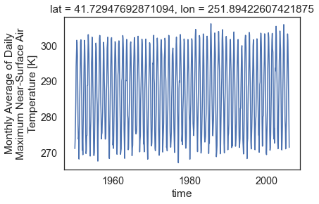
Subset Your Data
Now it is time to subset the data for the point location that
you are interested in studying (the lat / lon value that you plotted above).
You can slice the data for one single latitude, longitude location using
the .sel() method.
When you select the data using one single point, your output for every time step in the data will be a single pixel value representing max temperature. For this monthly data this means that you will have one pixel value for every month in the data.
# Slice the data spatially using a single lat/lon point
one_point = max_temp_xr["air_temperature"].sel(lat=latitude,
                                               lon=longitude)
one_point
<xarray.DataArray 'air_temperature' (time: 672)>
array([271.11615, 274.05585, 279.538  , ..., 286.85074, 279.6746 , 271.4411 ],
      dtype=float32)
Coordinates:
    lat      float64 41.73
    lon      float64 251.9
  * time     (time) object 1950-01-15 00:00:00 ... 2005-12-15 00:00:00
Attributes:
    long_name:      Monthly Average of Daily Maximum Near-Surface Air Tempera...
    units:          K
    grid_mapping:   crs
    standard_name:  air_temperature
    height:         2 m
    cell_methods:   time: maximum(interval: 24 hours);mean over days
_ChunkSizes: [ 10 44 107]- time: 672
- 271.1 274.1 279.5 284.4 294.1 298.4 ... 301.5 294.3 286.9 279.7 271.4
array([271.11615, 274.05585, 279.538 , ..., 286.85074, 279.6746 , 271.4411 ], dtype=float32) - lat()float6441.73
- long_name :
- latitude
- standard_name :
- latitude
- units :
- degrees_north
- axis :
- Y
- description :
- Latitude of the center of the grid cell
array(41.72947693)
- lon()float64251.9
- units :
- degrees_east
- description :
- Longitude of the center of the grid cell
- long_name :
- longitude
- standard_name :
- longitude
- axis :
- X
array(251.89422607)
- time(time)object1950-01-15 00:00:00 ... 2005-12-...
- description :
- days since 1900-01-01
array([cftime.DatetimeNoLeap(1950, 1, 15, 0, 0, 0, 0, has_year_zero=True),
       cftime.DatetimeNoLeap(1950, 2, 15, 0, 0, 0, 0, has_year_zero=True),
       cftime.DatetimeNoLeap(1950, 3, 15, 0, 0, 0, 0, has_year_zero=True), ...,
       cftime.DatetimeNoLeap(2005, 10, 15, 0, 0, 0, 0, has_year_zero=True),
       cftime.DatetimeNoLeap(2005, 11, 15, 0, 0, 0, 0, has_year_zero=True),
       cftime.DatetimeNoLeap(2005, 12, 15, 0, 0, 0, 0, has_year_zero=True)],
      dtype=object)
- long_name :
- Monthly Average of Daily Maximum Near-Surface Air Temperature
- units :
- K
- grid_mapping :
- crs
- standard_name :
- air_temperature
- height :
- 2 m
- cell_methods :
- time: maximum(interval: 24 hours);mean over days
- _ChunkSizes :
- [ 10 44 107]
When you slice the data by a single point, notice that output data only has a single array of values. In this case these values represent air temperature (in K) over time.
# Notice the shape of the output array
one_point.shape
(672,)
The data stored in the xarray object is a numpy array. You can process the data in the same way you would process any other numpy array.
# View the first 5 values for that single point
one_point.values[:5]
array([271.11615, 274.05585, 279.538  , 284.42365, 294.1337 ],
      dtype=float32)
Plot A Time Series For a Single Location
Above you used a single point location to slice your data. Because
the data are for only one location, but over time, you can quickly
create a scatterplot of the data using objectname.plot().
# Use xarray to create a quick time series plot
one_point.plot.line()
plt.show()
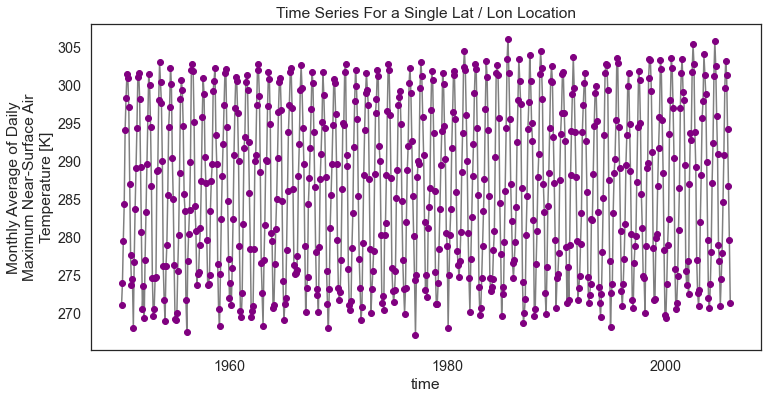
You can make the plot a bit prettier if you’d like using the
standard Python matplotlib plot parameters. Below you change the marker color
to purple and the lines to grey. figsize is used to adjust the
size of the plot.
# You can clean up your plot as you wish using standard matplotlib approaches
f, ax = plt.subplots(figsize=(12, 6))
one_point.plot.line(hue='lat',
                    marker="o",
                    ax=ax,
                    color="grey",
                    markerfacecolor="purple",
                    markeredgecolor="purple")
ax.set(title="Time Series For a Single Lat / Lon Location")

# Uncomment the line below if you wish to export the figure as a .png file
# plt.savefig("single_point_timeseries.png")
plt.show()
Convert Climate Time Series Data to a Pandas DataFrame & Export to a .csv File
You can convert your data to a DataFrame and export to
a .csv file using to_dataframe() and to_csv().
# Convert to dataframe -- then this can easily be exported to a csv
one_point_df = one_point.to_dataframe()
# View just the first 5 rows of the data
one_point_df.head()
| lat | lon | air_temperature | |
|---|---|---|---|
| time | |||
| 1950-01-15 00:00:00 | 41.729477 | 251.894226 | 271.116150 |
| 1950-02-15 00:00:00 | 41.729477 | 251.894226 | 274.055847 |
| 1950-03-15 00:00:00 | 41.729477 | 251.894226 | 279.537994 |
| 1950-04-15 00:00:00 | 41.729477 | 251.894226 | 284.423645 |
| 1950-05-15 00:00:00 | 41.729477 | 251.894226 | 294.133698 |
Once you have a dataframe object, you can export it
directly to a .csv file format.
# Export data to .csv file
one_point_df.to_csv("one-location.csv")
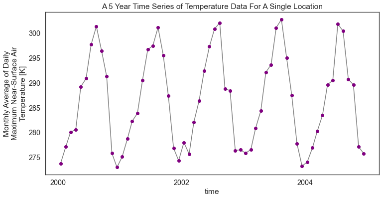
Slice Climate MACAv2 Data By Time and Location
Above you sliced the data by spatial location, selecting only one point location at a specific latitude and longitude. You can also slice the data by time. Below, you slice the data at the selected lat / long location and for a 5-year time period in the year 2000.
Notice that the output shape is 60. 60 represents 12 months a year over 5 years for the selected lat / lon location. Again because you are slicing out data for a single point location, you have a total of 60 data points in the output numpy array.
start_date = "2000-01-01"
end_date = "2005-01-01"
temp_2000_2005 = max_temp_xr["air_temperature"].sel(time=slice(start_date, end_date),
                                                    lat=45.02109146118164,
                                                    lon=243.01937866210938)
temp_2000_2005
<xarray.DataArray 'air_temperature' (time: 60)>
array([273.74884, 277.1434 , 280.0702 , 280.6042 , 289.23993, 290.86853,
       297.70242, 301.36722, 296.4382 , 291.29434, 275.8434 , 273.0037 ,
       275.154  , 278.77863, 282.29105, 283.87787, 290.53387, 296.701  ,
       297.4607 , 301.16116, 295.5421 , 287.3863 , 276.85397, 274.35953,
       278.0117 , 275.68024, 282.12674, 286.41693, 292.4094 , 297.30606,
       300.84628, 302.10593, 288.83698, 288.44   , 276.38992, 276.5348 ,
       275.86145, 276.5708 , 280.8476 , 284.35712, 292.14087, 293.66147,
       301.09534, 302.7656 , 294.99573, 287.5425 , 277.80093, 273.25894,
       274.09232, 276.94736, 280.25446, 283.47614, 289.63776, 290.5187 ,
       301.8519 , 300.40402, 290.73633, 289.60886, 277.12424, 275.7836 ],
      dtype=float32)
Coordinates:
    lat      float64 45.02
    lon      float64 243.0
  * time     (time) object 2000-01-15 00:00:00 ... 2004-12-15 00:00:00
Attributes:
    long_name:      Monthly Average of Daily Maximum Near-Surface Air Tempera...
    units:          K
    grid_mapping:   crs
    standard_name:  air_temperature
    height:         2 m
    cell_methods:   time: maximum(interval: 24 hours);mean over days
_ChunkSizes: [ 10 44 107]- time: 60
- 273.7 277.1 280.1 280.6 289.2 290.9 ... 300.4 290.7 289.6 277.1 275.8
array([273.74884, 277.1434 , 280.0702 , 280.6042 , 289.23993, 290.86853, 297.70242, 301.36722, 296.4382 , 291.29434, 275.8434 , 273.0037 , 275.154 , 278.77863, 282.29105, 283.87787, 290.53387, 296.701 , 297.4607 , 301.16116, 295.5421 , 287.3863 , 276.85397, 274.35953, 278.0117 , 275.68024, 282.12674, 286.41693, 292.4094 , 297.30606, 300.84628, 302.10593, 288.83698, 288.44 , 276.38992, 276.5348 , 275.86145, 276.5708 , 280.8476 , 284.35712, 292.14087, 293.66147, 301.09534, 302.7656 , 294.99573, 287.5425 , 277.80093, 273.25894, 274.09232, 276.94736, 280.25446, 283.47614, 289.63776, 290.5187 , 301.8519 , 300.40402, 290.73633, 289.60886, 277.12424, 275.7836 ], dtype=float32) - lat()float6445.02
- long_name :
- latitude
- standard_name :
- latitude
- units :
- degrees_north
- axis :
- Y
- description :
- Latitude of the center of the grid cell
array(45.02109146)
- lon()float64243.0
- units :
- degrees_east
- description :
- Longitude of the center of the grid cell
- long_name :
- longitude
- standard_name :
- longitude
- axis :
- X
array(243.01937866)
- time(time)object2000-01-15 00:00:00 ... 2004-12-...
- description :
- days since 1900-01-01
array([cftime.DatetimeNoLeap(2000, 1, 15, 0, 0, 0, 0, has_year_zero=True),
       cftime.DatetimeNoLeap(2000, 2, 15, 0, 0, 0, 0, has_year_zero=True),
       cftime.DatetimeNoLeap(2000, 3, 15, 0, 0, 0, 0, has_year_zero=True),
       cftime.DatetimeNoLeap(2000, 4, 15, 0, 0, 0, 0, has_year_zero=True),
       cftime.DatetimeNoLeap(2000, 5, 15, 0, 0, 0, 0, has_year_zero=True),
       cftime.DatetimeNoLeap(2000, 6, 15, 0, 0, 0, 0, has_year_zero=True),
       cftime.DatetimeNoLeap(2000, 7, 15, 0, 0, 0, 0, has_year_zero=True),
       cftime.DatetimeNoLeap(2000, 8, 15, 0, 0, 0, 0, has_year_zero=True),
       cftime.DatetimeNoLeap(2000, 9, 15, 0, 0, 0, 0, has_year_zero=True),
       cftime.DatetimeNoLeap(2000, 10, 15, 0, 0, 0, 0, has_year_zero=True),
       cftime.DatetimeNoLeap(2000, 11, 15, 0, 0, 0, 0, has_year_zero=True),
       cftime.DatetimeNoLeap(2000, 12, 15, 0, 0, 0, 0, has_year_zero=True),
       cftime.DatetimeNoLeap(2001, 1, 15, 0, 0, 0, 0, has_year_zero=True),
       cftime.DatetimeNoLeap(2001, 2, 15, 0, 0, 0, 0, has_year_zero=True),
       cftime.DatetimeNoLeap(2001, 3, 15, 0, 0, 0, 0, has_year_zero=True),
       cftime.DatetimeNoLeap(2001, 4, 15, 0, 0, 0, 0, has_year_zero=True),
       cftime.DatetimeNoLeap(2001, 5, 15, 0, 0, 0, 0, has_year_zero=True),
       cftime.DatetimeNoLeap(2001, 6, 15, 0, 0, 0, 0, has_year_zero=True),
       cftime.DatetimeNoLeap(2001, 7, 15, 0, 0, 0, 0, has_year_zero=True),
       cftime.DatetimeNoLeap(2001, 8, 15, 0, 0, 0, 0, has_year_zero=True),
       cftime.DatetimeNoLeap(2001, 9, 15, 0, 0, 0, 0, has_year_zero=True),
       cftime.DatetimeNoLeap(2001, 10, 15, 0, 0, 0, 0, has_year_zero=True),
       cftime.DatetimeNoLeap(2001, 11, 15, 0, 0, 0, 0, has_year_zero=True),
       cftime.DatetimeNoLeap(2001, 12, 15, 0, 0, 0, 0, has_year_zero=True),
       cftime.DatetimeNoLeap(2002, 1, 15, 0, 0, 0, 0, has_year_zero=True),
       cftime.DatetimeNoLeap(2002, 2, 15, 0, 0, 0, 0, has_year_zero=True),
       cftime.DatetimeNoLeap(2002, 3, 15, 0, 0, 0, 0, has_year_zero=True),
       cftime.DatetimeNoLeap(2002, 4, 15, 0, 0, 0, 0, has_year_zero=True),
       cftime.DatetimeNoLeap(2002, 5, 15, 0, 0, 0, 0, has_year_zero=True),
       cftime.DatetimeNoLeap(2002, 6, 15, 0, 0, 0, 0, has_year_zero=True),
       cftime.DatetimeNoLeap(2002, 7, 15, 0, 0, 0, 0, has_year_zero=True),
       cftime.DatetimeNoLeap(2002, 8, 15, 0, 0, 0, 0, has_year_zero=True),
       cftime.DatetimeNoLeap(2002, 9, 15, 0, 0, 0, 0, has_year_zero=True),
       cftime.DatetimeNoLeap(2002, 10, 15, 0, 0, 0, 0, has_year_zero=True),
       cftime.DatetimeNoLeap(2002, 11, 15, 0, 0, 0, 0, has_year_zero=True),
       cftime.DatetimeNoLeap(2002, 12, 15, 0, 0, 0, 0, has_year_zero=True),
       cftime.DatetimeNoLeap(2003, 1, 15, 0, 0, 0, 0, has_year_zero=True),
       cftime.DatetimeNoLeap(2003, 2, 15, 0, 0, 0, 0, has_year_zero=True),
       cftime.DatetimeNoLeap(2003, 3, 15, 0, 0, 0, 0, has_year_zero=True),
       cftime.DatetimeNoLeap(2003, 4, 15, 0, 0, 0, 0, has_year_zero=True),
       cftime.DatetimeNoLeap(2003, 5, 15, 0, 0, 0, 0, has_year_zero=True),
       cftime.DatetimeNoLeap(2003, 6, 15, 0, 0, 0, 0, has_year_zero=True),
       cftime.DatetimeNoLeap(2003, 7, 15, 0, 0, 0, 0, has_year_zero=True),
       cftime.DatetimeNoLeap(2003, 8, 15, 0, 0, 0, 0, has_year_zero=True),
       cftime.DatetimeNoLeap(2003, 9, 15, 0, 0, 0, 0, has_year_zero=True),
       cftime.DatetimeNoLeap(2003, 10, 15, 0, 0, 0, 0, has_year_zero=True),
       cftime.DatetimeNoLeap(2003, 11, 15, 0, 0, 0, 0, has_year_zero=True),
       cftime.DatetimeNoLeap(2003, 12, 15, 0, 0, 0, 0, has_year_zero=True),
       cftime.DatetimeNoLeap(2004, 1, 15, 0, 0, 0, 0, has_year_zero=True),
       cftime.DatetimeNoLeap(2004, 2, 15, 0, 0, 0, 0, has_year_zero=True),
       cftime.DatetimeNoLeap(2004, 3, 15, 0, 0, 0, 0, has_year_zero=True),
       cftime.DatetimeNoLeap(2004, 4, 15, 0, 0, 0, 0, has_year_zero=True),
       cftime.DatetimeNoLeap(2004, 5, 15, 0, 0, 0, 0, has_year_zero=True),
       cftime.DatetimeNoLeap(2004, 6, 15, 0, 0, 0, 0, has_year_zero=True),
       cftime.DatetimeNoLeap(2004, 7, 15, 0, 0, 0, 0, has_year_zero=True),
       cftime.DatetimeNoLeap(2004, 8, 15, 0, 0, 0, 0, has_year_zero=True),
       cftime.DatetimeNoLeap(2004, 9, 15, 0, 0, 0, 0, has_year_zero=True),
       cftime.DatetimeNoLeap(2004, 10, 15, 0, 0, 0, 0, has_year_zero=True),
       cftime.DatetimeNoLeap(2004, 11, 15, 0, 0, 0, 0, has_year_zero=True),
       cftime.DatetimeNoLeap(2004, 12, 15, 0, 0, 0, 0, has_year_zero=True)],
      dtype=object)
- long_name :
- Monthly Average of Daily Maximum Near-Surface Air Temperature
- units :
- K
- grid_mapping :
- crs
- standard_name :
- air_temperature
- height :
- 2 m
- cell_methods :
- time: maximum(interval: 24 hours);mean over days
- _ChunkSizes :
- [ 10 44 107]
temp_2000_2005.shape
(60,)
# View the 60 data points (raster cell values) associated with the spatial and temporal subset
temp_2000_2005.values
array([273.74884, 277.1434 , 280.0702 , 280.6042 , 289.23993, 290.86853,
       297.70242, 301.36722, 296.4382 , 291.29434, 275.8434 , 273.0037 ,
       275.154  , 278.77863, 282.29105, 283.87787, 290.53387, 296.701  ,
       297.4607 , 301.16116, 295.5421 , 287.3863 , 276.85397, 274.35953,
       278.0117 , 275.68024, 282.12674, 286.41693, 292.4094 , 297.30606,
       300.84628, 302.10593, 288.83698, 288.44   , 276.38992, 276.5348 ,
       275.86145, 276.5708 , 280.8476 , 284.35712, 292.14087, 293.66147,
       301.09534, 302.7656 , 294.99573, 287.5425 , 277.80093, 273.25894,
       274.09232, 276.94736, 280.25446, 283.47614, 289.63776, 290.5187 ,
       301.8519 , 300.40402, 290.73633, 289.60886, 277.12424, 275.7836 ],
      dtype=float32)
Notice that in this instance you have much less data for that specific point (5 years worth of data to be exact).
# Plot the data just like you did above
f, ax = plt.subplots(figsize=(12, 6))
temp_2000_2005.plot.line(hue='lat',
                         marker="o",
                         ax=ax,
                         color="grey",
                         markerfacecolor="purple",
                         markeredgecolor="purple")
ax.set(title="A 5 Year Time Series of Temperature Data For A Single Location")
plt.show()
Convert Subsetted to a DataFrame & Export to a .csv File
Similar to what you did above, you can also convert your data to a DataFrame. Once your data are in a
DataFrame format, you can quickly export a .csv file.
# Convert to dataframe -- then this can be exported to a csv if you want that
temp_2000_2005_df = temp_2000_2005.to_dataframe()
# View just the first 5 rows of the data
temp_2000_2005_df.head()
| lat | lon | air_temperature | |
|---|---|---|---|
| time | |||
| 2000-01-15 00:00:00 | 45.021091 | 243.019379 | 273.748840 |
| 2000-02-15 00:00:00 | 45.021091 | 243.019379 | 277.143402 |
| 2000-03-15 00:00:00 | 45.021091 | 243.019379 | 280.070190 |
| 2000-04-15 00:00:00 | 45.021091 | 243.019379 | 280.604187 |
| 2000-05-15 00:00:00 | 45.021091 | 243.019379 | 289.239929 |
# Create filename from subset info
file_name = "monthly-temp-" + start_date + "-" + end_date + ".csv"
file_name
'monthly-temp-2000-01-01-2005-01-01.csv'
# Export to a csv file to share with your friends!
temp_2000_2005_df.to_csv(file_name)
Slice The Data Across a Spatial Extent For A Specific Time Period
In the above example you sliced out a subset of the data for a specific point location over time. Below you select data for the entire CONUS (Continental United States) study area and analyze it as a spatial raster object.
Once again you use .sel() combined with slice() subset the data.
Notice below that if you don’t specify the lat and lon extent, it will by default return all of the pixels available in the data for the specified time period.
Notice that you are plotting the entire spatial extent of the data which is in this case called CONUS (CONtinental United States)
start_date = "1950-01-15"
end_date = "1950-02-15"

two_months_conus = max_temp_xr["air_temperature"].sel(
    time=slice(start_date, end_date))
# Notice that time has a value of **2** below representing two time steps or months worth of data
two_months_conus
<xarray.DataArray 'air_temperature' (time: 2, lat: 585, lon: 1386)>
[1621620 values with dtype=float32]
Coordinates:
  * lat      (lat) float64 25.06 25.1 25.15 25.19 ... 49.27 49.31 49.35 49.4
  * lon      (lon) float64 235.2 235.3 235.3 235.4 ... 292.8 292.9 292.9 292.9
  * time     (time) object 1950-01-15 00:00:00 1950-02-15 00:00:00
Attributes:
    long_name:      Monthly Average of Daily Maximum Near-Surface Air Tempera...
    units:          K
    grid_mapping:   crs
    standard_name:  air_temperature
    height:         2 m
    cell_methods:   time: maximum(interval: 24 hours);mean over days
_ChunkSizes: [ 10 44 107]- time: 2
- lat: 585
- lon: 1386
- ...
[1621620 values with dtype=float32]
- lat(lat)float6425.06 25.1 25.15 ... 49.35 49.4
- long_name :
- latitude
- standard_name :
- latitude
- units :
- degrees_north
- axis :
- Y
- description :
- Latitude of the center of the grid cell
array([25.063078, 25.104744, 25.14641 , ..., 49.312691, 49.354359, 49.396023])
- lon(lon)float64235.2 235.3 235.3 ... 292.9 292.9
- units :
- degrees_east
- description :
- Longitude of the center of the grid cell
- long_name :
- longitude
- standard_name :
- longitude
- axis :
- X
array([235.227844, 235.269501, 235.311157, ..., 292.851929, 292.893585, 292.935242]) - time(time)object1950-01-15 00:00:00 1950-02-15 0...
- description :
- days since 1900-01-01
array([cftime.DatetimeNoLeap(1950, 1, 15, 0, 0, 0, 0, has_year_zero=True),
       cftime.DatetimeNoLeap(1950, 2, 15, 0, 0, 0, 0, has_year_zero=True)],
      dtype=object)
- long_name :
- Monthly Average of Daily Maximum Near-Surface Air Temperature
- units :
- K
- grid_mapping :
- crs
- standard_name :
- air_temperature
- height :
- 2 m
- cell_methods :
- time: maximum(interval: 24 hours);mean over days
- _ChunkSizes :
- [ 10 44 107]
two_months_conus.shape
(2, 585, 1386)
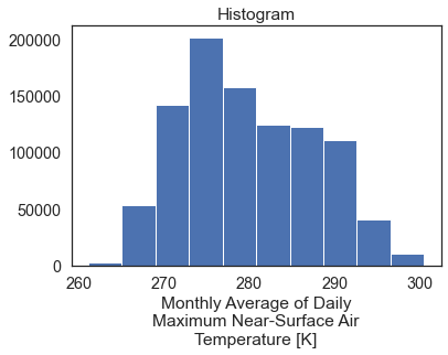
The default return when you plot an xarray object with multipple years worth of data across a spatial extent is a histogram.
two_months_conus.shape
(2, 585, 1386)
When you call .plot() on the data, the default plot is a
histogram representing the range of raster pixel values in your data
for all time periods (2 months in this case).
# Directly plot just a single day using time in "years"
two_months_conus.plot()
plt.show()
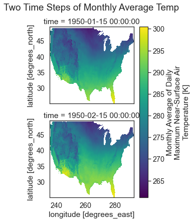
Spatial Raster Plots of MACA v2 Climate Data
If you want to plot the data spatially as a raster, you can use
.plot() but specify the lon and lat values as the x and y dimensions
to plot. You can add the following parameters to your .plot() call to
make sure each time step in your data plots spatially:
col_wrap=2: adjust how how many columns the each subplot is spread across
col=: what dimension is being plotted in each subplot.
In this case, you want a single raster for each month (time step) in the
data so you specify col='time'. col_wrap=1 forces the plots to
stack on top of each other in your matplotlib figure.
# Quickly plot the data using xarray.plot()
two_months_conus.plot(x="lon",
                      y="lat",
                      col="time",
                      col_wrap=1)
plt.suptitle("Two Time Steps of Monthly Average Temp", y=1.03)
plt.show()
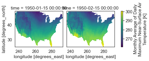
If you set col_wrap to 2 you end up with two columns and
one subplot in each column.
# Plot the data using 2 columns
two_months_conus.plot(x="lon",
                      y="lat",
                      col="time",
                      col_wrap=2)
plt.show()
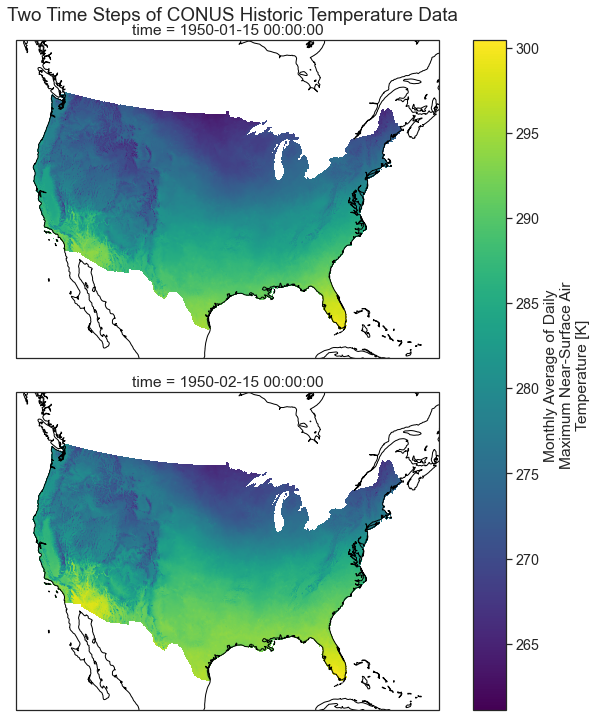
Plot Multiple MACA v2 Climate Data Raster Files With a Spatial Projection
Below you plot the same data using cartopy which support spatial
projectsion. The coastlines() basemap is also added to the plot.
central_lat = 37.5
central_long = 96
extent = [-120, -70, 20, 55.5]  # CONUS

map_proj = ccrs.AlbersEqualArea(central_longitude=central_lon,
                                central_latitude=central_lat)

aspect = two_months_conus.shape[2] / two_months_conus.shape[1]
p = two_months_conus.plot(transform=ccrs.PlateCarree(),  # the data's projection
                          col='time', col_wrap=1,
                          aspect=aspect,
                          figsize=(10, 10),
                          subplot_kws={'projection': map_proj})  # the plot's projection

plt.suptitle("Two Time Steps of CONUS Historic Temperature Data", y=1)
# Add the coastlines to each axis object and set extent
for ax in p.axes.flat:
    ax.coastlines()
    ax.set_extent(extent)
Export Raster to Geotiff File
In the above workflows you converted your data into a DataFrame and exported it to a .csv file. This approach works well if you only need the summary values and don’t need any spatial information. However sometimes you may need to export spatial raster files.
You can export your data to a geotiff file format using rioxarray. To do this you will need to:
- ensure that your xarray object has a crs defined and define it if it’s missing.
- call xarray to export your data
Notice below that your two month subset no long contains CRS information.
# Double check the crs still exist
two_months_conus.rio.crs
At the very beginning of this lesson, you saved the crs information from the original xarray object. You can use that to export your geotiff data below.
CRS.from_wkt('GEOGCS["undefined",DATUM["undefined",SPHEROID["undefined",6378137,298.257223563]],PRIMEM["undefined",0],UNIT["degree",0.0174532925199433,AUTHORITY["EPSG","9122"]],AXIS["Longitude",EAST],AXIS["Latitude",NORTH]]')
Once the crs is set, you can export to a geotiff file format.
# Export to geotiff
file_path = "two_months_temp_data.tif"
two_months_conus.rio.to_raster(file_path)
Now test our your data. Reimport it using xarray.open_rasterio.
# Open the data up as a geotiff
two_months_tiff = rxr.open_rasterio(file_path)
two_months_tiff
<xarray.DataArray (band: 2, y: 585, x: 1386)>
[1621620 values with dtype=float32]
Coordinates:
  * band         (band) int64 1 2
  * x            (x) float64 235.2 235.3 235.3 235.4 ... 292.8 292.9 292.9 292.9
  * y            (y) float64 25.06 25.1 25.15 25.19 ... 49.27 49.31 49.35 49.4
    spatial_ref  int64 0
Attributes:
    _FillValue:    -9999.0
    scale_factor:  1.0
    add_offset:    0.0
long_name: Monthly Average of Daily Maximum Near-Surface Air Temperature- band: 2
- y: 585
- x: 1386
- ...
[1621620 values with dtype=float32]
- band(band)int641 2
array([1, 2])
- x(x)float64235.2 235.3 235.3 ... 292.9 292.9
array([235.227844, 235.26951 , 235.311176, ..., 292.85191 , 292.893576, 292.935242]) - y(y)float6425.06 25.1 25.15 ... 49.35 49.4
array([25.063078, 25.104744, 25.14641 , ..., 49.312691, 49.354357, 49.396023])
- spatial_ref()int640
- crs_wkt :
- GEOGCS["undefined",DATUM["undefined",SPHEROID["undefined",6378137,298.257223563]],PRIMEM["undefined",0],UNIT["degree",0.0174532925199433,AUTHORITY["EPSG","9122"]],AXIS["Latitude",NORTH],AXIS["Longitude",EAST]]
- semi_major_axis :
- 6378137.0
- semi_minor_axis :
- 6356752.314245179
- inverse_flattening :
- 298.257223563
- reference_ellipsoid_name :
- undefined
- longitude_of_prime_meridian :
- 0.0
- prime_meridian_name :
- undefined
- geographic_crs_name :
- undefined
- grid_mapping_name :
- latitude_longitude
- spatial_ref :
- GEOGCS["undefined",DATUM["undefined",SPHEROID["undefined",6378137,298.257223563]],PRIMEM["undefined",0],UNIT["degree",0.0174532925199433,AUTHORITY["EPSG","9122"]],AXIS["Latitude",NORTH],AXIS["Longitude",EAST]]
- GeoTransform :
- 235.207011242808 0.04166599094652527 0.0 25.042244925890884 0.0 0.04166600148971766
array(0)
- _FillValue :
- -9999.0
- scale_factor :
- 1.0
- add_offset :
- 0.0
- long_name :
- Monthly Average of Daily Maximum Near-Surface Air Temperature
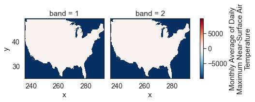
Plot the data. Do you notice anything about the values in the histogram below?
two_months_tiff.plot()
plt.show()
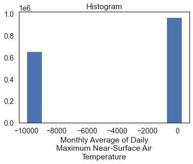
# Plot the data - this doesn't look right!
two_months_tiff.plot(col="band")
plt.show()
The data above are plotting oddly because there are no data
values in your array. You can mask those values using xarray.where().
two_months_tiff.rio.nodata
-9999.0
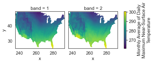
Below you use .where() to mask all values in your data that are
equal to -9999, the nodata value for this data.
# Remove no data values and try to plot again
two_months_tiff = rxr.open_rasterio(file_path)

two_months_clean = two_months_tiff.where(
    two_months_tiff != two_months_tiff.rio.nodata)

two_months_clean.plot(col="band")
plt.show()
Above you learned how to begin to work with NETCDF4 format files containing climate focused data. You learned how to open and subset the data by time and location. In the next lesson you will learn how to implement spatial subsets using shapefiles of your data.
Share on
Twitter Facebook Google+ LinkedIn
Leave a Comment