Lesson 1. Work With Datetime Format in Python - Time Series Data
Use Time Series Data in Python With Pandas - Intermediate earth data science textbook course module
Welcome to the first lesson in the Use Time Series Data in Python With Pandas module. Python provides a datetime object for storing and working with dates. Learn how to handle date fields using pandas to work with time series data in Python.Chapter One - Introduction to Time Series Data in Python
In this chapter, you will learn how to work with the datetime object in
Python which you need for plotting and working with time series data.
You will also learn how to work with “no data” values in Python.
Learning Objectives
After completing this chapter, you will be able to:
- Import a time series dataset using pandas with dates converted to a
datetimeobject in Python. - Use the
datetimeobject to create easier-to-read time series plots and work with data across various timeframes (e.g. daily, monthly, yearly) in Python. - Explain the role of “no data” values and how the
NaNvalue is used in Python to label “no data” values. - Set a “no data” value for a file when you import it into a pandas dataframe.
What You Need
You should have Conda setup on your computer and the Earth Analytics Python Conda environment. Follow the Set up Git, Bash, and Conda on your computer to install these tools.
Be sure that you have reviewed the Introduction to Earth Data Science textbook or are familiar with the Python programming language and the pandas package for working with dataframes.
Why Use Datetime Objects in Python
Dates can be tricky in any programming language. While you may see a date in a dataset and recognize it as something that can be quantified and related to time, a computer reads in numbers and characters. Often by default, date information is loaded as a string (i.e. a set of characters), rather than something that has an order in time.
The Python datetime object will make working with and plotting
time series data easier. You can convert pandas dataframe
columns containing dates and times as strings into datetime objects.
Below, you will find a quick introduction to working with and plotting time series data using Pandas. The following pages in this chapter will dive further into the details associated with using, manipulating and analyzing time series data.
Import Packages and Get Data
To begin, import the packages that you need to work with tabular data in Python.
# Import necessary packages
from matplotlib.axes._axes import _log as matplotlib_axes_logger
import os
import matplotlib.pyplot as plt
import seaborn as sns
import pandas as pd
import earthpy as et

# Handle date time conversions between pandas and matplotlib
from pandas.plotting import register_matplotlib_converters
register_matplotlib_converters()

# Dealing with error thrown by one of the plots
matplotlib_axes_logger.setLevel('ERROR')
import warnings
warnings.filterwarnings('ignore')


# Adjust font size and style of all plots in notebook with seaborn
sns.set(font_scale=1.5, style="whitegrid")
Next, you set your working directory to:
~/earth-analytics/data
And finally you open up the file: 805325-precip-dailysum-2003-2013.csv
which is a .csv file that contains precipitation data for
Boulder, Colorado for 2003 to 2013 when the flood occurred
in Colorado.
# Download the data
data = et.data.get_data('colorado-flood')

# Set working directory
os.chdir(os.path.join(et.io.HOME, 'earth-analytics', "data"))
Downloading from https://ndownloader.figshare.com/files/16371473
Extracted output to /root/earth-analytics/data/colorado-flood/.
Next, open the precipitation data for Boulder, Colorado. Look at the structure of the data.
# Define relative path to the data
file_path = os.path.join("colorado-flood",
                         "precipitation",
                         "805325-precip-daily-2003-2013.csv")

# Import the file as a pandas dataframe
boulder_precip_2003_2013 = pd.read_csv(file_path)
boulder_precip_2003_2013.head()
| STATION | STATION_NAME | ELEVATION | LATITUDE | LONGITUDE | DATE | HPCP | Measurement Flag | Quality Flag | |
|---|---|---|---|---|---|---|---|---|---|
| 0 | COOP:050843 | BOULDER 2 CO US | 1650.5 | 40.03389 | -105.28111 | 20030101 01:00 | 0.0 | g | |
| 1 | COOP:050843 | BOULDER 2 CO US | 1650.5 | 40.03389 | -105.28111 | 20030201 01:00 | 0.0 | g | |
| 2 | COOP:050843 | BOULDER 2 CO US | 1650.5 | 40.03389 | -105.28111 | 20030202 19:00 | 0.2 | ||
| 3 | COOP:050843 | BOULDER 2 CO US | 1650.5 | 40.03389 | -105.28111 | 20030202 22:00 | 0.1 | ||
| 4 | COOP:050843 | BOULDER 2 CO US | 1650.5 | 40.03389 | -105.28111 | 20030203 02:00 | 0.1 |
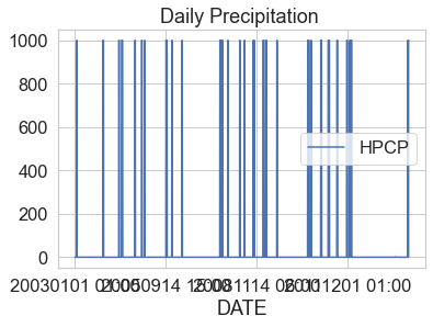
Plot the data using the DAILY_PRECIP column. What do you notice about
the plot?
boulder_precip_2003_2013.plot(x="DATE",
                              y="HPCP",
                              title="Daily Precipitation ")
plt.show()
Challenge 1: Review Metadata
In the cell below list the things that you think look “wrong” with the plot above.
Next, read the PRECIP_HLY_documentation.pdf metadata document that was included
with the data before answering items 1-4.
- Do the data have a no data value?
- How are missing data “identified” in the table”?
- How frequently are the data recorded (every second, minute, hour, day, week, etc?)?
- What are the units of the data (NOTE - this may be a “trick” question :) ). But see what you can find in the metadata.
HINT: the next few cells may help you explore the data to better understand what is going on with it.
Time Series Data Cleaning & Exploration
The data above do not look quite right. Take some time to explore the data to better understand what you need to clean up.
# Look at the range of values in the data - specifically the HPCP column
boulder_precip_2003_2013["HPCP"].describe()
count    1840.000000
mean       51.192587
std       220.208147
min         0.000000
25%         0.100000
50%         0.100000
75%         0.100000
max       999.990000
Name: HPCP, dtype: float64
boulder_precip_2003_2013.dtypes
STATION              object
STATION_NAME         object
ELEVATION           float64
LATITUDE            float64
LONGITUDE           float64
DATE                 object
HPCP                float64
Measurement Flag     object
Quality Flag         object
dtype: object
You may have observed several anomalies in the data.
- The data seem to have a very large number: 999.99. More often than note, a value of 999 represents a no data value that needs to be removed from your data.
- You may have noticed that your x axis date values in the plot look “messy”. When you see an x-axis like this but you know your data are time series, it’s most often caused by your datetime data not being read in properly as numeric date times.
You can address all of these issues using the following read_csv() parameters:
parse_dates=: Column containing date information that should be read into theDataFrameas a datetime object.na_values=: Values in the file that should be replaced withNaN(Not a Number).index_col=1: optional – but this will make subsetting the data much easier
# Import data using datetime and no data value
boulder_precip_2003_2013 = pd.read_csv(file_path,
                                       # Make sure the dates import in datetime format
                                       parse_dates=['DATE'],
                                       # Set DATE as the index so you can subset data by time period
                                       index_col=['DATE'],
                                       # Mask no data values so they are not plotted / used in analysis
                                       na_values=['999.99'])

# View the data
boulder_precip_2003_2013.head()
| STATION | STATION_NAME | ELEVATION | LATITUDE | LONGITUDE | HPCP | Measurement Flag | Quality Flag | |
|---|---|---|---|---|---|---|---|---|
| DATE | ||||||||
| 2003-01-01 01:00:00 | COOP:050843 | BOULDER 2 CO US | 1650.5 | 40.03389 | -105.28111 | 0.0 | g | |
| 2003-02-01 01:00:00 | COOP:050843 | BOULDER 2 CO US | 1650.5 | 40.03389 | -105.28111 | 0.0 | g | |
| 2003-02-02 19:00:00 | COOP:050843 | BOULDER 2 CO US | 1650.5 | 40.03389 | -105.28111 | 0.2 | ||
| 2003-02-02 22:00:00 | COOP:050843 | BOULDER 2 CO US | 1650.5 | 40.03389 | -105.28111 | 0.1 | ||
| 2003-02-03 02:00:00 | COOP:050843 | BOULDER 2 CO US | 1650.5 | 40.03389 | -105.28111 | 0.1 |
Notice above that the DATE column header is visually lower than the other columns and the entire column is bold. This represents the DATE column as an index. You set the DATE column as an index above using the parameter:
index_col=['DATE']
Once your date values are an index, you can more easily subset the data by time period. You will learn how to do this below.
# View summary statistics == Notice the DATE column is not included
boulder_precip_2003_2013.describe()
| ELEVATION | LATITUDE | LONGITUDE | HPCP | |
|---|---|---|---|---|
| count | 1840.0 | 1840.000000 | 1840.000000 | 1746.000000 |
| mean | 1650.5 | 40.033851 | -105.281106 | 0.111856 |
| std | 0.0 | 0.000045 | 0.000005 | 0.093222 |
| min | 1650.5 | 40.033800 | -105.281110 | 0.000000 |
| 25% | 1650.5 | 40.033800 | -105.281110 | 0.100000 |
| 50% | 1650.5 | 40.033890 | -105.281110 | 0.100000 |
| 75% | 1650.5 | 40.033890 | -105.281100 | 0.100000 |
| max | 1650.5 | 40.033890 | -105.281100 | 2.200000 |
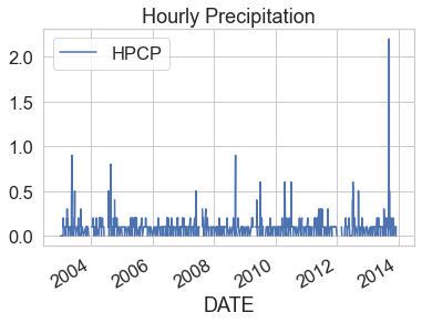
Notice that once you remove no data values, the min and max values for the HPCP column are more reasonable for hourly precipitation ranging from 0 to 2.2.
Using An Index In Pandas
Above, you used index_col=['DATE'] to get the date column to be an index for
the Pandas DataFrame. Assigning an index column is helpful when using timeseries
data as it allows you to easily subset your data by time (see below for an
overview of subsetting data).
It is also important to know that once a column is an index, you need to call
it differently. For instance, below you run .dtypes on your data. Notice that
DATE is no longer a column described in your dataframe.
# Where is the date column
boulder_precip_2003_2013.dtypes
STATION              object
STATION_NAME         object
ELEVATION           float64
LATITUDE            float64
LONGITUDE           float64
HPCP                float64
Measurement Flag     object
Quality Flag         object
dtype: object
You can still access the DATE column as an index column using .index:
data-frame-name.index
Try it out. Notice that below the output of .index is a datetime64
object.
# View the index for your data frame
boulder_precip_2003_2013.index
DatetimeIndex(['2003-01-01 01:00:00', '2003-02-01 01:00:00',
               '2003-02-02 19:00:00', '2003-02-02 22:00:00',
               '2003-02-03 02:00:00', '2003-02-05 02:00:00',
               '2003-02-05 08:00:00', '2003-02-06 00:00:00',
               '2003-02-07 12:00:00', '2003-02-10 13:00:00',
               ...
               '2013-12-01 01:00:00', '2013-12-03 20:00:00',
               '2013-12-04 03:00:00', '2013-12-04 06:00:00',
               '2013-12-04 09:00:00', '2013-12-22 01:00:00',
               '2013-12-23 00:00:00', '2013-12-23 02:00:00',
               '2013-12-29 01:00:00', '2013-12-31 00:00:00'],
              dtype='datetime64[ns]', name='DATE', length=1840, freq=None)
You can also reset the index if you want it to turn it back into a normal
column using data-frame.reset_index()
boulder_precip_2003_2013.reset_index()
| DATE | STATION | STATION_NAME | ELEVATION | LATITUDE | LONGITUDE | HPCP | Measurement Flag | Quality Flag | |
|---|---|---|---|---|---|---|---|---|---|
| 0 | 2003-01-01 01:00:00 | COOP:050843 | BOULDER 2 CO US | 1650.5 | 40.03389 | -105.28111 | 0.0 | g | |
| 1 | 2003-02-01 01:00:00 | COOP:050843 | BOULDER 2 CO US | 1650.5 | 40.03389 | -105.28111 | 0.0 | g | |
| 2 | 2003-02-02 19:00:00 | COOP:050843 | BOULDER 2 CO US | 1650.5 | 40.03389 | -105.28111 | 0.2 | ||
| 3 | 2003-02-02 22:00:00 | COOP:050843 | BOULDER 2 CO US | 1650.5 | 40.03389 | -105.28111 | 0.1 | ||
| 4 | 2003-02-03 02:00:00 | COOP:050843 | BOULDER 2 CO US | 1650.5 | 40.03389 | -105.28111 | 0.1 | ||
| ... | ... | ... | ... | ... | ... | ... | ... | ... | ... |
| 1835 | 2013-12-22 01:00:00 | COOP:050843 | BOULDER 2 CO US | 1650.5 | 40.03380 | -105.28110 | NaN | [ | |
| 1836 | 2013-12-23 00:00:00 | COOP:050843 | BOULDER 2 CO US | 1650.5 | 40.03380 | -105.28110 | NaN | ] | |
| 1837 | 2013-12-23 02:00:00 | COOP:050843 | BOULDER 2 CO US | 1650.5 | 40.03380 | -105.28110 | 0.1 | ||
| 1838 | 2013-12-29 01:00:00 | COOP:050843 | BOULDER 2 CO US | 1650.5 | 40.03380 | -105.28110 | NaN | [ | |
| 1839 | 2013-12-31 00:00:00 | COOP:050843 | BOULDER 2 CO US | 1650.5 | 40.03380 | -105.28110 | NaN | ] |
1840 rows × 9 columns
Now that you have cleaned up the data, you can plot it. Below, you use
.plot() to plot. If you have an index column, then .plot() will automatically
select that column to plot on the x-axis. You then only need to specify the
y-axis column.
boulder_precip_2003_2013.plot(y="HPCP",
                              title="Hourly Precipitation")
plt.show()
Subset Time Series Data by Time
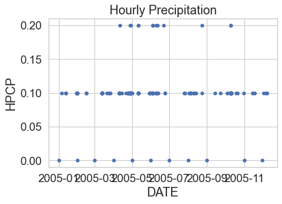
Once you have cleaned up your data, and assigned a datetime index, you can quickly begin to plot and summarize data by time periods. Below you subset the data for 2005.
# Subset data from 2005
precip_2005 = boulder_precip_2003_2013['2005']
precip_2005.head()
| STATION | STATION_NAME | ELEVATION | LATITUDE | LONGITUDE | HPCP | Measurement Flag | Quality Flag | |
|---|---|---|---|---|---|---|---|---|
| DATE | ||||||||
| 2005-01-01 01:00:00 | COOP:050843 | BOULDER 2 CO US | 1650.5 | 40.03389 | -105.28111 | 0.0 | g | |
| 2005-01-02 06:00:00 | COOP:050843 | BOULDER 2 CO US | 1650.5 | 40.03389 | -105.28111 | NaN | { | |
| 2005-01-02 08:00:00 | COOP:050843 | BOULDER 2 CO US | 1650.5 | 40.03389 | -105.28111 | NaN | } | |
| 2005-01-05 08:00:00 | COOP:050843 | BOULDER 2 CO US | 1650.5 | 40.03389 | -105.28111 | 0.1 | ||
| 2005-01-12 04:00:00 | COOP:050843 | BOULDER 2 CO US | 1650.5 | 40.03389 | -105.28111 | 0.1 |
# Remove missing data values
precip_2005_clean = precip_2005.dropna()
# Plot the data using pandas

precip_2005_clean.reset_index().plot(x="DATE",
                                     y="HPCP",
                                     title="Hourly Precipitation",
                                     kind="scatter")
plt.show()
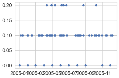
While you can plot data with pandas, it’s often easier to simply use matplotlib
directly as this gives you more control of your plots. Below you create a scatter
plot of the data using ax.scatter.
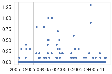
# Plot the data using native matplotlib
f, ax = plt.subplots()
ax.scatter(x=precip_2005_clean.index.values,
           y=precip_2005_clean["HPCP"])
plt.show()
Resample Time Series Data
Resampling time series data refers to the act of summarizing data over different time periods. For example, above you have been working with hourly data. However, you may want to plot data summarized by day.
You can resample time series data in Pandas using the resample()
method. Within that method you call the time frequency for which
you want to resample. Examples including day ("D") or week ("w").
When you resample data, you need to also tell Python how you wish to summarize the data for that time period. For example do you want to summarize or add all all values for each day?
precip_2005_clean.resample("D").sum()
or do you want a max value:
precip_2005_clean.resample("D").max()
Below you resample the 2005 data subset that you created above, and then you plot it. Resampling is discussed in more detail later in this chapter.
precip_2005_daily = precip_2005_clean.resample("D").sum()
# Plot the data using native matplotlib
f, ax = plt.subplots()
ax.scatter(x=precip_2005_daily.index.values,
           y=precip_2005_daily["HPCP"])
plt.show()
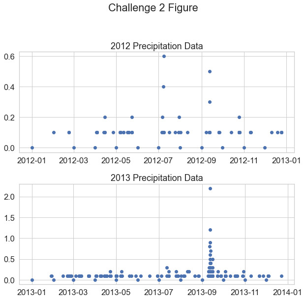
Challenge 2: Plot Multiple Axes
If you recall from previous lessons, you can create a figure with multiple subplots using:
f, (ax1, ax2) = plot.subplots(2,1)
In the cell below, do the following
- Create a variable that contains precipitation data from 2012 and a second variable that contains data from 2013.
- Plot each variable on a subplot within a matplotlib figure. The 2012 data should be on the top of your figure and the 2013 data should be on the bottom.
Then answer the following questions:
- In which year 2012 or 2013 do you see the highest hourly precipitation value(s)?
- What is the max hourly precipitation value for each year? HINT:
data-frame.max()should help you answer this question.
Customize your plots with x and y axis labels and titles.
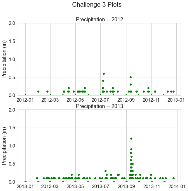
Challenge 3: Modify Plot x and y Limits
Have a look at the min and max values in your plots above. Do you notice anything about the y-axis that may make the data look similar when in reality one year has much higher values compared to the other?
Recreate the same plot that you made above. However, this time set the y limits of each plot to span from 0 to 2.
ax1.set(ylim=[0, 2])
Customize your plot by changing the colors.
Add your plot code to the cell below.
Challenge 4: Data Subsets
Above you subset the data by year and plotted two years in the same figure. You can also create temporal subsets using dates to create subsets that span across specific dates of the year - like this:
data_frame_name['2005-05-01':'2005-06-31']
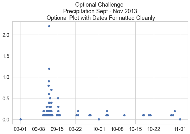
In the cell below create a scatter plot of your precipitation data. Subset the data to the date range September 1, 2013 (2013-09-01) to November 1, 2013 (2013-11-01).
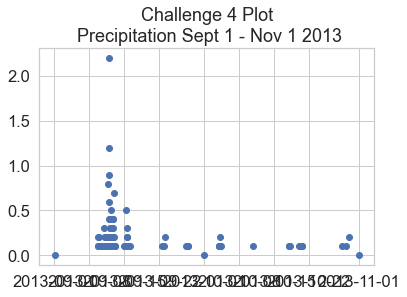
Bonus Challenge: Formatting Dates on the X-Axis
You may have noticed the dates look a little messy on the x-axis. Remake the plot from above, but use this lesson on customizing the format of time ticks on the x-axis of a plot to adjust the x-axis to be more legible.
from matplotlib.dates import DateFormatter

# Place your code to plot your data here
flood_data = boulder_precip_2003_2013['2013-09-01':'2013-11-01']

f, ax = plt.subplots(figsize=(10, 6))

ax.scatter(x=flood_data.index.values,
           y=flood_data["HPCP"])

# Define the date format
date_form = DateFormatter("%m-%d")
ax.xaxis.set_major_formatter(date_form)
ax.set(title="Optional Challenge \n Precipitation Sept - Nov 2013 \n Optional Plot with Dates Formatted Cleanly")
plt.show()
Summary
This lesson provides a high level overview of working with dates using Pandas in Python. The rest of this chapter will dive into more detail surrounding working with dates, subsettings and also customizing date time labels on plots.
Share on
Twitter Facebook Google+ LinkedIn
Leave a Comment