Lesson 1. Learn to Use NAIP Multiband Remote Sensing Images in Python
Learn How to Work With NAIP Multispectral Remote Sensing Data in Python - Intermediate earth data science textbook course module
Welcome to the first lesson in the Learn How to Work With NAIP Multispectral Remote Sensing Data in Python module. Learn how to work with NAIP multi-band raster data stored in .tif format in Python using RasterioChapter Eight - NAIP Data In Python
In this chapter, you will learn how to work with NAIP multi-band raster data stored in .tif format in Python using rasterio.
Learning Objectives
After completing this chapter, you will be able to:
- Open an RGB image with 3-4 bands in Python using rioxarray.
- Identify the number of bands stored in a multi-band raster in Python.
- Plot various band composites in Python including True Color (RGB), and Color Infrared (CIR) color images.
What You Need
You will need a computer with internet access to complete this chapter and the Cold Springs Fire data.
Download Cold Springs Fire Data (~150 MB)
Or use earthpy
et.data.get_data('cold-springs-fire')
What is NAIP?
In this chapter, you will work with NAIP data.
The National Agriculture Imagery Program (NAIP) acquires aerial imagery during the agricultural growing seasons in the continental U.S. A primary goal of the NAIP program is to make digital ortho photography available to governmental agencies and the public within a year of acquisition.
NAIP is administered by the USDA’s Farm Service Agency (FSA) through the Aerial Photography Field Office in Salt Lake City. This “leaf-on” imagery is used as a base layer for GIS programs in FSA’s County Service Centers, and is used to maintain the Common Land Unit (CLU) boundaries. – USDA NAIP Program
NAIP is a great source of high resolution imagery across the United States. NAIP imagery is often collected with just a red, green and Blue band. However, some flights include a near infrared band which is very useful for quantifying vegetation cover and health.
NAIP data access: The data used in this lesson were downloaded from the USGS Earth explorer website.
Open NAIP Data in Python
Next, you will use NAIP imagery for the Coldsprings fire study area in
Colorado. To work with multi-band raster data you will use the rioxarray and geopandas
packages. You will also use the plot module from the earthpy package for raster plotting.
Before you get started, make sure that your working directory is set.
import os

import matplotlib.pyplot as plt
import numpy as np
import rioxarray as rxr
import geopandas as gpd
import earthpy as et
import earthpy.plot as ep
import earthpy.spatial as es

# Get the data
data = et.data.get_data('cold-springs-fire')

# Set working directory
os.chdir(os.path.join(et.io.HOME, 'earth-analytics', 'data'))

plt.rcParams['figure.figsize'] = (10, 10)
plt.rcParams['axes.titlesize'] = 20
To begin, you will use the rioxarray open_rasterio function to open the multi-band NAIP image
rxr.open_rasterio("path-to-tif-file-here")
Don’t forget that with rioxarray you can automatically mask out the fill values of a raster with the argument masked=True in open_rasterio.
naip_csf_path = os.path.join("cold-springs-fire",
                             "naip",
                             "m_3910505_nw_13_1_20150919",
                             "crop",
                             "m_3910505_nw_13_1_20150919_crop.tif")

naip_csf = rxr.open_rasterio(naip_csf_path, masked=True)
naip_csf
<xarray.DataArray (band: 4, y: 2312, x: 4377)>
[40478496 values with dtype=float64]
Coordinates:
  * band         (band) int64 1 2 3 4
  * y            (y) float64 4.427e+06 4.427e+06 ... 4.425e+06 4.425e+06
  * x            (x) float64 4.572e+05 4.572e+05 ... 4.615e+05 4.615e+05
    spatial_ref  int64 0
Attributes:
    STATISTICS_MAXIMUM:  239
    STATISTICS_MEAN:     nan
    STATISTICS_MINIMUM:  32
    STATISTICS_STDDEV:   nan
    scale_factor:        1.0
    add_offset:          0.0
grid_mapping: spatial_ref- band: 4
- y: 2312
- x: 4377
- ...
[40478496 values with dtype=float64]
- band(band)int641 2 3 4
array([1, 2, 3, 4])
- y(y)float644.427e+06 4.427e+06 ... 4.425e+06
array([4426951.5, 4426950.5, 4426949.5, ..., 4424642.5, 4424641.5, 4424640.5])
- x(x)float644.572e+05 4.572e+05 ... 4.615e+05
array([457163.5, 457164.5, 457165.5, ..., 461537.5, 461538.5, 461539.5])
- spatial_ref()int640
- crs_wkt :
- BOUNDCRS[SOURCECRS[PROJCRS["UTM Zone 13, Northern Hemisphere",BASEGEOGCRS["GRS 1980(IUGG, 1980)",DATUM["unknown",ELLIPSOID["GRS80",6378137,298.257222101,LENGTHUNIT["metre",1,ID["EPSG",9001]]]],PRIMEM["Greenwich",0,ANGLEUNIT["degree",0.0174532925199433,ID["EPSG",9122]]]],CONVERSION["UTM zone 13N",METHOD["Transverse Mercator",ID["EPSG",9807]],PARAMETER["Latitude of natural origin",0,ANGLEUNIT["degree",0.0174532925199433],ID["EPSG",8801]],PARAMETER["Longitude of natural origin",-105,ANGLEUNIT["degree",0.0174532925199433],ID["EPSG",8802]],PARAMETER["Scale factor at natural origin",0.9996,SCALEUNIT["unity",1],ID["EPSG",8805]],PARAMETER["False easting",500000,LENGTHUNIT["metre",1],ID["EPSG",8806]],PARAMETER["False northing",0,LENGTHUNIT["metre",1],ID["EPSG",8807]],ID["EPSG",16013]],CS[Cartesian,2],AXIS["easting",east,ORDER[1],LENGTHUNIT["metre",1,ID["EPSG",9001]]],AXIS["northing",north,ORDER[2],LENGTHUNIT["metre",1,ID["EPSG",9001]]]]],TARGETCRS[GEOGCRS["WGS 84",DATUM["World Geodetic System 1984",ELLIPSOID["WGS 84",6378137,298.257223563,LENGTHUNIT["metre",1]]],PRIMEM["Greenwich",0,ANGLEUNIT["degree",0.0174532925199433]],CS[ellipsoidal,2],AXIS["latitude",north,ORDER[1],ANGLEUNIT["degree",0.0174532925199433]],AXIS["longitude",east,ORDER[2],ANGLEUNIT["degree",0.0174532925199433]],ID["EPSG",4326]]],ABRIDGEDTRANSFORMATION["Transformation from GRS 1980(IUGG, 1980) to WGS84",METHOD["Position Vector transformation (geog2D domain)",ID["EPSG",9606]],PARAMETER["X-axis translation",0,ID["EPSG",8605]],PARAMETER["Y-axis translation",0,ID["EPSG",8606]],PARAMETER["Z-axis translation",0,ID["EPSG",8607]],PARAMETER["X-axis rotation",0,ID["EPSG",8608]],PARAMETER["Y-axis rotation",0,ID["EPSG",8609]],PARAMETER["Z-axis rotation",0,ID["EPSG",8610]],PARAMETER["Scale difference",1,ID["EPSG",8611]]]]
- semi_major_axis :
- 6378137.0
- semi_minor_axis :
- 6356752.314140356
- inverse_flattening :
- 298.257222101
- reference_ellipsoid_name :
- GRS80
- longitude_of_prime_meridian :
- 0.0
- prime_meridian_name :
- Greenwich
- geographic_crs_name :
- GRS 1980(IUGG, 1980)
- horizontal_datum_name :
- unknown
- projected_crs_name :
- UTM Zone 13, Northern Hemisphere
- grid_mapping_name :
- transverse_mercator
- latitude_of_projection_origin :
- 0.0
- longitude_of_central_meridian :
- -105.0
- false_easting :
- 500000.0
- false_northing :
- 0.0
- scale_factor_at_central_meridian :
- 0.9996
- towgs84 :
- [0.0, 0.0, 0.0, 0.0, 0.0, 0.0, 0.0]
- spatial_ref :
- BOUNDCRS[SOURCECRS[PROJCRS["UTM Zone 13, Northern Hemisphere",BASEGEOGCRS["GRS 1980(IUGG, 1980)",DATUM["unknown",ELLIPSOID["GRS80",6378137,298.257222101,LENGTHUNIT["metre",1,ID["EPSG",9001]]]],PRIMEM["Greenwich",0,ANGLEUNIT["degree",0.0174532925199433,ID["EPSG",9122]]]],CONVERSION["UTM zone 13N",METHOD["Transverse Mercator",ID["EPSG",9807]],PARAMETER["Latitude of natural origin",0,ANGLEUNIT["degree",0.0174532925199433],ID["EPSG",8801]],PARAMETER["Longitude of natural origin",-105,ANGLEUNIT["degree",0.0174532925199433],ID["EPSG",8802]],PARAMETER["Scale factor at natural origin",0.9996,SCALEUNIT["unity",1],ID["EPSG",8805]],PARAMETER["False easting",500000,LENGTHUNIT["metre",1],ID["EPSG",8806]],PARAMETER["False northing",0,LENGTHUNIT["metre",1],ID["EPSG",8807]],ID["EPSG",16013]],CS[Cartesian,2],AXIS["easting",east,ORDER[1],LENGTHUNIT["metre",1,ID["EPSG",9001]]],AXIS["northing",north,ORDER[2],LENGTHUNIT["metre",1,ID["EPSG",9001]]]]],TARGETCRS[GEOGCRS["WGS 84",DATUM["World Geodetic System 1984",ELLIPSOID["WGS 84",6378137,298.257223563,LENGTHUNIT["metre",1]]],PRIMEM["Greenwich",0,ANGLEUNIT["degree",0.0174532925199433]],CS[ellipsoidal,2],AXIS["latitude",north,ORDER[1],ANGLEUNIT["degree",0.0174532925199433]],AXIS["longitude",east,ORDER[2],ANGLEUNIT["degree",0.0174532925199433]],ID["EPSG",4326]]],ABRIDGEDTRANSFORMATION["Transformation from GRS 1980(IUGG, 1980) to WGS84",METHOD["Position Vector transformation (geog2D domain)",ID["EPSG",9606]],PARAMETER["X-axis translation",0,ID["EPSG",8605]],PARAMETER["Y-axis translation",0,ID["EPSG",8606]],PARAMETER["Z-axis translation",0,ID["EPSG",8607]],PARAMETER["X-axis rotation",0,ID["EPSG",8608]],PARAMETER["Y-axis rotation",0,ID["EPSG",8609]],PARAMETER["Z-axis rotation",0,ID["EPSG",8610]],PARAMETER["Scale difference",1,ID["EPSG",8611]]]]
- GeoTransform :
- 457163.0 1.0 0.0 4426952.0 0.0 -1.0
array(0)
- STATISTICS_MAXIMUM :
- 239
- STATISTICS_MEAN :
- nan
- STATISTICS_MINIMUM :
- 32
- STATISTICS_STDDEV :
- nan
- scale_factor :
- 1.0
- add_offset :
- 0.0
- grid_mapping :
- spatial_ref
Above you imported a geotiff like you’ve done before. But this file is different. Notice the shape of the resulting numpy array. How many layers (known as bands) does it have?
naip_csf.shape
(4, 2312, 4377)
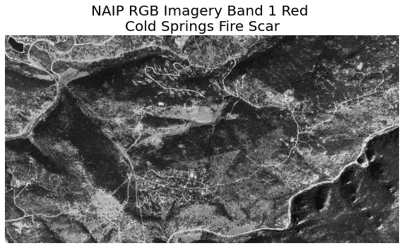
Just like you’ve done before, you can plot a single band in the NAIP raster using imshow(). However, now that you have multiple layers or bands, you need to tell imshow() what layer you wish to plot. Use arrayname[0] to plot the first band of the image.
fig, ax = plt.subplots()

ax.imshow(naip_csf[0],
          cmap="Greys_r")
ax.set_title("NAIP RGB Imagery Band 1 Red \nCold Springs Fire Scar")
ax.set_axis_off()
plt.show()
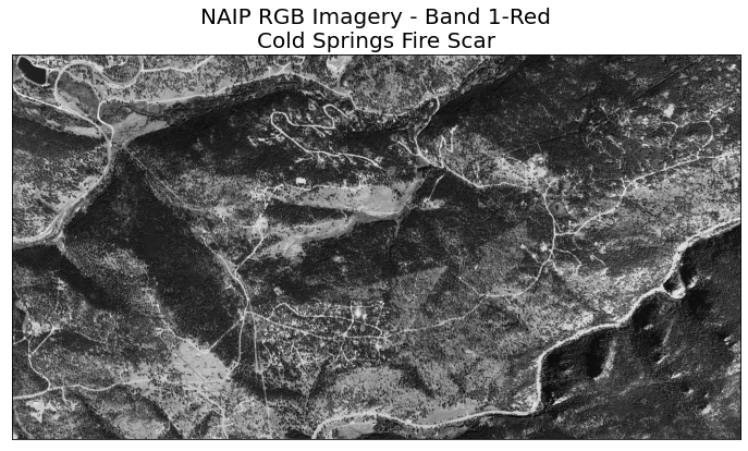
Or you can use the earthpy function plot_bands(). Note that in this lesson, you will first be shown how to use earthpy to plot multiband rasters. The earthpy package was developed to make it easier to work with spatial data in Python.
ep.plot_bands(naip_csf[0],
              title="NAIP RGB Imagery - Band 1-Red\nCold Springs Fire Scar",
              cbar=False)
plt.show()
Look closely at the .band element of your raster. Note that now, there are four bands instead of one. This is because you have multiple bands in your raster, one for each ‘color’ or type of light collected by the camera. For NAIP data you have red, green, blue and near infrared bands. When you worked with the lidar rasters in week 2 your count was 1 as a DSM or DTM is only composed of one band.
naip_csf.band
<xarray.DataArray 'band' (band: 4)>
array([1, 2, 3, 4])
Coordinates:
  * band         (band) int64 1 2 3 4
spatial_ref int64 0- band: 4
- 1 2 3 4
array([1, 2, 3, 4])
- band(band)int641 2 3 4
array([1, 2, 3, 4])
- spatial_ref()int640
- crs_wkt :
- BOUNDCRS[SOURCECRS[PROJCRS["UTM Zone 13, Northern Hemisphere",BASEGEOGCRS["GRS 1980(IUGG, 1980)",DATUM["unknown",ELLIPSOID["GRS80",6378137,298.257222101,LENGTHUNIT["metre",1,ID["EPSG",9001]]]],PRIMEM["Greenwich",0,ANGLEUNIT["degree",0.0174532925199433,ID["EPSG",9122]]]],CONVERSION["UTM zone 13N",METHOD["Transverse Mercator",ID["EPSG",9807]],PARAMETER["Latitude of natural origin",0,ANGLEUNIT["degree",0.0174532925199433],ID["EPSG",8801]],PARAMETER["Longitude of natural origin",-105,ANGLEUNIT["degree",0.0174532925199433],ID["EPSG",8802]],PARAMETER["Scale factor at natural origin",0.9996,SCALEUNIT["unity",1],ID["EPSG",8805]],PARAMETER["False easting",500000,LENGTHUNIT["metre",1],ID["EPSG",8806]],PARAMETER["False northing",0,LENGTHUNIT["metre",1],ID["EPSG",8807]],ID["EPSG",16013]],CS[Cartesian,2],AXIS["easting",east,ORDER[1],LENGTHUNIT["metre",1,ID["EPSG",9001]]],AXIS["northing",north,ORDER[2],LENGTHUNIT["metre",1,ID["EPSG",9001]]]]],TARGETCRS[GEOGCRS["WGS 84",DATUM["World Geodetic System 1984",ELLIPSOID["WGS 84",6378137,298.257223563,LENGTHUNIT["metre",1]]],PRIMEM["Greenwich",0,ANGLEUNIT["degree",0.0174532925199433]],CS[ellipsoidal,2],AXIS["latitude",north,ORDER[1],ANGLEUNIT["degree",0.0174532925199433]],AXIS["longitude",east,ORDER[2],ANGLEUNIT["degree",0.0174532925199433]],ID["EPSG",4326]]],ABRIDGEDTRANSFORMATION["Transformation from GRS 1980(IUGG, 1980) to WGS84",METHOD["Position Vector transformation (geog2D domain)",ID["EPSG",9606]],PARAMETER["X-axis translation",0,ID["EPSG",8605]],PARAMETER["Y-axis translation",0,ID["EPSG",8606]],PARAMETER["Z-axis translation",0,ID["EPSG",8607]],PARAMETER["X-axis rotation",0,ID["EPSG",8608]],PARAMETER["Y-axis rotation",0,ID["EPSG",8609]],PARAMETER["Z-axis rotation",0,ID["EPSG",8610]],PARAMETER["Scale difference",1,ID["EPSG",8611]]]]
- semi_major_axis :
- 6378137.0
- semi_minor_axis :
- 6356752.314140356
- inverse_flattening :
- 298.257222101
- reference_ellipsoid_name :
- GRS80
- longitude_of_prime_meridian :
- 0.0
- prime_meridian_name :
- Greenwich
- geographic_crs_name :
- GRS 1980(IUGG, 1980)
- horizontal_datum_name :
- unknown
- projected_crs_name :
- UTM Zone 13, Northern Hemisphere
- grid_mapping_name :
- transverse_mercator
- latitude_of_projection_origin :
- 0.0
- longitude_of_central_meridian :
- -105.0
- false_easting :
- 500000.0
- false_northing :
- 0.0
- scale_factor_at_central_meridian :
- 0.9996
- towgs84 :
- [0.0, 0.0, 0.0, 0.0, 0.0, 0.0, 0.0]
- spatial_ref :
- BOUNDCRS[SOURCECRS[PROJCRS["UTM Zone 13, Northern Hemisphere",BASEGEOGCRS["GRS 1980(IUGG, 1980)",DATUM["unknown",ELLIPSOID["GRS80",6378137,298.257222101,LENGTHUNIT["metre",1,ID["EPSG",9001]]]],PRIMEM["Greenwich",0,ANGLEUNIT["degree",0.0174532925199433,ID["EPSG",9122]]]],CONVERSION["UTM zone 13N",METHOD["Transverse Mercator",ID["EPSG",9807]],PARAMETER["Latitude of natural origin",0,ANGLEUNIT["degree",0.0174532925199433],ID["EPSG",8801]],PARAMETER["Longitude of natural origin",-105,ANGLEUNIT["degree",0.0174532925199433],ID["EPSG",8802]],PARAMETER["Scale factor at natural origin",0.9996,SCALEUNIT["unity",1],ID["EPSG",8805]],PARAMETER["False easting",500000,LENGTHUNIT["metre",1],ID["EPSG",8806]],PARAMETER["False northing",0,LENGTHUNIT["metre",1],ID["EPSG",8807]],ID["EPSG",16013]],CS[Cartesian,2],AXIS["easting",east,ORDER[1],LENGTHUNIT["metre",1,ID["EPSG",9001]]],AXIS["northing",north,ORDER[2],LENGTHUNIT["metre",1,ID["EPSG",9001]]]]],TARGETCRS[GEOGCRS["WGS 84",DATUM["World Geodetic System 1984",ELLIPSOID["WGS 84",6378137,298.257223563,LENGTHUNIT["metre",1]]],PRIMEM["Greenwich",0,ANGLEUNIT["degree",0.0174532925199433]],CS[ellipsoidal,2],AXIS["latitude",north,ORDER[1],ANGLEUNIT["degree",0.0174532925199433]],AXIS["longitude",east,ORDER[2],ANGLEUNIT["degree",0.0174532925199433]],ID["EPSG",4326]]],ABRIDGEDTRANSFORMATION["Transformation from GRS 1980(IUGG, 1980) to WGS84",METHOD["Position Vector transformation (geog2D domain)",ID["EPSG",9606]],PARAMETER["X-axis translation",0,ID["EPSG",8605]],PARAMETER["Y-axis translation",0,ID["EPSG",8606]],PARAMETER["Z-axis translation",0,ID["EPSG",8607]],PARAMETER["X-axis rotation",0,ID["EPSG",8608]],PARAMETER["Y-axis rotation",0,ID["EPSG",8609]],PARAMETER["Z-axis rotation",0,ID["EPSG",8610]],PARAMETER["Scale difference",1,ID["EPSG",8611]]]]
- GeoTransform :
- 457163.0 1.0 0.0 4426952.0 0.0 -1.0
array(0)
Data Tip: Remember that a tiff can store 1 or more bands. It’s unusual to find tif files with more than 4 bands.
Image Raster Data Values
Next, examine the raster’s min and max values. What is the value range?
# View min and max value
print(naip_csf.min())
print(naip_csf.max())
<xarray.DataArray ()>
array(17.)
Coordinates:
    spatial_ref  int64 0
<xarray.DataArray ()>
array(242.)
Coordinates:
    spatial_ref  int64 0
This raster contains values between 0 and 255. These values represent degrees of brightness associated with the image band. In the case of a RGB image (red, green and blue), band 1 is the red band. When we plot the red band, larger numbers (towards 255) represent pixels with more red in them (a strong red reflection). Smaller numbers (towards 0) represent pixels with less red in them (less red was reflected).
To plot an RGB image, we mix red + green + blue values, using the ratio of each. The ratio of each color is determined by how much light was recorded (the reflectance value) in each band. This mixture creates one single color that, in turn, makes up the full color image - similar to the color image that your camera phone creates.
8 vs 16 Bit Images
It’s important to note that this image is an 8 bit image. This means that all values in the raster are stored within a range of 0:255. This differs from a 16-bit image, in which values can be stored within a range of 0:65,535.
In these lessons, you will work with 8-bit images. For 8-bit images, the brightest whites will be at or close to 255. The darkest values in each band will be closer to 0.
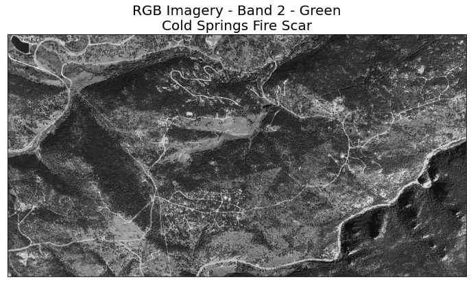
Plot A Specific Band
You can plot a single band of your choice using numpy indexing. naip_csf[1] will access just the second band - which is the green band when using NAIP data.
# Plot band 2 - green
ep.plot_bands(naip_csf[1],
              title="RGB Imagery - Band 2 - Green\nCold Springs Fire Scar",
              cbar=False)
plt.show()
Rasters and Numpy Arrays - A Review
Remember that when you import a raster dataset into Python, the data are converted to an xarray object. A numpy array has no inherent spatial information attached to it, nor does an xarray object. The data are just a matrix of values. This makes processing the data fast.
The spatial information for the raster is stored in a .rio attribute which is available if you import
rioxarray in your workflow. This rio attribute allows you to export the data as a geotiff or other spatial format.
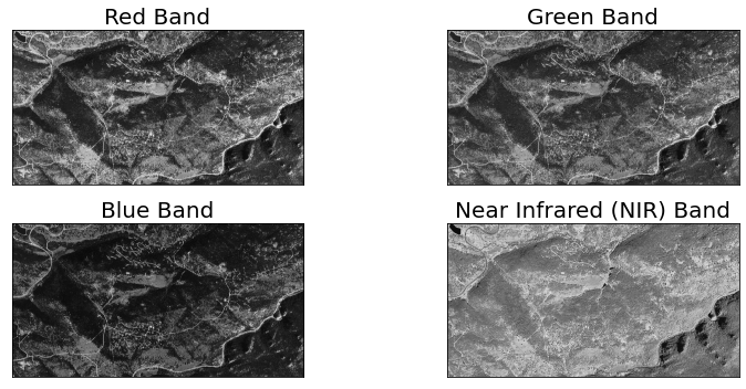
Plot Raster Band Images
Next plot each band in the raster. This is another intermediate step (like plotting histograms) that you might want to do when you first explore and open your data. You will not need this for your homework but you might want to do it to explore other data that you use in your career. Earthpy contains a plot_bands() function that allows you to quickly plot each band individually.
Similar to plotting a single band, in each band “color”, the brightest pixels are lighter in color or white representing a stronger reflectance for that color on that pixel. The darkest pixels are darker to black in color representing less reflectance of that color in that pixel.
Plot Bands Using Earthpy
You can use the earthpy package to plot a single or all bands in your array. To use earthpy call:
ep.plot_bands()
plot_bands() takes several key agruments including:
arr: an n-dimensional numpy array to plot.figsize: a tuple of 2 values representing the x and y dimensions of the image.cols: if you are plotting more than one band you can specify the number of columns in the grid that you’d like to plot.title: OPTIONAL - A single title for one band or a list of x titles for x bands in your array.cbar: OPTIONAL -ep.plot_bands()by default will add a colorbar to each plot it creates. You can turn the colobar off by setting this argument to false.
titles = ["Red Band", "Green Band", "Blue Band", "Near Infrared (NIR) Band"]

# Plot all bands using the earthpy function
ep.plot_bands(naip_csf,
              figsize=(12, 5),
              cols=2,
              title=titles,
              cbar=False)
plt.show()
Plot RGB Data in Python
Previously you have plotted individual bands using a greyscale color ramp in Python. Next, you will learn how to plot an RGB composite image. This type of image is similar in appearance to one you capture using a cell phone or digital camera.
You can use the Earthpy function called plot_rgb() to quickly plot 3 band composite images.
This function has several key arguments including
arr: a numpy array in rasterio band order (bands first)rgb: the three bands that you wish to plot on the red, green and blue channels respectivelytitle: OPTIONAL - if you want to add a title to your plot.
Similar to plotting with geopandas, you can provide an ax= argument as well to plot your data on a particular matplotlib axis.
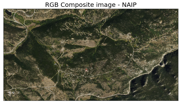
ep.plot_rgb(naip_csf.values,
            rgb=[0, 1, 2],
            title="RGB Composite image - NAIP")
plt.show()
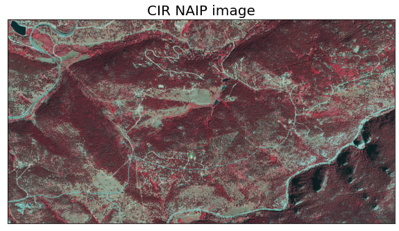
Optionally, you can also provide the bands that you wish to plot, the title and the figure size.
ep.plot_rgb(naip_csf.values, title="CIR NAIP image",
            rgb=[3, 0, 1],
            figsize=(10, 8))
plt.show()
Optional Challenge: Making Sense of Single Band Images
Plot all of the bands in the NAIP image using python, following the code examples above. Compare grayscale plots of band 1 (red), band 2 (green) and band 4 (near infrared). Is the forested area darker or lighter in band 2 (the green band) compared to band 1 (the red band)?
titles = ['red', 'green', 'near\ninfrared']
ep.plot_bands(naip_csf[[0, 1, 3]],
              figsize=(10,  7),
              title=titles,
              cbar=False)
plt.show()
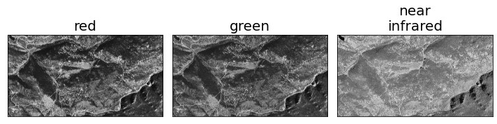
Image Stretch To Increase Contrast
The image above looks pretty good. You can explore whether applying a stretch to the image improves clarity and contrast.
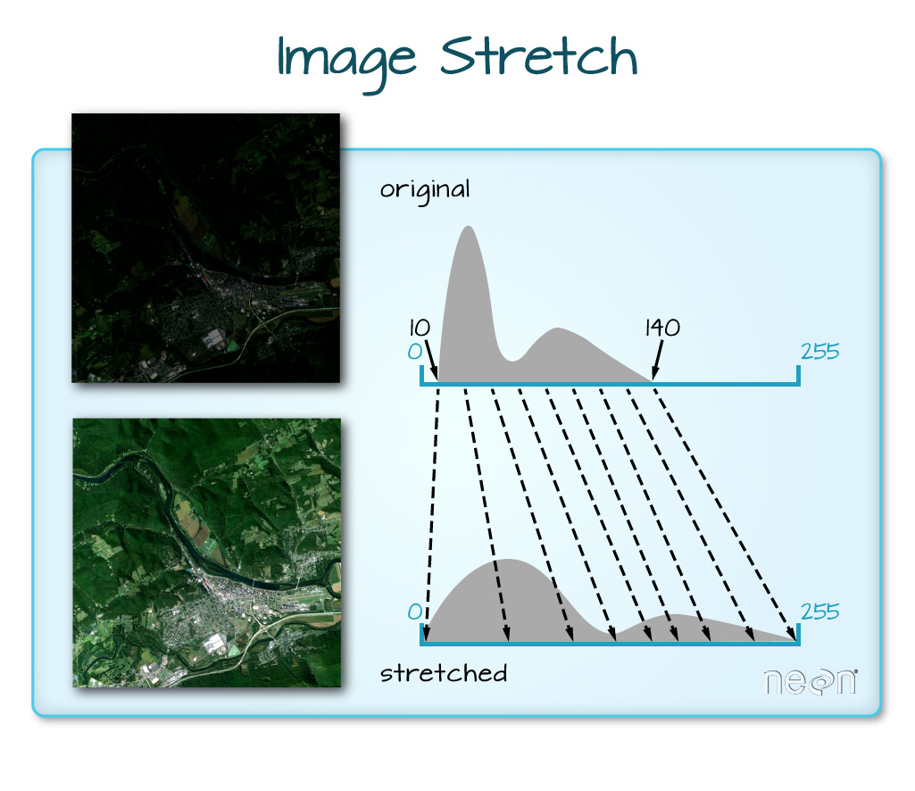
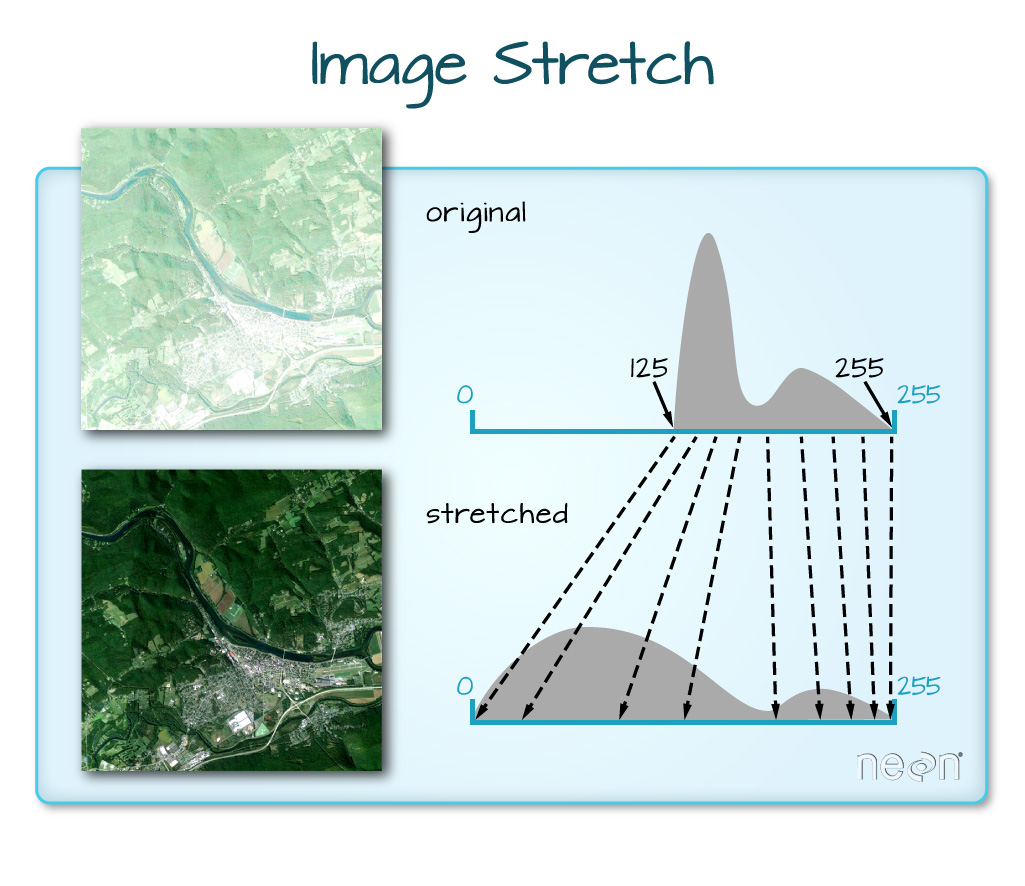
Below you use the skimage package to contrast stretch each band in your data to make the whites more bright and the blacks more dark.
In the example below you only stretch bands 0,1 and 2 which are the RGB bands. To begin,
- preallocate an array of zeros that is the same shape as your numpy array.
- then look through each band in the image and rescale it.
Data Tip: Read more about image stretch on the scikit-image website.
For convenience we have also built a stretch feature into earthpy. You can call it using the stretch argument.
band_indices = [0, 1, 2]

# Apply stretch using the earthpy plot_rgb function
ep.plot_rgb(naip_csf.values,
            rgb=band_indices,
            title="RGB NAIP image\n Stretch Applied",
            figsize=(10, 8),
            stretch=True)
plt.show()
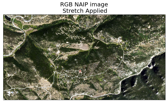
What does the image look like using a different stretch? Any better? worse?
In this case, the stretch does increase the contrast in our image. However visually it may or may not be what you want to plot.
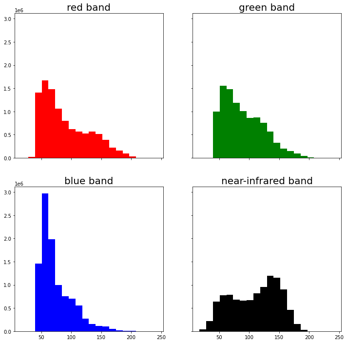
Multiband Raster Histograms
Just like you did with single band rasters, you can view a histogram of each band in your data using matplotlib. Below, you loop through each band or layer in the number array and plot the distribution of reflectance values.
You can use the ep.hist() function in earthpy to plot histograms for all bands in your raster. hist() accepts several key arguments including
arr: a numpy array in rasterio band order (bands first)colors: a list of colors to use for each histogram.title: plot titles to use for each histogram.cols: the number of columns for the plot grid.
# Create a colors and titles list to use in the histogram, then plot
colors = ['r', 'g', 'b', 'k']
titles = ['red band', 'green band', 'blue band', 'near-infrared band']

ep.hist(naip_csf.values,
        colors=colors,
        title=titles,
        cols=2)

plt.show()
Share on
Twitter Facebook Google+ LinkedIn
Leave a Comment