Lesson 6. Plot Data and Customize Plots with ggplot Plots in R - Earth Analytics - Data Science for Scientists
In this tutorial, you will explore more advanced plotting techniques using ggplot2.
Learning Objectives
At the end of this activity, you will be able to:
- Use the
ggplot()plot function to create custom plots. - Add labels to x and y axes and a title to your
ggplot()plot. - Customize the colors and look of a
ggplot()plot.
What You Need
You need R and RStudio to complete this tutorial. Also you should have an earth-analytics directory set up on your computer with a /data directory within it.
In your week 1 homework, you used the quick plot function of ggplot2 to plot your data. In this tutorial, you’ll explore ggplot - which offers many more advanced plotting features.
Let’s explore the code below to create a quick plot.
# load the ggplot2 library for plotting
library(ggplot2)

# download data from figshare
# note that you already downloaded the data to your laptops previously
# but in case you don't have it - re-download it by uncommenting the code below.
# download.file("https://ndownloader.figshare.com/files/9282364",
#             "data/boulder-precip.csv",
#             method = "libcurl")

# import data
boulder_precip <- read.csv(file = "data/boulder-precip.csv")

# view first few rows of the data
head(boulder_precip)
##     X       DATE PRECIP
## 1 756 2013-08-21    0.1
## 2 757 2013-08-26    0.1
## 3 758 2013-08-27    0.1
## 4 759 2013-09-01    0.0
## 5 760 2013-09-09    0.1
## 6 761 2013-09-10    1.0

# when you download the data you create a dataframe
# view each column of the data frame using its name (or header)
boulder_precip$DATE
##  [1] "2013-08-21" "2013-08-26" "2013-08-27" "2013-09-01" "2013-09-09"
##  [6] "2013-09-10" "2013-09-11" "2013-09-12" "2013-09-13" "2013-09-15"
## [11] "2013-09-16" "2013-09-22" "2013-09-23" "2013-09-27" "2013-09-28"
## [16] "2013-10-01" "2013-10-04" "2013-10-11"

# view the precip column
boulder_precip$PRECIP
##  [1] 0.1 0.1 0.1 0.0 0.1 1.0 2.3 9.8 1.9 1.4 0.4 0.1 0.3 0.3 0.1 0.0 0.9
## [18] 0.1

# q plot stands for quick plot. Let's use it to plot your data
qplot(x = boulder_precip$DATE,
      y = boulder_precip$PRECIP)

Plot with ggplot2
ggplot2 is a plotting package that makes it simple to create complex plots from data in a data.frame. It uses default settings, which help to create publication quality plots with a minimal amount of settings and tweaking.
ggplot graphics are built step by step by adding new elements.
To build a ggplot() you need to:
- Bind the plot to a specific data frame using the
dataargument
ggplot(data = boulder_precip)
- Define aesthetics (
aes), by selecting the variables to be plotted and the variables to define the presentation such as plotting size, shape color, etc.,
ggplot(data = boulder_precip, aes(x = DATE, y = PRECIP))
- Add
geoms– graphical representation of the data in the plot (points, lines, bars). To add a geom to the plot use+operator:
ggplot(data = boulder_precip,  aes(x = DATE, y = PRECIP)) +
  geom_point()
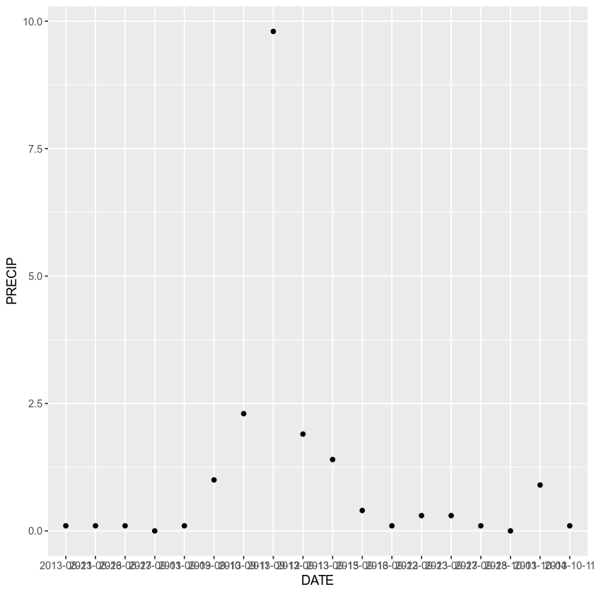
The + in the ggplot2 package is particularly useful because it allows you to modify existing ggplot objects. This means you can easily set up plot “templates” and conveniently explore different types of plots, so the above plot can also be generated with code like this:
# Create the plot object (nothing will render on your screen)
precip_plot <-  ggplot(data = boulder_precip,  aes(x = DATE, y = PRECIP))

# Draw the plot
precip_plot + geom_point()
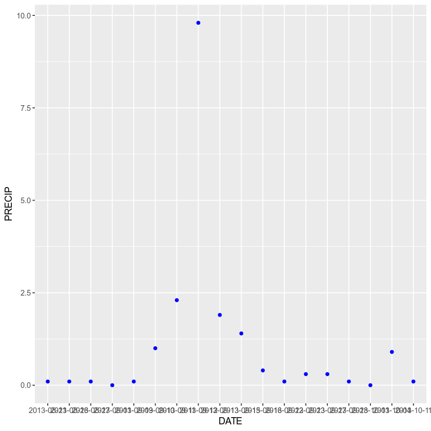
You can also apply a color to your points
ggplot(data = boulder_precip,  aes(x = DATE, y = PRECIP)) +
    geom_point(color = "blue")
And adjust the transparency
ggplot(data = boulder_precip,  aes(x = DATE, y = PRECIP)) +
    geom_point(alpha = .5, color = "blue")

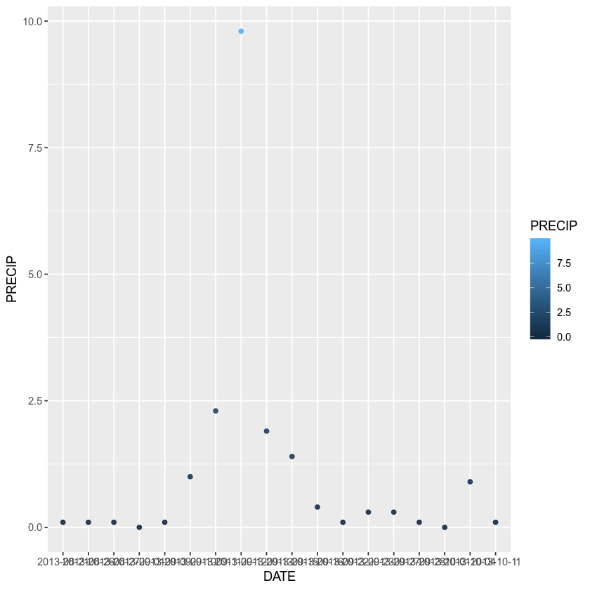
Or to color each value in the plot differently
ggplot(data = boulder_precip,  aes(x = DATE, y = PRECIP)) +
    geom_point(alpha = 0.9, aes(color = PRECIP))
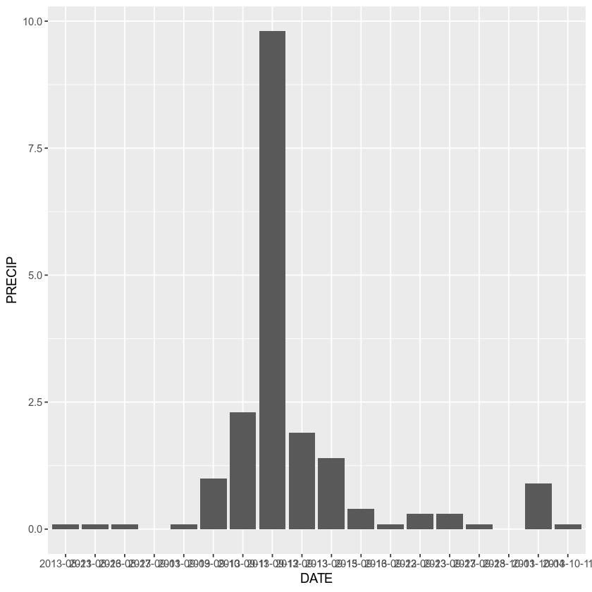
You can turn your plot into a bar plot
ggplot(data = boulder_precip,  aes(x = DATE, y = PRECIP)) +
    geom_bar(stat = "identity")
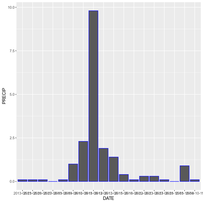
Turn the bar outlines blue
ggplot(data = boulder_precip,  aes(x = DATE, y = PRECIP)) +
    geom_bar(stat = "identity", color = "blue")
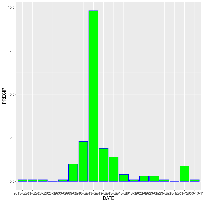
Or change the fill to bright green
ggplot(data = boulder_precip,  aes(x = DATE, y = PRECIP)) +
    geom_bar(stat = "identity", color = "blue", fill = "green")
Add Plot Labels
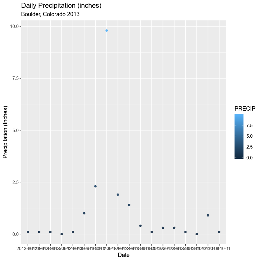
You can add labels to your plots as well. Let’s add a title, and x and y labels using the glab() argument.
ggplot(data = boulder_precip,  aes(x = DATE, y = PRECIP)) +
    geom_point(alpha = 0.9, aes(color = PRECIP)) +
    labs(x = "Date",
      y = "Precipitation (Inches)",
      title = "Daily Precipitation (inches)",
      subtitle = "Boulder, Colorado 2013")
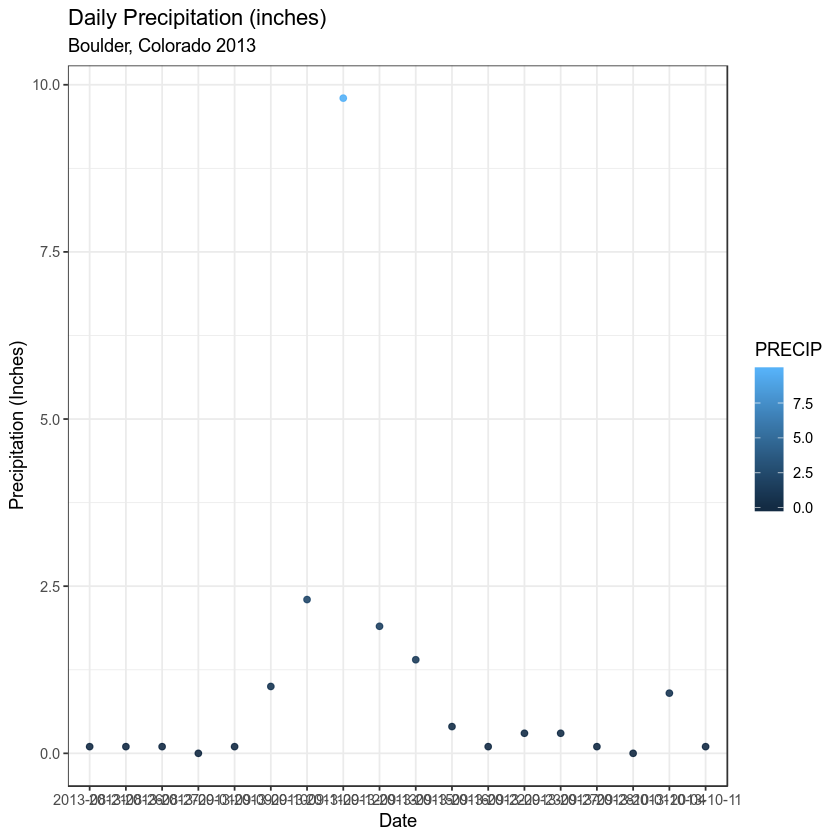
Finally, Explore Using Themes
ggplot(data = boulder_precip,  aes(x = DATE, y = PRECIP)) +
    geom_point(alpha = 0.9, aes(color = PRECIP)) +
    labs(x = "Date",
      y = "Precipitation (Inches)",
      title = "Daily Precipitation (inches)",
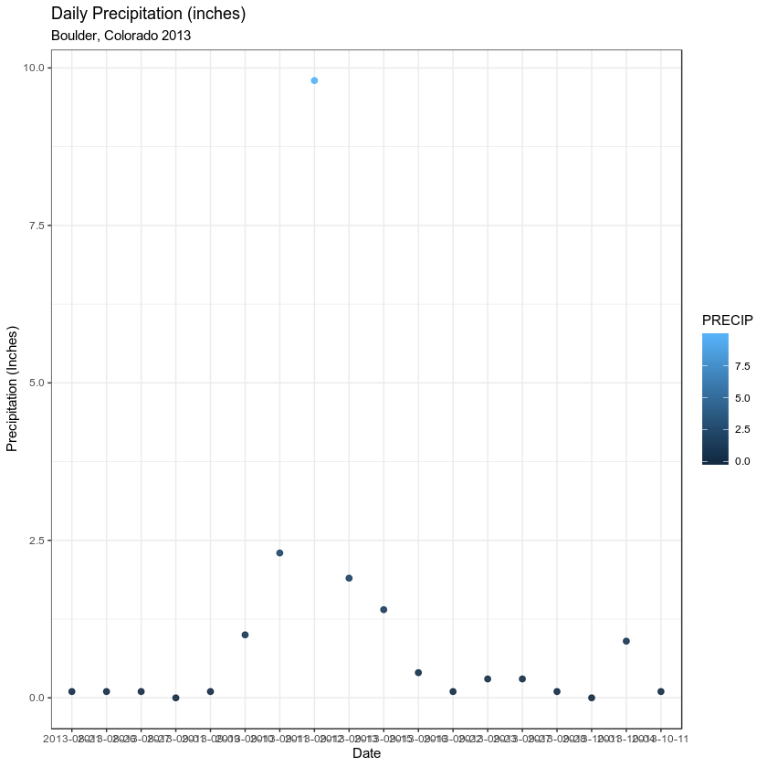
      subtitle = "Boulder, Colorado 2013") + theme_bw()
Make font size for all labels larger by setting the base size!
ggplot(data = boulder_precip,  aes(x = DATE, y = PRECIP)) +
    geom_point(alpha = 0.9, aes(color = PRECIP)) +
    labs(x = "Date",
      y = "Precipitation (Inches)",
      title = "Daily Precipitation (inches)",
      subtitle = "Boulder, Colorado 2013") + theme_bw(base_size = 9)
More on Customizing Your Plots
There are many different tutorials out there on customizing ggplot plots. A few are listed below.
Optional Challenge
Customize the plot that you created in last weeks homework as follows:
- Change the colors of the plot
- Plot the data using points
geom_point()AND barsgeom_bar() - Add a title to your plot and x and y axis labels.
Share on
Twitter Facebook Google+ LinkedIn
Leave a Comment