Lesson 2. Open, Plot and Explore Raster Data with Python and Xarray
Learning Objectives
- Open, plot, and explore raster data using Python.
- Handle no data values in raster data.
- Create plotting extents so you can plot raster and vector data together using matplotlib.
- Explore raster data using histograms and descriptive statistics.
Open Raster Data in Open Source Python
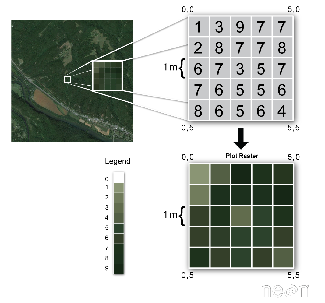
Remember from the previous lesson that raster or “gridded” data are stored as a grid of values which are rendered on a map as pixels. Each pixel value represents an area on the Earth’s surface. A raster file is composed of regular grid of cells, all of which are the same size. Raster data can be used to store many different types of scientific data including
- elevation data
- canopy height models
- surface temperature
- climate model data outputs
- landuse / landcover data
- and more.
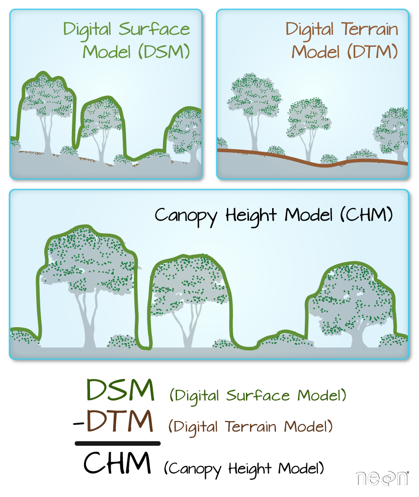
In this lesson you will learn more about working with lidar derived raster data that represents both terrain / elevation data (elevation of the earth’s surface), and surface elevation (elevation at the tops of trees, buildings etc above the earth’s surface). If you want to read more about how lidar data are used to derive raster based surface models, you can check out this chapter on lidar remote sensing data and the various raster data products derived from lidar data.
Data Tip: The data used in this lesson are NEON (National Ecological Observatory Network) data.
To begin load the packages that you need to process your raster data.
# Import necessary packages
import os

import numpy as np
import matplotlib.pyplot as plt
import seaborn as sns
# Use geopandas for vector data and xarray for raster data
import geopandas as gpd
import rioxarray as rxr

import earthpy as et

# Prettier plotting with seaborn
sns.set(font_scale=1.5, style="white")
# Get data and set working directory
et.data.get_data("colorado-flood")
os.chdir(os.path.join(et.io.HOME,
                      'earth-analytics',
                      'data'))
Downloading from https://ndownloader.figshare.com/files/16371473
Extracted output to /root/earth-analytics/data/colorado-flood/.
Below, you define the path to a lidar derived digital elevation model (DEM) that was created using NEON (the National Ecological Observatory Network) data.
Data Tip: DEM’s are also sometimes referred to as DTM (Digital Terrain Model or DTM). You can learn more about the 3 lidar derived elevation data types: DEMs, Canopy Height Models (CHM) and Digital Surface Models (DSMs) in the lidar chapter of this textbook.
You then open the data using rioxarray - rxr.open_rasterio("path-to-raster-here").
# Define relative path to file
dem_pre_path = os.path.join("colorado-flood",
                            "spatial",
                            "boulder-leehill-rd",
                            "pre-flood",
                            "lidar",
                            "pre_DTM.tif")

dtm_pre_arr = rxr.open_rasterio(dem_pre_path)
dtm_pre_arr
<xarray.DataArray (band: 1, y: 2000, x: 4000)>
[8000000 values with dtype=float32]
Coordinates:
  * band         (band) int64 1
  * y            (y) float64 4.436e+06 4.436e+06 ... 4.434e+06 4.434e+06
  * x            (x) float64 4.72e+05 4.72e+05 4.72e+05 ... 4.76e+05 4.76e+05
    spatial_ref  int64 0
Attributes:
    _FillValue:    -3.4028234663852886e+38
    scale_factor:  1.0
    add_offset:    0.0
grid_mapping: spatial_ref- band: 1
- y: 2000
- x: 4000
- ...
[8000000 values with dtype=float32]
- band(band)int641
array([1])
- y(y)float644.436e+06 4.436e+06 ... 4.434e+06
array([4435999.5, 4435998.5, 4435997.5, ..., 4434002.5, 4434001.5, 4434000.5])
- x(x)float644.72e+05 4.72e+05 ... 4.76e+05
array([472000.5, 472001.5, 472002.5, ..., 475997.5, 475998.5, 475999.5])
- spatial_ref()int640
- crs_wkt :
- PROJCRS["WGS 84 / UTM zone 13N",BASEGEOGCRS["WGS 84",DATUM["World Geodetic System 1984",ELLIPSOID["WGS 84",6378137,298.257223563,LENGTHUNIT["metre",1]]],PRIMEM["Greenwich",0,ANGLEUNIT["degree",0.0174532925199433]],ID["EPSG",4326]],CONVERSION["UTM zone 13N",METHOD["Transverse Mercator",ID["EPSG",9807]],PARAMETER["Latitude of natural origin",0,ANGLEUNIT["degree",0.0174532925199433],ID["EPSG",8801]],PARAMETER["Longitude of natural origin",-105,ANGLEUNIT["degree",0.0174532925199433],ID["EPSG",8802]],PARAMETER["Scale factor at natural origin",0.9996,SCALEUNIT["unity",1],ID["EPSG",8805]],PARAMETER["False easting",500000,LENGTHUNIT["metre",1],ID["EPSG",8806]],PARAMETER["False northing",0,LENGTHUNIT["metre",1],ID["EPSG",8807]]],CS[Cartesian,2],AXIS["easting",east,ORDER[1],LENGTHUNIT["metre",1]],AXIS["northing",north,ORDER[2],LENGTHUNIT["metre",1]],ID["EPSG",32613]]
- semi_major_axis :
- 6378137.0
- semi_minor_axis :
- 6356752.314245179
- inverse_flattening :
- 298.257223563
- reference_ellipsoid_name :
- WGS 84
- longitude_of_prime_meridian :
- 0.0
- prime_meridian_name :
- Greenwich
- geographic_crs_name :
- WGS 84
- horizontal_datum_name :
- World Geodetic System 1984
- projected_crs_name :
- WGS 84 / UTM zone 13N
- grid_mapping_name :
- transverse_mercator
- latitude_of_projection_origin :
- 0.0
- longitude_of_central_meridian :
- -105.0
- false_easting :
- 500000.0
- false_northing :
- 0.0
- scale_factor_at_central_meridian :
- 0.9996
- spatial_ref :
- PROJCRS["WGS 84 / UTM zone 13N",BASEGEOGCRS["WGS 84",DATUM["World Geodetic System 1984",ELLIPSOID["WGS 84",6378137,298.257223563,LENGTHUNIT["metre",1]]],PRIMEM["Greenwich",0,ANGLEUNIT["degree",0.0174532925199433]],ID["EPSG",4326]],CONVERSION["UTM zone 13N",METHOD["Transverse Mercator",ID["EPSG",9807]],PARAMETER["Latitude of natural origin",0,ANGLEUNIT["degree",0.0174532925199433],ID["EPSG",8801]],PARAMETER["Longitude of natural origin",-105,ANGLEUNIT["degree",0.0174532925199433],ID["EPSG",8802]],PARAMETER["Scale factor at natural origin",0.9996,SCALEUNIT["unity",1],ID["EPSG",8805]],PARAMETER["False easting",500000,LENGTHUNIT["metre",1],ID["EPSG",8806]],PARAMETER["False northing",0,LENGTHUNIT["metre",1],ID["EPSG",8807]]],CS[Cartesian,2],AXIS["easting",east,ORDER[1],LENGTHUNIT["metre",1]],AXIS["northing",north,ORDER[2],LENGTHUNIT["metre",1]],ID["EPSG",32613]]
- GeoTransform :
- 472000.0 1.0 0.0 4436000.0 0.0 -1.0
array(0)
- _FillValue :
- -3.4028234663852886e+38
- scale_factor :
- 1.0
- add_offset :
- 0.0
- grid_mapping :
- spatial_ref
When you open raster data using xarray or rioxarray you are creating an
xarray.DataArray. The. DataArray object stores the:
- raster data in a numpy array format
- spatial metadata including the CRS, spatial extent of the object
- and any metadata
Xarray and numpy provide an efficient way to work with and process
raster data. xarray also supports dask and parallel processing which
allows you to more efficiently process larger datasets using the processing power
that you have on your computer
When you add rioxarray to your package imports, you further get access
to spatial data processing using xarray objects. Below, you can view
the spatial extent (bounds()) and CRS of the data that you just opened
above.
# View the Coordinate Reference System (CRS) & spatial extent
print("The CRS for this data is:", dtm_pre_arr.rio.crs)
print("The spatial extent is:", dtm_pre_arr.rio.bounds())
The CRS for this data is: EPSG:32613
The spatial extent is: (472000.0, 4434000.0, 476000.0, 4436000.0)
The nodata value (or fill value) is also stored in the
xarray object.
# View no data value
print("The no data value is:", dtm_pre_arr.rio.nodata)
The no data value is: -3.4028235e+38
Once you have imported your data, you can plot is
using xarray.plot().
dtm_pre_arr.plot()
plt.show()
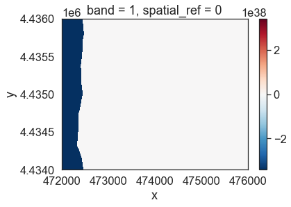
The data above should represent terrain model data. However, the range of values is not what is expected. These data are for Boulder, Colorado where the elevation may range from 1000-3000m. There may be some outlier values in the data that may need to be addressed. Below you look at the distribution of pixel values in the data by plotting a histogram.
Notice that there seem to be a lot of pixel values in the negative range in that plot.
# A histogram can also be helpful to look at the range of values in your data
# What do you notice about the histogram below?
dtm_pre_arr.plot.hist(color="purple")
plt.show()
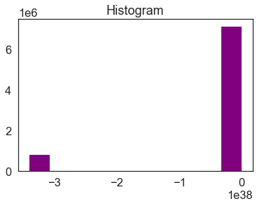
Looking at the min and max values of the data, you can see a very small negative number for the minimum. This number matches the nodata value that you looked at above.
print("the minimum raster value is: ", np.nanmin(dtm_pre_arr.values))
print("the maximum raster value is: ", np.nanmax(dtm_pre_arr.values))
the minimum raster value is:  -3.4028235e+38
the maximum raster value is:  2087.43
Raster Data Exploration - Min and Max Values
Looking at the minimum value of the data, there is one of two things going on that need to be fixed:
- there may be no data values in the data with a negative value that are skewing your plot colors
- there also could be outlier data in your raster
You can explore the first option - that there are no data values by reading
in the data and masking no data values using the masked=True parameter like this:
rxr.open_rasterio(dem_pre_path, masked=True)
Above you may have also noticed that the array has an additional dimension for the
“band”. While the raster only has one layer - there is a 1 in the output of
shape that could get in the way of processing.
You can remove that additional dimension using .squeeze()
# Notice that the shape of this object has a 1 at the beginning
# This can cause issues with plotting
dtm_pre_arr.shape
(1, 2000, 4000)
# Open the data and mask no data values
# Squeeze reduces the third dimension given there is only one "band" or layer to this data
dtm_pre_arr = rxr.open_rasterio(dem_pre_path, masked=True).squeeze()
# Notice there are now only 2 dimensions to your array
dtm_pre_arr.shape
(2000, 4000)
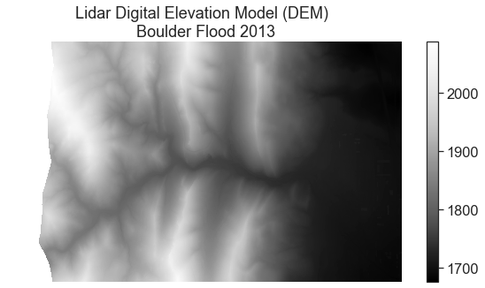
Plot the data again to see what has changed. Now you have a reasonable range of data values and the data plot as you might expect it to.
# Plot the data and notice that the scale bar looks better
# No data values are now masked
f, ax = plt.subplots(figsize=(10, 5))
dtm_pre_arr.plot(cmap="Greys_r",
                 ax=ax)
ax.set_title("Lidar Digital Elevation Model (DEM) \n Boulder Flood 2013")
ax.set_axis_off()
plt.show()
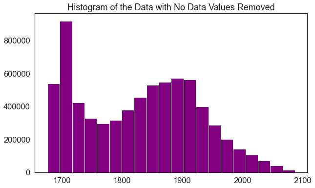
The histogram has also changed. Now, it shows a reasonable distribution of pixel values.
f, ax = plt.subplots(figsize=(10, 6))
dtm_pre_arr.plot.hist(color="purple",
                      bins=20)
ax.set_title("Histogram of the Data with No Data Values Removed")
plt.show()
Notice that now the minimum value looks more like an elevation value (which should most often not be negative).
print("The minimum raster value is: ", np.nanmin(dtm_pre_arr.data))
print("The maximum raster value is: ", np.nanmax(dtm_pre_arr.data))
The minimum raster value is:  1676.2099609375
The maximum raster value is:  2087.429931640625
Plot Raster and Vector Data Together
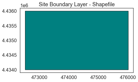
If you want, you can also add shapefile overlays to your raster data plot. Below you open a single shapefile using Geopandas that contains a boundary layer that you can overlay on top of your raster dataset. You will learn more about working with shapefiles in Geopandas in this chapter of the earthdatascience.org intermediate textbook.
# Open site boundary vector layer
site_bound_path = os.path.join("colorado-flood",
                               "spatial",
                               "boulder-leehill-rd",
                               "clip-extent.shp")
site_bound_shp = gpd.read_file(site_bound_path)

# Plot the vector data
f, ax = plt.subplots(figsize=(8,4))
site_bound_shp.plot(color='teal',
                    edgecolor='black',
                    ax=ax)
ax.set(title="Site Boundary Layer - Shapefile")
plt.show()
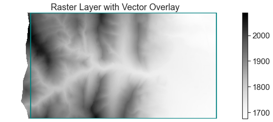
Once you have your shapefile open, can plot the two datasets together and begin to create a map.
f, ax = plt.subplots(figsize=(11, 4))

dtm_pre_arr.plot.imshow(cmap="Greys",
                        ax=ax)
site_bound_shp.plot(color='None',
                    edgecolor='teal',
                    linewidth=2,
                    ax=ax,
                    zorder=4)

ax.set(title="Raster Layer with Vector Overlay")
ax.axis('off')
plt.show()
Data Tip: Customizing Raster Plot Color Ramps
To change the color of a raster plot you set the colormap. Matplotlib has a list of pre-determined color ramps that you can chose from. You can reverse a color ramp by adding _r at the end of the color ramp’s name, for example cmap = 'viridis' vs cmap = 'viridis_r'.
You now have the basic skills needed to open and plot raster data using
rioxarray and xarray. In the following lessons, you will learn more
about exploring and processing raster data.
Share on
Twitter Facebook Google+ LinkedIn