Lesson 6. Summary Activity for Time Series Data
Test Your Skills - Time Series Data In Python Using Pandas
Now that you have learned how to open and manipulate time series data in Python, it’s time to test your skills. Complete the activities below.
# Import necessary packages
import os
import matplotlib.pyplot as plt
import matplotlib.dates as mdates
from matplotlib.dates import DateFormatter
import seaborn as sns
import pandas as pd
import earthpy as et

# Handle date time conversions between pandas and matplotlib
from pandas.plotting import register_matplotlib_converters
register_matplotlib_converters()

# Use white grid plot background from seaborn
sns.set(font_scale=1.5, style="whitegrid")
# Download the data
data = et.data.get_data('colorado-flood')
# Set working directory
os.chdir(os.path.join(et.io.HOME,
                      'earth-analytics',
                      'data'))

# Define relative path to file with daily discharge data
stream_discharge_path = os.path.join("colorado-flood",
                                     "discharge",
                                     "06730200-discharge-daily-1986-2013.csv")
Challenge 1: Explore Your Data & Metadata
Before you begin working with files using python, it can be helpful to look at the structure of the file itself. In some cases, text files have metadata at the top of the file that tell you more about the data within the file itself. This information at the top of the text file can help you make decisions about how you plan to import the data, and what cleanup steps you may need to take.
Open the files earth-analytics/data/colorado-flood/discharge/06730200-discharge-daily-1986-2013.csv and earth-analytics/data/colorado-flood/discharge/06730200-discharge-daily-1986-2013.txt by clicking on them and review their contents. Use these files to answer the questions below:
- What is the delimiter used in
06730200-discharge-daily-1986-2013.csv? - What are the units for stream discharge in the data?
- Where was this data collected?
- What is the frequency of the data collection (day, week, month)?
- What does each number represent in the data (a single observation, minimum value, max value or mean value)?
Write down your answers in the cell below as a comment.
HINT: You may also want to explore the README_dischargeMetadata.rtf file located in the same directory. This file contains metadata that describes in more detail the data that you are using
Challenge 2: Open and Plot a CSV File with Time Series Data
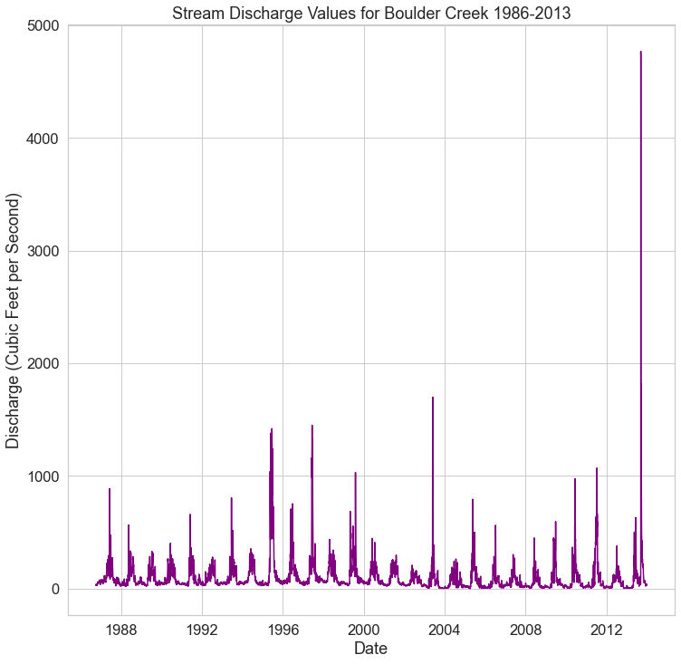
The code above creates a path (stream_discharge_path) to open daily stream discharge measurements taken by U.S. Geological Survey from 1986 to 2013 at Boulder Creek in Boulder, Colorado. Using pandas, do the following with the data:
- Read the data into Python as a pandas
DataFrame. - Parse the dates in the
datetimecolumn of the pandasDataFrame. - Set the
datetimeas the index for yourDataFrame. - Plot the newly opened data with matplotlib. Make sure your x-axis is the dates, and your y-axis is the
disValuecolumn from the pandasDataFrame. - Give your plot a title and label the axes.
If you need a refresher on how to plot time series data, check out this lesson on working with time series data in Pandas.
Once you have created your plot, answer the following questions.
- What is the max value for stream charge in the data? One what date did that value occur?
- Consider the entire dataset. Do you see any patterns of stream discharge values in the data?
Your final plot should look like the plot below.
Challenge 3: Subset the Data
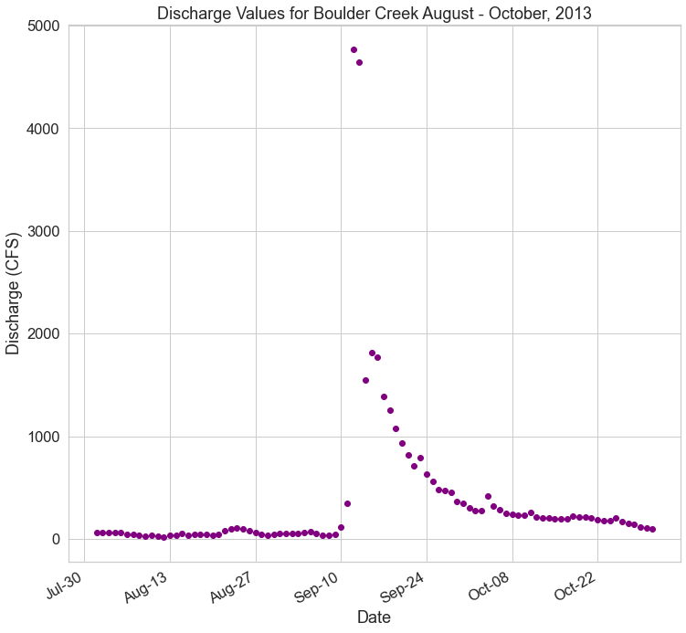
The 2013 Colorado Flood occurred in 2013 (as the name implies). The plot above shows all of the stream discharge data over several decades. In this challenge you will subset the data to just the year and months during which the flood event occurred.
Do the following:
- Subset the data to include only discharge data from August 1st, 2013 through October 31, 2013
- Plot the newly subset data with matplotlib. Make sure your x-axis contains dates, and your y-axis is contains the
disValuecolumn from your pandasDataFrame. - Give your plot a title and label the axes.
- Format the dates on the x-axis so they only show the month and the day. Additionally, you can angle the dates using the line of code
fig.autofmt_xdate(). - Make the x-axis week ticks only show up for every other week.
The lessons below should help you complete this challenge:
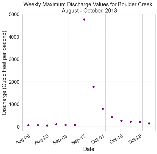
Challenge 4: Resample the Data
Next, summarize the stream discharge data by week. Additionally, you will clean up the format of the date labels on the x-axis. Do the following:
- Resample the
DataFramethat you made above for August - October, 2013 to represent the maximum stream discharge value for each week. - Plot the newly resampled data as a scatterplot (
ax.scatter())usingmatplotlib. Give your plot a title and label the x and y axes. - Format the dates on the x-axis so they only show the month and the day. Additionally, you can angle the dates using the line of code
fig.autofmt_xdate(). - Adjust the x-axis ticks and labels so you have one label and tick for every other week.
HINT: The lessons below might help you complete this challenge:
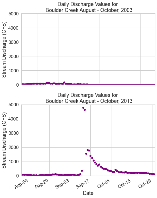
Challenge 5: Compare Two Months Side by Side
In this next challenge, you will compare daily max stream discharge for two time periods. Create a plot comparing stream discharge in levels to the levels seen 10 years ago during the same months. Do the following:
- Create a data subset for the time periods:
- August 1st, 2003 - October 31st, 2003
- August 1st, 2013 - October 31st, 2013
- Plot the data from 2003 on a plot above of the data from 2013 using
matplotlib. - Add titles to each plot and and label the x and y axes.
- Use
fig.suptitle("title-here")to add a title to your figure. - Modify the y limits of both plots to range from 0 to the max value found in the 2013 data subset.
- Hint: you can use
round(data-frame-name["disValue"].max(), -3)to get the max value from your 2013 data. - use
ax.set_ylim(min-value, max-value)to set the limits
- Hint: you can use
- Format the dates on the x-axis as follows:
- Make sure date ticks only show the month and the day - example:
Aug-06. - Make the x-axis week ticks only display for every other week.
- Make sure date ticks only show the month and the day - example:
- Use
plt.tight_layout()to ensure your plots don’t overlap each other.
OPTIONAL: You may have noticed empty space on either side of the x-axis in your previous plot. Use ax.set_xlim() to set the x limits of your plot to the minimum and maximum date values in each of your subset datasets.
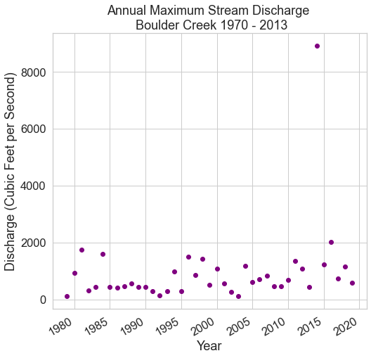
Bonus Challenge 1: Get Data from Hydrofunctions
There are many ways to get data into python. So far you have used et.data.get_data() to download your data. However you can also access data directly using open source tools that access API’s (automated tools that directly access and downoad data from the data servers).
hydrofunctions is an open source Python package that allows you to download hydrologic data from the U.S. Geological Survey. For the bonus challenge, you’ll use hydrofunctions to download stream discharge data and plot it much like you did above. To get the data using hydrofunctions, run the code below.
import hydrofunctions as hf

# Define the site number and start and end dates that you are interested in
site = "06730500"
start = '1946-05-10'
end = '2018-08-29'

# Request data for that site and time period
longmont_resp = hf.get_nwis(site, 'dv', start, end)

# Convert the response to a json in order to use the extract_nwis_df function
longmont_resp = longmont_resp.json()

longmont_discharge = hf.extract_nwis_df(longmont_resp)
Once you have imported the data into a pandas DataFrame using the code above, perform the following tasks:
- Rename the columns (USGS:06730500:00060:00003, USGS:06730500:00060:00003_qualifiers))
dischargeandflags. This will make the data a bit easier to work with. - Subset the data to the time period:
1970through the present. - Resample the data to calculate the annual maximum stream discharge value for each year.
- Plot the data using
matplotlib. Format the x and y axis so the labels are easy to read. Add a title to your plot.
HINT: if you don’t know how to rename a dataframe column, try looking it up using a Google search!
Bonus Challenge 2: Plot Precipitation and Stream Discharge In One Figure
For this challenge, you will open up the precipitation dataset also found in the colorado-flood download, and plot it side by side with discharge to see how they interact. For this challenge, you need to:
Precipitation Data Processing
- Open the precipitation data that you used previously (
colorado-flood/precipitation/805325-precip-daily-2003-2013.csv) using Pandas.- Make sure the date column (“DATE”) is set as the index.
- Set the
na_valuesto999.99.
- Subset the precipitation data to the time period 2013.
- Resample the precipitation data to provide a weekly
sum()of all values instead of hourly.
Stream Discharge Data Processing
- Subset the stream discharge data to the time period 2013.
- Resample the discharge data provide a the weekly maximum values instead of daily.
Plot Your Data In One Figure
- Plot the precipitation data and the discharge data as scatter plots stacked one on top of each other so you can compare the two visually.
- Format your plots with titles, x and y axis labels. Make sure the dates are easy to read.
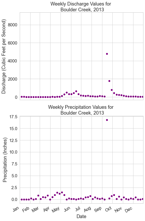
Bonus Challenge 2b: Explore the Data
Look at the two plots above. Do you notice any patterns between the max precipitation values and the max stream discharge values?
Share on
Twitter Facebook Google+ LinkedIn
Leave a Comment