Lesson 2. Activity: Plot Time Series Data Using Pandas in Open Source Python
Chapter Five - Practice Your Plotting Skills
In this chapter, you will practice your skills creating different types of plots in Python using earthpy, matplotlib, and folium.
Learning Objectives
- Apply your skills in plotting time series data using matplotlib and pandas in open source Python.
Plot Time Series Data in Python
Time series data formats apply to many different types of data including precipitation, temperature, land use change data, and much more. Plotting time series data can be particularly tricky given varying time stamp formats, time zone differences and your analysis needs. In this lesson you will practice you skills associated with plotting time series data in Python. To review how to work with time series data using Pandas, check out the chapter of time series data in the intermediate earth data science textbook.
Below is you will find a challenge activity that you can use to practice your plotting skills for plot time series data using matplotlib and pandas. The packages that you will need to complete this activity are listed below.
# Import Packages
import os
from datetime import datetime

import matplotlib.pyplot as plt
import matplotlib.dates as mdates
import seaborn as sns
import pandas as pd
import earthpy as et

# Add seaborn general plot specifications
sns.set(font_scale=1.5, style="whitegrid")
Challenge 1: Plot Time-Series Data
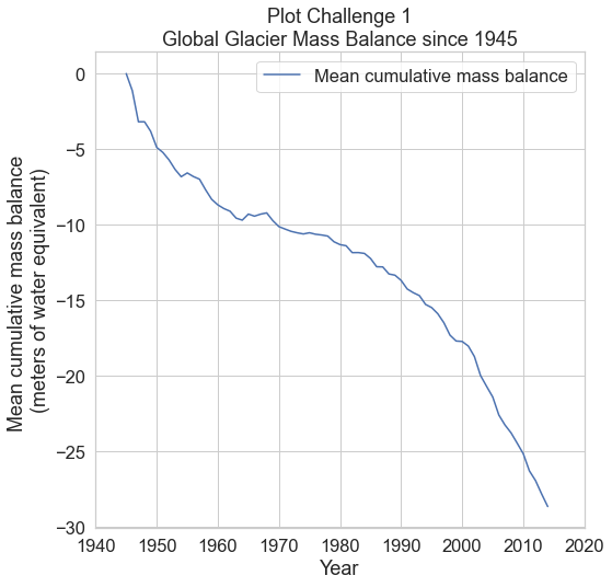
The plot that you will create will show the global loss of glaciers from 1945 to the present using NOAA data. To make this plot, you will have to do the following:
- Read in the
.csvusing the API link:https://datahub.io/core/glacier-mass-balance/r/glacier-mass-balance_zip.zipusing pandas to create aDataFrame. - Parse the dates from the
.csvfile. Assign the date column to be aDataFrameindex. - Plot your data making sure datetime is on the x-axis and
Mean cumulative mass balancecolumn is on the y-axis. - Set an appropriate xlabel, ylabel, and plot title.
- Change the x limits to range from 1940 to 2020. Use the
ax.set_xlim()argument, and ensure that you create your limits as datetime objects. For example, if the lower xlimit was to be set for 1920, I would create it usingdatetime(1920, 1, 1)to say the datetime is for January 1st, 2020. - Open and look at the metadata found in the
README.mdfile of your download, to find out what the units for theMean cumulative mass balanceare.
The plot below is an example of what your final plot should look like after completing this challenge.
# Download the data & Set your working directory
et.data.get_data(
    url="https://ndownloader.figshare.com/files/24649952")
os.chdir(os.path.join(et.io.HOME,
                      "earth-analytics",
                      "data"))
Downloading from https://ndownloader.figshare.com/files/24649952
Extracted output to /root/earth-analytics/data/earthpy-downloads/glacier-mass-balance

Share on
Twitter Facebook Google+ LinkedIn
Leave a Comment