Lesson 1. Activity: Practice Plotting Tabular Data Using Matplotlib and Pandas in Open Source Python
Practice Your Python Plotting Skills - Scientists guide to plotting data in python textbook course module
Welcome to the first lesson in the Practice Your Python Plotting Skills module. This chapter provides a series of activities that allow you to practice your Python plotting skills using differen types of data.Chapter Five - Practice Your Plotting Skills
In this chapter, you will practice your skills creating different types of plots in Python using earthpy, matplotlib, and folium.
Learning Objectives
- Apply your skills in plotting tabular (shreadsheet format) data using matplotlib and pandas in open source Python.
Plot Tabular Data in Python Using Matplotlib and Pandas
There are several ways to plot tabular data in a pandas dataframe format. In this lesson you will practice you skills associated with plotting tabular data in Python. To review how to work with pandas, check out the chapter of time series data in the intermediate earth data science textbook.
Below is you will find a challenge activity that you can use to practice your plotting skills for plot time series data using matplotlib and pandas. The packages that you will need to complete this activity are listed below.
# Import Packages
import os

import matplotlib.pyplot as plt
import matplotlib.dates as mdates
import seaborn as sns
import pandas as pd
import earthpy as et

# Add seaborn general plot specifications
sns.set(font_scale=1.5, style="whitegrid")
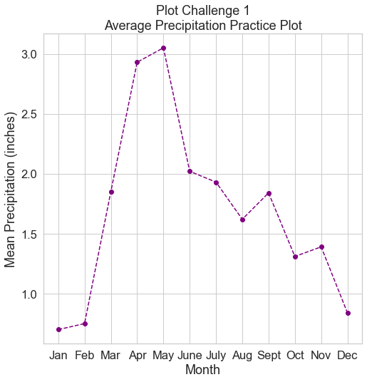
Challenge 1: Plot Precipitation Data
Use the code below to open up a precipitation dataset that contains average monthly rainfall in inches. Practice your plotting skills. To begin, do the following:
- Read in the
.csvfile calledavg-precip-months-seasons.csv. - Create a basic plot using
.plot() - Set an appropriate xlabel, ylabel, and plot title.
- Use the linestyle parameter to modify the line style to something other than solid.
- Change the color to something other than the default blue.
- Add a marker parameter to the
ax.plot. What happens when you change the marker in a line plot?
The plot below is an example of what your final plot should look like after completing this challenge.
# URL for .csv with avg monthly precip data
avg_monthly_precip_url = "https://ndownloader.figshare.com/files/12710618"

# Download file from URL
# NOTE - this csv file should download to your home directory: `~/earth-analytics/earthpy-downloads`
et.data.get_data(url=avg_monthly_precip_url)

# Set your working directory
os.chdir(os.path.join(et.io.HOME,
                      "earth-analytics",
                      "data"))
Downloading from https://ndownloader.figshare.com/files/12710618
precip_path = os.path.join("earthpy-downloads",
                           "avg-precip-months-seasons.csv")

precip_data = pd.read_csv(precip_path)
precip_data
| months | precip | seasons | |
|---|---|---|---|
| 0 | Jan | 0.70 | Winter |
| 1 | Feb | 0.75 | Winter |
| 2 | Mar | 1.85 | Spring |
| 3 | Apr | 2.93 | Spring |
| 4 | May | 3.05 | Spring |
| 5 | June | 2.02 | Summer |
| 6 | July | 1.93 | Summer |
| 7 | Aug | 1.62 | Summer |
| 8 | Sept | 1.84 | Fall |
| 9 | Oct | 1.31 | Fall |
| 10 | Nov | 1.39 | Fall |
| 11 | Dec | 0.84 | Winter |
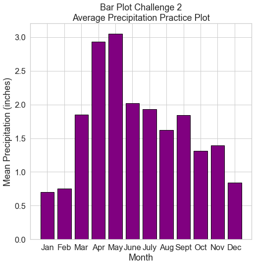
Challenge 2: Bar Plot of Precipitation Data
Using the same data you used above, create a bar plot of precipitation data. Once again do the following:
- Read in the
.csvfile calledavg-precip-months-seasons.csv. - Create a bar plot using
ax.bar() - Set an appropriate xlabel, ylabel, and plot title.
- Use the edgecolor and color parameters to modify the colors of your plot to something other than blue.
The plot below is an example of what your final plot should look like after completing this challenge.
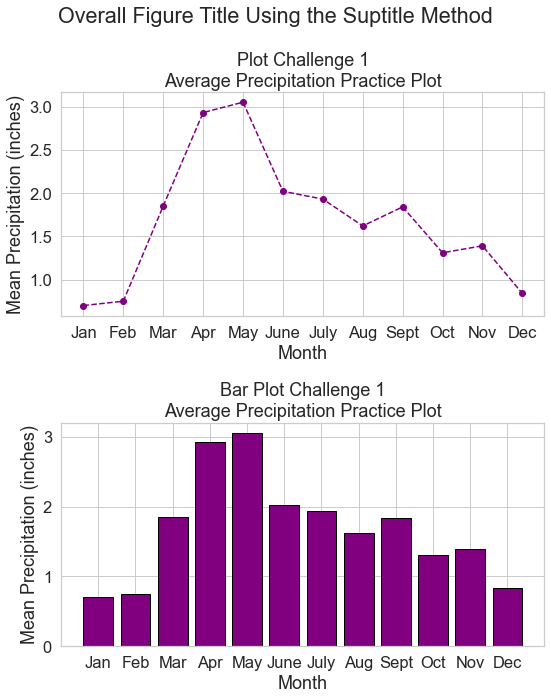
Challenge 3: Figure with Two Subplots of Precipitation Data
Above you created two plots:
- a line plot of precipitation data with each point highlighted using a marker.
- a bar plot of precipitation data.
Here, create a single figure that contains two subplots stacked on top of each other.
- The first should be your line plot.
- The second should be your scatter plot.
For the figure do the following:
- Add an overal title to your figure using
plt.suptitle() - Use
plt.tight_layout()to make space between the two plots so that the titles and labels do nor overlap
The plot below is an example of what your final plot should look like after completing this challenge.
# Plot the data
fig, (ax1, ax2) = plt.subplots(2,1, figsize=(8, 10))
plt.suptitle("Overall Figure Title Using the Suptitle Method")
ax1.plot(precip_data.months,
        precip_data.precip,
        color="purple",
        linestyle='dashed', marker="o")

ax1.set(ylabel="Mean Precipitation (inches)",
       xlabel="Month",
       title="Plot Challenge 1\nAverage Precipitation Practice Plot")
ax2.bar(precip_data.months,
       precip_data.precip,
       color="purple",
       edgecolor="black")

ax2.set(ylabel="Mean Precipitation (inches)",
       xlabel="Month",
       title="Bar Plot Challenge 1\nAverage Precipitation Practice Plot")

plt.tight_layout()
plt.show()
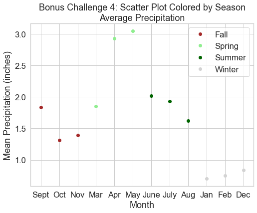
Bonus Challenge 4: Plot Grouped Data
There are differents ways to go about plotting grouped data with a legend using pandas. Below you will walk through an approach to plot your precip data by season using:
- matplotlib
- and a grouped pandas dataframe
To achieve this plot, you will do the following:
- Create a for loop which groups for your pandas dataframe
- Create a figure as you would normally do using
fig, ax = plt.subplots() - Add a legend to your plot using
plt.legend()
In each iteration of the for loop, you will specify the label (which is the group by object - in this case the seasons column). Your code will look something likee the code below:
for label, df in precip_data.groupby("seasons"):
    ax.plot(df.months,
            df.precip,
            "o",
            # The label is the season or the group by object in this case
            label=label)
HINT:
You can create a dictionary that maps categories (seasons in this case) to colors - like this:
colors = {"Winter": "lightgrey",
          "Spring": "green",
          "Summer": "darkgreen",
          "Fall": "brown"}
you can then call each color using colors[label] where the label is season
in this example and the colors object is the dictionary that you created above:
for label, df in precip_data.groupby("seasons"):
    ax.plot(df.months,
            df.precip,
            "o",
            # The label is the season or the group by object in this case
            label=label,
            color=colors[label])
Understanding For Loops
To break down the for loop it can be helpful to print the two variables being created in each iteration. Below you create a label object which contains the label or word that is being used to group the data. In this case the label is “season”.
# Print each label object which is the group by category - season
for label, df in precip_data.groupby("seasons"):
    print(label)
Fall
Spring
Summer
Winter
Next you can print each group by object - the df object. This
object represents the dataframe subsetted by the specific season.
# Print each grouped data
for label, df in precip_data.groupby("seasons"):
    print(df)
   months  precip seasons
8    Sept    1.84    Fall
9     Oct    1.31    Fall
10    Nov    1.39    Fall
  months  precip seasons
2    Mar    1.85  Spring
3    Apr    2.93  Spring
4    May    3.05  Spring
  months  precip seasons
5   June    2.02  Summer
6   July    1.93  Summer
7    Aug    1.62  Summer
   months  precip seasons
0     Jan    0.70  Winter
1     Feb    0.75  Winter
11    Dec    0.84  Winter
Create your final challenge plot of the precipitation data colored by season. Modify the colors used to plot each season. The plot below is an example of what your final plot should look like after completing this challenge.
Share on
Twitter Facebook Google+ LinkedIn
Leave a Comment