Lesson 2. Customize Your Plots Using Matplotlib
Learning Objectives
- Add data to plots created with matplotlib.
- Use matplotlib to create scatter, line and bar plots.
- Customize the labels, colors and look of your matplotlib plot.
- Save figure as an image file (e.g. .png format).
Previously in this chapter, you learned how to create your figure and axis objects using the subplots() function from pyplot (which you imported using the alias plt):
fig, ax = plt.subplots()
Now you know how to create basic plots using matplotlib, you can begin adding data to the plots in your figure.
Begin by importing the matplotlib.pyplot module with the alias plt and creating a few lists to plot the monthly average precipitation (inches) for Boulder, Colorado provided by the U.S. National Oceanic and Atmospheric Administration (NOAA).
# Import pyplot
import matplotlib.pyplot as plt
# Monthly average precipitation
boulder_monthly_precip = [0.70, 0.75, 1.85, 2.93, 3.05, 2.02,
                          1.93, 1.62, 1.84, 1.31, 1.39, 0.84]

# Month names for plotting
months = ["Jan", "Feb", "Mar", "Apr", "May", "June", "July",
          "Aug", "Sept", "Oct", "Nov", "Dec"]
Plot Your Data Using Matplotlib
You can add data to your plot by calling the desired ax object, which is the axis element that you previously defined with:
fig, ax = plt.subplots()
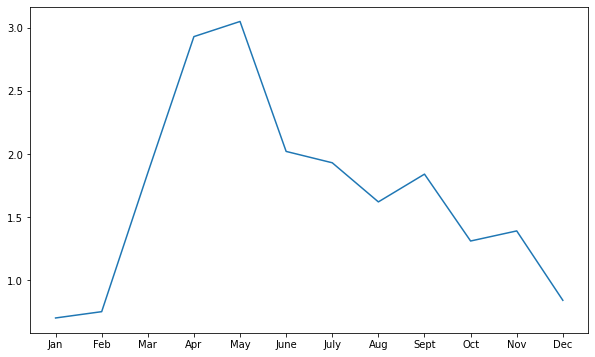
You can call the .plot method of the ax object and specify the arguments for the x axis (horizontal axis) and the y axis (vertical axis) of the plot as follows:
ax.plot(x_axis, y_axis)
In this example, you are adding data from lists that you previously defined, with months along the x axis and boulder_monthly_precip along the y axis.
Data Tip: Note that the data plotted along the x and y axes can also come from numpy arrays as well as rows or columns in a pandas dataframes.
# Define plot space
fig, ax = plt.subplots(figsize=(10, 6))

# Define x and y axes
ax.plot(months,
        boulder_monthly_precip)
[<matplotlib.lines.Line2D at 0x7fac9a202df0>]

Note that the output displays the object type as well as the unique identifier (or the memory location) for the figure.
<matplotlib.lines.Line2D at 0x7f12063c7898>
You can hide this information from the output by adding plt.show() as the last line you call in your plot code.
# Define plot space
fig, ax = plt.subplots(figsize=(10, 6))

# Define x and y axes
ax.plot(months,
        boulder_monthly_precip)

plt.show()

Naming Conventions for Matplotlib Plot Objects
Note that the ax object that you created above can actually be called anything that you want; for example, you could decide you wanted to call it bob!
However, it is not good practice to use random names for objects such as bob.
The convention in the Python community is to use ax to name the axis object, but it is good to know that objects in Python do not have to be named something specific.
You simply need to use the same name to call the object that you want, each time that you call it.
For example, if you did name the ax object bob when you created it, then you would use the same name bob to call the object when you want to add data to it.
# Define plot space with ax named bob
fig, bob = plt.subplots(figsize=(10, 6))

# Define x and y axes
bob.plot(months,
         boulder_monthly_precip)

plt.show()
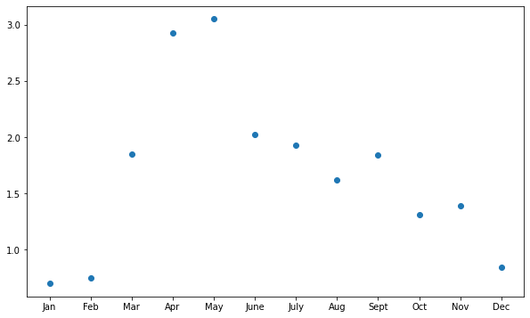
Create Different Types of Matplotlib Plots: Scatter and Bar Plots
You may have noticed that by default, ax.plot creates the plot as a line plot (meaning that all of the values are connected by a continuous line across the plot).
You can also use the ax object to create:
- scatter plots (using
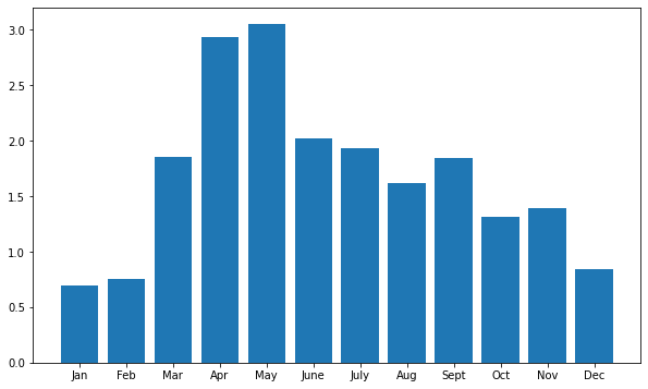
ax.scatter): values are displayed as individual points that are not connected with a continuous line. - bar plots (using
ax.bar): values are displayed as bars with height indicating the value at a specific point.
# Define plot space
fig, ax = plt.subplots(figsize=(10, 6))

# Create scatter plot
ax.scatter(months,
           boulder_monthly_precip)

plt.show()
# Define plot space
fig, ax = plt.subplots(figsize=(10, 6))

# Create bar plot
ax.bar(months,
       boulder_monthly_precip)

plt.show()
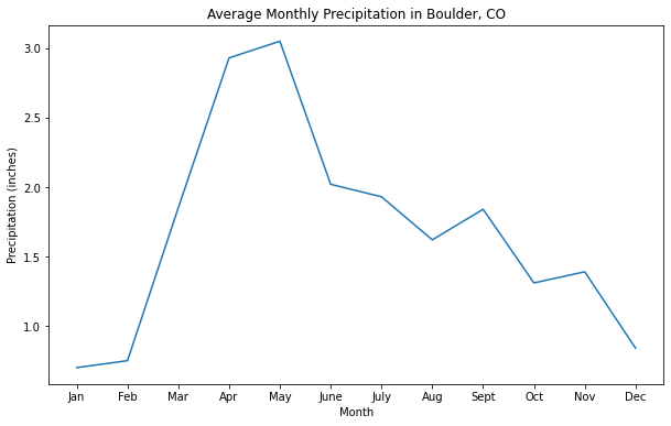
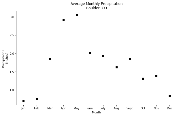
Customize Plot Title and Axes Labels
You can customize and add more information to your plot by adding a plot title and labels for the axes using the title, xlabel, ylabel arguments within the ax.set() method:
ax.set(title = "Plot title here",
       xlabel = "X axis label here",
       ylabel = "Y axis label here")
# Define plot space
fig, ax = plt.subplots(figsize=(10, 6))

# Define x and y axes
ax.plot(months,
        boulder_monthly_precip)

# Set plot title and axes labels
ax.set(title = "Average Monthly Precipitation in Boulder, CO",
       xlabel = "Month",
       ylabel = "Precipitation (inches)")

plt.show()
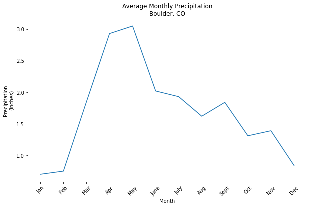
Multi-line Titles and Labels
You can also create titles and axes labels with have multiple lines of text using the new line character \n between two words to identity the start of the new line.
# Define plot space
fig, ax = plt.subplots(figsize=(10, 6))

# Define x and y axes
ax.plot(months,
        boulder_monthly_precip)

# Set plot title and axes labels
ax.set(title = "Average Monthly Precipitation\nBoulder, CO",
       xlabel = "Month",
       ylabel = "Precipitation\n(inches)")

plt.show()

Rotate Labels
You can use plt.setp to set properties in your plot, such as customizing labels including the tick labels.
In the example below, ax.get_xticklabels() grabs the tick labels from the x axis, and then the rotation argument specifies an angle of rotation (e.g. 45), so that the tick labels along the x axis are rotated 45 degrees.
# Define plot space
fig, ax = plt.subplots(figsize=(10, 6))

# Define x and y axes
ax.plot(months,
        boulder_monthly_precip)

# Set plot title and axes labels
ax.set(title = "Average Monthly Precipitation\nBoulder, CO",
       xlabel = "Month",
       ylabel = "Precipitation\n(inches)")

plt.setp(ax.get_xticklabels(), rotation = 45)

plt.show()
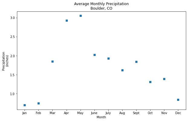
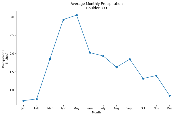
Custom Markers in Line and Scatter Plots
You can change the point marker type in your line or scatter plot using the argument marker = and setting it equal to the symbol that you want to use to identify the points in the plot.
For example, "," will display the point markers as a pixel or box, and “o” will display point markers as a circle.
| Marker symbol | Marker description |
|---|---|
| . | point |
| , | pixel |
| o | circle |
| v | triangle_down |
| ^ | triangle_up |
| < | triangle_left |
| > | triangle_right |
Visit the Matplotlib documentation for a list of marker types.
# Define plot space
fig, ax = plt.subplots(figsize=(10, 6))

# Define x and y axes
ax.scatter(months,
        boulder_monthly_precip,
        marker = ',')

# Set plot title and axes labels
ax.set(title = "Average Monthly Precipitation\nBoulder, CO",
       xlabel = "Month",
       ylabel = "Precipitation\n(inches)")

plt.show()
# Define plot space
fig, ax = plt.subplots(figsize=(10, 6))

# Define x and y axes
ax.plot(months,
        boulder_monthly_precip,
        marker = 'o')

# Set plot title and axes labels
ax.set(title = "Average Monthly Precipitation\nBoulder, CO",
       xlabel = "Month",
       ylabel = "Precipitation\n(inches)")

plt.show()
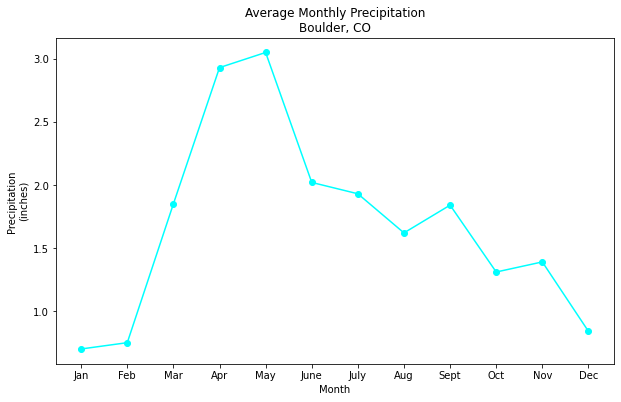
Customize Plot Colors
You can customize the color of your plot using the color argument and setting it equal to the color that you want to use for the plot.
A list of some of the base color options available in matplotlib is below:
    b: blue
    g: green
    r: red
    c: cyan
    m: magenta
    y: yellow
    k: black
    w: white
For these base colors, you can set the color argument equal to the full name (e.g. cyan) or simply just the key letter as shown in the table above (e.g. c).
Data Tip: For more colors, visit the matplotlib documentation on color.
# Define plot space
fig, ax = plt.subplots(figsize=(10, 6))

# Define x and y axes
ax.plot(months,
        boulder_monthly_precip,
        marker = 'o',
        color = 'cyan')

# Set plot title and axes labels
ax.set(title = "Average Monthly Precipitation\nBoulder, CO",
       xlabel = "Month",
       ylabel = "Precipitation\n(inches)")

plt.show()
# Define plot space
fig, ax = plt.subplots(figsize=(10, 6))

# Define x and y axes
ax.scatter(months,
        boulder_monthly_precip,
        marker = ',',
        color = 'k')

# Set plot title and axes labels
ax.set(title = "Average Monthly Precipitation\nBoulder, CO",
       xlabel = "Month",
       ylabel = "Precipitation\n(inches)")

plt.show()
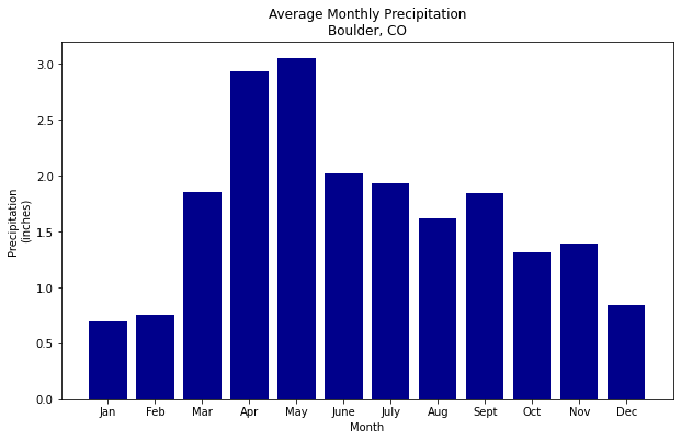
# Define plot space
fig, ax = plt.subplots(figsize=(10, 6))

# Define x and y axes
ax.bar(months,
        boulder_monthly_precip,
        color = 'darkblue')

# Set plot title and axes labels
ax.set(title = "Average Monthly Precipitation\nBoulder, CO",
       xlabel = "Month",
       ylabel = "Precipitation\n(inches)")

plt.show()
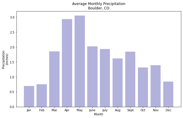
Set Color Transparency
You can also adjust the transparency of color using the alpha = argument, with values closer to 0.0 indicating a higher transparency.
# Define plot space
fig, ax = plt.subplots(figsize=(10, 6))

# Define x and y axes
ax.bar(months,
       boulder_monthly_precip,
       color = 'darkblue',
       alpha = 0.3)

# Set plot title and axes labels
ax.set(title = "Average Monthly Precipitation\nBoulder, CO",
       xlabel = "Month",
       ylabel = "Precipitation\n(inches)")

plt.show()
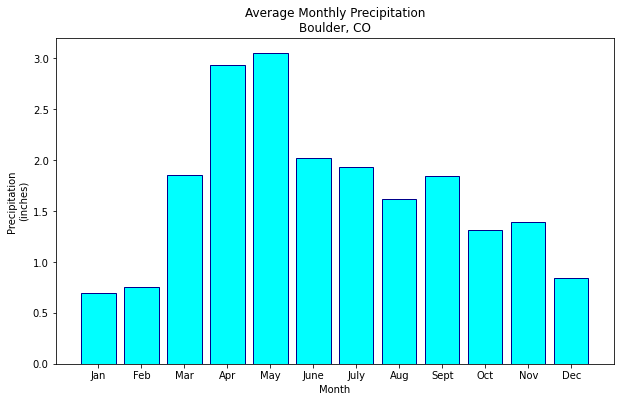
Customize Colors For Bar Plots
You can customize your bar plot further by changing the outline color for each bar to be blue using the argument edgecolor and specifying a color from the matplotlib color options previously discussed.
# Define plot space
fig, ax = plt.subplots(figsize=(10, 6))

# Define x and y axes
ax.bar(months,
       boulder_monthly_precip,
       color = 'cyan',
       edgecolor = 'darkblue')

# Set plot title and axes labels
ax.set(title = "Average Monthly Precipitation\nBoulder, CO",
       xlabel = "Month",
       ylabel = "Precipitation\n(inches)")

plt.show()
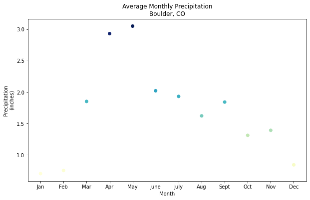
Customize Colors For Scatter Plots
When using scatter plots, you can also assign each point a color based upon its data value using the c and cmap arguments.
The c argument allows you to specify the sequence of values that will be color-mapped (e.g. boulder_monthly_precip), while cmap allows you to specify the color map to use for the sequence.
The example below uses the YlGnBu colormap, in which lower values are filled in with yellow to green shades, while higher values are filled in with increasingly darker shades of blue.
Data Tip: To see a list of color map options, visit the matplotlib documentation on colormaps.
# Define plot space
fig, ax = plt.subplots(figsize=(10, 6))

# Define x and y axes
ax.scatter(months,
        boulder_monthly_precip,
        c = boulder_monthly_precip,
        cmap = 'YlGnBu')

# Set plot title and axes labels
ax.set(title = "Average Monthly Precipitation\nBoulder, CO",
       xlabel = "Month",
       ylabel = "Precipitation\n(inches)")

plt.show()
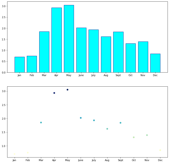
Add Data to Multi-plot Figures
Recall that matplotlib’s object oriented approach makes it easy to include more than one plot in a figure by creating additional axis objects:
fig, (ax1, ax2) = plt.subplots(num_rows, num_columns)
Once you have your fig and two axis objects defined, you can add data to each axis and define the plot with unique characteristics.
In the example below, ax1.bar creates a customized bar plot in the first plot, and ax2.scatter creates a customized scatter in the second plot.
# Define plot space
fig, (ax1, ax2) = plt.subplots(2, 1, figsize=(12, 12))

# Define x and y axes
ax1.bar(months,
       boulder_monthly_precip,
       color = 'cyan',
       edgecolor = 'darkblue')

# Define x and y axes
ax2.scatter(months,
        boulder_monthly_precip,
        c = boulder_monthly_precip,
        cmap = 'YlGnBu')

plt.show()
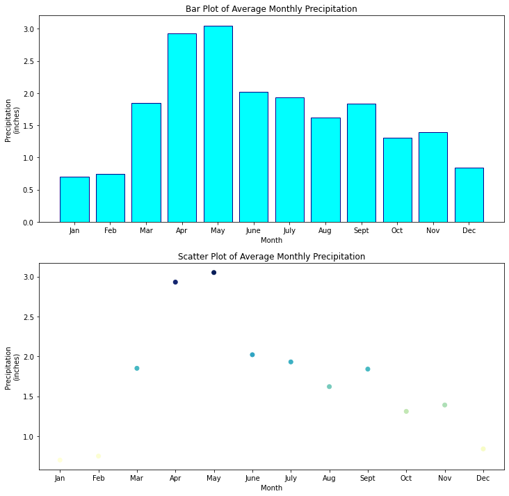
Add Titles and Axes Labels to Multi-plot Figures
You can continue to add to ax1 and ax2 such as adding the title and axes labels for each individual plot, just like you did before when the figure only had one plot.
You can use ax1.set() to define these elements for the first plot (the bar plot), and ax2.set() to define them for the second plot (the scatter plot).
# Define plot space
fig, (ax1, ax2) = plt.subplots(2, 1, figsize=(12, 12))

# Define x and y axes
ax1.bar(months,
       boulder_monthly_precip,
       color = 'cyan',
       edgecolor = 'darkblue')

# Set plot title and axes labels
ax1.set(title = "Bar Plot of Average Monthly Precipitation",
       xlabel = "Month",
       ylabel = "Precipitation\n(inches)");

# Define x and y axes
ax2.scatter(months,
        boulder_monthly_precip,
        c = boulder_monthly_precip,
        cmap = 'YlGnBu')

# Set plot title and axes labels
ax2.set(title = "Scatter Plot of Average Monthly Precipitation",
       xlabel = "Month",
       ylabel = "Precipitation\n(inches)")

plt.show()
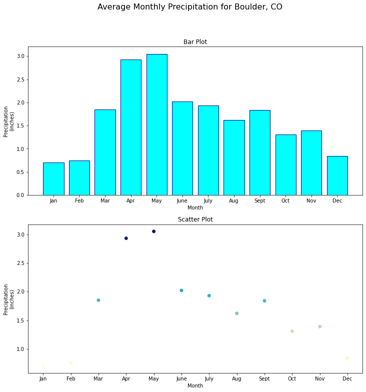
Now that you have more than one plot (each with their own labels), you can also add an overall title (with a specified font size) for the entire figure using:
fig.suptitle("Title text", fontsize = 16)
# Define plot space
fig, (ax1, ax2) = plt.subplots(2, 1, figsize=(12, 12))

fig.suptitle("Average Monthly Precipitation for Boulder, CO", fontsize = 16)

# Define x and y axes
ax1.bar(months,
       boulder_monthly_precip,
       color = 'cyan',
       edgecolor = 'darkblue')

# Set plot title and axes labels
ax1.set(title = "Bar Plot",
       xlabel = "Month",
       ylabel = "Precipitation\n(inches)");

# Define x and y axes
ax2.scatter(months,
        boulder_monthly_precip,
        c = boulder_monthly_precip,
        cmap = 'YlGnBu')

# Set plot title and axes labels
ax2.set(title = "Scatter Plot",
       xlabel = "Month",
       ylabel = "Precipitation\n(inches)")

plt.show()

Save a Matplotlib Figure As An Image File
You can easily save a figure to an image file such as .png using:
plt.savefig("path/name-of-file.png")
which will save the latest figure rendered.
If you do not specify a path for the file, the file will be created in your current working directory.
Review the Matplotlib documentation to see a list of the additional file formats that be used to save figures.
# Define plot space
fig, (ax1, ax2) = plt.subplots(2, 1, figsize=(12, 12))

fig.suptitle("Average Monthly Precipitation for Boulder, CO", fontsize = 16)

# Define x and y axes
ax1.bar(months,
       boulder_monthly_precip,
       color = 'cyan',
       edgecolor = 'darkblue')

# Set plot title and axes labels
ax1.set(title = "Bar Plot",
       xlabel = "Month",
       ylabel = "Precipitation\n(inches)");

# Define x and y axes
ax2.scatter(months,
        boulder_monthly_precip,
        c = boulder_monthly_precip,
        cmap = 'YlGnBu')

# Set plot title and axes labels
ax2.set(title = "Scatter Plot",
       xlabel = "Month",
       ylabel = "Precipitation\n(inches)")

plt.savefig("average-monthly-precip-boulder-co.png")

plt.show()
Additional Resources
- Additional information about color bars
- An in-depth guide to matplotlib
Share on
Twitter Facebook Google+ LinkedIn
Leave a Comment