Lesson 4. GIS in Python: Introduction to Vector Format Spatial Data - Points, Lines and Polygons Spatial data open source python Workshop
Learning Objectives
After completing this tutorial, you will be able to:
- describe the characteristics of 3 key vector data structures: points, lines and polygons.
- open a shapefile in
Pythonusinggeopandas-gpd.read_file. - view the
CRSand other spatial metadata of a vector spatial layer inPython - access and view the attributes of a vector spatial layer in
Python.
What You Need
You will need a computer with internet access to complete this lesson and the spatial-vector-lidar data subset created for the course.
About Vector Data
Vector data are composed of discrete geometric locations (x, y values) known as vertices that define the “shape” of the spatial object. The organization of the vertices determines the type of vector that you are working with. There are three types of vector data:
-
Points: Each individual point is defined by a single x, y coordinate. There can be many points in a vector point file. Examples of point data include: sampling locations, the location of individual trees or the location of plots.
-
Lines: Lines are composed of many (at least 2) vertices, or points, that are connected. For instance, a road or a stream may be represented by a line. This line is composed of a series of segments, each “bend” in the road or stream represents a vertex that has defined
x, ylocation. -
Polygons: A polygon consists of 3 or more vertices that are connected and “closed”. Thus the outlines of plot boundaries, lakes, oceans, and states or countries are often represented by polygons. Occasionally, a polygon can have a hole in the middle of it (like a doughnut), this is something to be aware of but not an issue you will deal with in this tutorial.
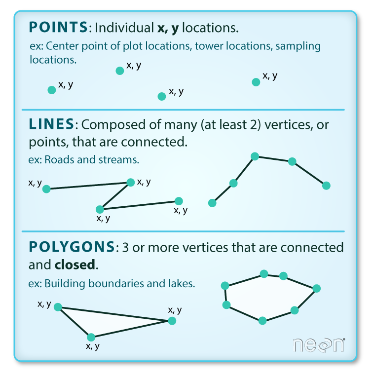
Data Tip: Sometimes, boundary layers such as states and countries, are stored as lines rather than polygons. However, these boundaries, when represented as a line, will not create a closed object with a defined “area” that can be “filled”.
Shapefiles: Points, Lines, and Polygons
Geospatial data in vector format are often stored in a shapefile format. Because the structure of points, lines, and polygons are different, each individual shapefile can only contain one vector type (all points, all lines
or all polygons). You will not find a mixture of point, line and polygon objects in a single shapefile.
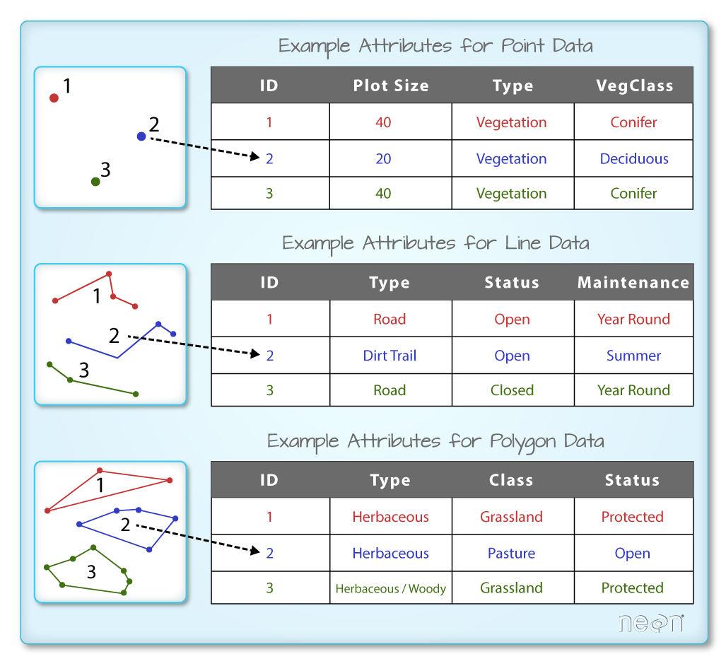
Objects stored in a shapefile often have a set of associated attributes that describe the data. For example, a line shapefile that contains the locations of streams, might contain the associated stream name, stream “order” and other
information about each stream line object.
- More about shapefiles can found on Wikipedia.
One Dataset - Many Files
While text files often are self contained (one CSV) is composed of one unique file, many spatial formats are composed of several files. A shapefile is created by 3 or more files, all of which must retain the same NAME and be stored in the same file directory, in order for you to be able to work with them.
Shapefile Structure
There are 3 key files associated with any and all shapefiles:
.shp: the file that contains the geometry for all features..shx: the file that indexes the geometry..dbf: the file that stores feature attributes in a tabular format.
These files need to have the same name and to be stored in the same directory (folder) to open properly in a GIS, R or Python tool.
Sometimes, a shapefile will have other associated files including:
.prj: the file that contains information on projection format including the coordinate system and projection information. It is a plain text file describing the projection using well-known text (WKT) format..sbnand.sbx: the files that are a spatial index of the features..shp.xml: the file that is the geospatial metadata in XML format, (e.g. ISO 19115 or XML format).
Data Management - Sharing Shapefiles
When you work with a shapefile, you must keep all of the key associated file types together. And when you share a shapefile with a colleague, it is important to zip up all of these files into one package before you send it to them!
Import Shapefiles
You will use the geopandas library to work with vector data in Python. You will also use matplotlib.pyplot to plot your data.
# import necessary packages
import os
import matplotlib.pyplot as plt
import geopandas as gpd
import earthpy as et

# set home directory and download data
et.data.get_data("spatial-vector-lidar")
os.chdir(os.path.join(et.io.HOME, 'earth-analytics'))
Downloading from https://ndownloader.figshare.com/files/12459464
Extracted output to /root/earth-analytics/data/spatial-vector-lidar/.
The shapefiles that you will import are:
- A polygon shapefile representing our field site boundary,
- A line shapefile representing roads, and
- A point shapefile representing the location of field sites at the San Joachin field site.
The first shapefile that you will open contains the point locations of plots where trees have been measured. To import shapefiles you use the geopandas function read_file(). Notice that you call the read_file() function using gpd.read_file() to tell python to look for the function within the geopandas library.
# import shapefile using geopandas
sjer_plot_locations = gpd.read_file('data/spatial-vector-lidar/california/neon-sjer-site/vector_data/SJER_plot_centroids.shp')
The CRS UTM zone 18N. The CRS is critical to interpreting the object extent values as it specifies units.
Spatial Data Attributes
Each object in a shapefile has one or more attributes associated with it. Shapefile attributes are similar to fields or columns in a spreadsheet. Each row in the spreadsheet has a set of columns associated with it that describe the row element. In the case of a shapefile, each row represents a spatial object - for example, a road, represented as a line in a line shapefile, will have one “row” of attributes associated with it. These attributes can include different types of information that describe objects stored within a shapefile. Thus, our road, may have a name, length, number of lanes, speed limit, type of road and other attributes stored with it.
You can view the attribute table associated with our geopandas GeoDataFrame by simply typing the object name into the console
(e.g., sjer_plot_locations).
Her you’ve used the .head(3) function to only display the first 3 rows of the attribute table. Remember that the number in the .head() function represents the total number of rows that will be returned by the function.
# view  the top 6 lines of attribute table of data
sjer_plot_locations.head(6)
| Plot_ID | Point | northing | easting | plot_type | geometry | |
|---|---|---|---|---|---|---|
| 0 | SJER1068 | center | 4111567.818 | 255852.376 | trees | POINT (255852.376 4111567.818) |
| 1 | SJER112 | center | 4111298.971 | 257406.967 | trees | POINT (257406.967 4111298.971) |
| 2 | SJER116 | center | 4110819.876 | 256838.760 | grass | POINT (256838.760 4110819.876) |
| 3 | SJER117 | center | 4108752.026 | 256176.947 | trees | POINT (256176.947 4108752.026) |
| 4 | SJER120 | center | 4110476.079 | 255968.372 | grass | POINT (255968.372 4110476.079) |
| 5 | SJER128 | center | 4111388.570 | 257078.867 | trees | POINT (257078.867 4111388.570) |
In this case, you have several attributes associated with our points including:
- Plot_ID, Point, easting, geometry, northing, plot_type
Data Tip: The acronym, OGR, refers to the OpenGIS Simple Features Reference Implementation. Learn more about OGR.
The Geopandas Data Structure
Notice that the geopandas data structure is a data.frame that contains a geometry column where the x, y point location values are stored. All of the other shapefile feature attributes are contained in columns, similar to what you may be used to if you’ve used a GIS tool such as ArcGIS or QGIS.
Shapefile Metadata & Attributes
When you import the SJER_plot_centroids shapefile layer into Python the gpd.read_file() function automatically stores information about the data as attributes. You are particularly interested in the geospatial metadata, describing the format, CRS, extent, and other components of the vector data, and the attributes which describe properties associated with each individual vector object.
Spatial Metadata
Key metadata for all shapefiles include:
- Object Type: the class of the imported object.
- Coordinate Reference System (CRS): the projection of the data.
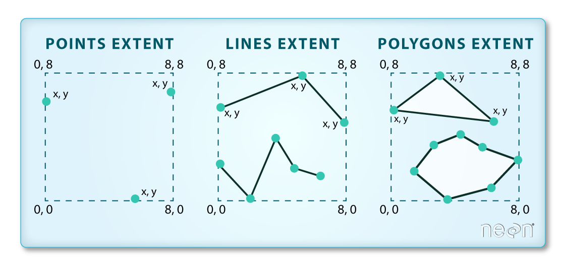
- Extent: the spatial extent (geographic area that the shapefile covers) of the shapefile. Note that the spatial extent for a shapefile represents the extent for ALL spatial objects in the shapefile.
You can view shapefile metadata using the class(), .crs and .total_bounds methods:
type(sjer_plot_locations)
geopandas.geodataframe.GeoDataFrame
# view the spatial extent
sjer_plot_locations.total_bounds
array([ 254738.618, 4107527.074, 258497.102, 4112167.778])
sjer_plot_locations.crs
<Projected CRS: EPSG:32611>
Name: WGS 84 / UTM zone 11N
Axis Info [cartesian]:
- E[east]: Easting (metre)
- N[north]: Northing (metre)
Area of Use:
- name: World - N hemisphere - 120°W to 114°W - by country
- bounds: (-120.0, 0.0, -114.0, 84.0)
Coordinate Operation:
- name: UTM zone 11N
- method: Transverse Mercator
Datum: World Geodetic System 1984
- Ellipsoid: WGS 84
- Prime Meridian: Greenwich
The CRS for our data is epsg code: 32611. You will learn about CRS formats and structures in a later lesson but for now a quick google search reveals that this CRS is: UTM zone 11 North - WGS84.
sjer_plot_locations.geom_type
0     Point
1     Point
2     Point
3     Point
4     Point
5     Point
6     Point
7     Point
8     Point
9     Point
10    Point
11    Point
12    Point
13    Point
14    Point
15    Point
16    Point
17    Point
dtype: object
How Many Features Are in Your Shapefile?
You can view the number of features (counted by the number of rows in the attribute table) and feature attributes (number of columns) in our data using the pandas .shape method. Note that the data are returned as a vector of two values:
(rows, columns)
Also note that the number of columns includes a column where the geometry (the x, y coordinate locations) are stored.
sjer_plot_locations.shape
(18, 6)
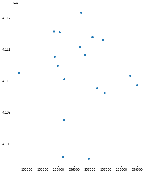
Plot a Shapefile
Next, you can visualize the data in your Python geodata.frame object using the .plot() method. Notice that you can create a plot using the geopandas base plotting using the syntax:
dataframe_name.plot()
The plot is made larger but adding a figsize = () argument.
# plot the data using geopandas .plot() method
fig, ax = plt.subplots(figsize = (10,10))
sjer_plot_locations.plot(ax=ax)
plt.show()
You can plot the data by feature attribute and add a legend too. Below you add the following plot arguments to your geopandas plot:
- column: the attribute column that you want to plot your data using
- categorical=True: set the plot to plot categorical data - in this case plot types.
- legend: add a legend
- markersize: increase or decrease the size of the points or markers rendered on the plot
- cmap: set the colors used to plot the data
and fig size if you want to specify the size of the output plot.
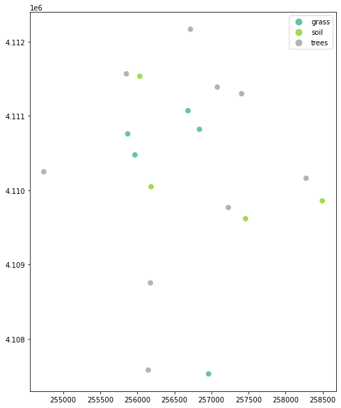
fig, ax = plt.subplots(figsize = (10,10))

# quickly plot the data adding a legend
sjer_plot_locations.plot(column='plot_type',
                         categorical=True,
                         legend=True,
                         figsize=(10,6),
                         markersize=45,
                         cmap="Set2", ax=ax);
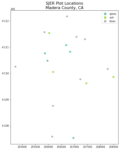
You can add a title to the plot too. Below you assign the plot element to a variable called ax.
You then add a title to the plot using ax.set_title().
# Plot the data adjusting marker size and colors
# # 'col' sets point symbol color
# quickly plot the data adding a legend
ax = sjer_plot_locations.plot(column='plot_type',
                         categorical=True,
                         legend=True,
                         figsize=(10,10),
                         markersize=45,
                         cmap="Set2")
# add a title to the plot
ax.set_title('SJER Plot Locations\nMadera County, CA', fontsize=16);
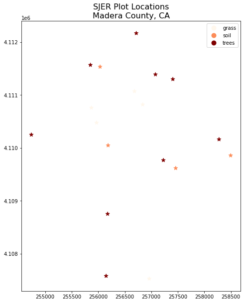
Change Plot Colors & Symbols
You can use the cmap argument to adjust the colors of our plot. Below you used a colormap that is a part of the matplotlib colormap library.
Finally you use the marker= argument to specify the marker style.
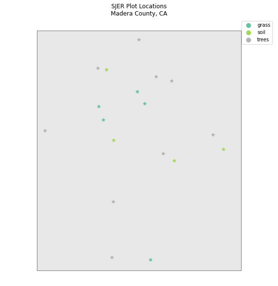
fig, ax = plt.subplots(figsize = (10,10))

sjer_plot_locations.plot(column='plot_type',
                              categorical=True,
                              legend=True,
                              marker='*',
                              markersize=65,
                              cmap='OrRd', ax=ax)
# add a title to the plot
ax.set_title('SJER Plot Locations\nMadera County, CA',
            fontsize=16)
plt.show()
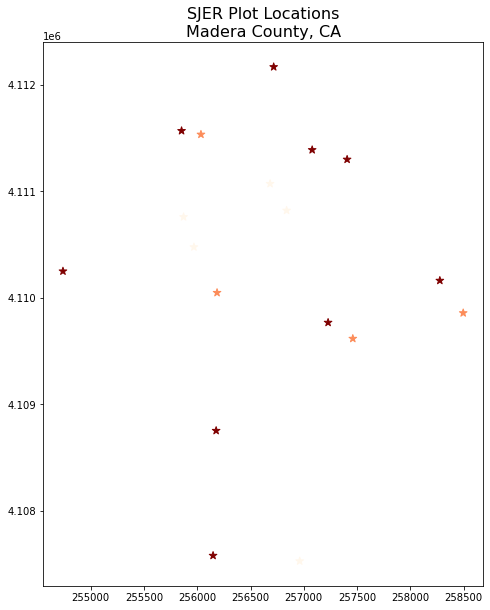
ax = sjer_plot_locations.plot(figsize=(10, 10),
                              column='plot_type',
                              categorical=True,
                              marker='*',
                              markersize=65,
                              cmap='OrRd')
# add a title to the plot
ax.set_title('SJER Plot Locations\nMadera County, CA',
            fontsize = 16)
plt.show()
Plot Shapefiles Using matplotlib and geopandas
Above you saw how to quickly plot shapefiles using geopandas plotting. The geopandas plotting is a great option for quickly exploring your data. However it is less customizable than matplotlib plotting. Below you will learn how to create the same map using matplotlib to setup the axes.
To plot with matplotlib you first setup the axes. Below you define the figuresize and marker size in the ax argument.
You can adjust the symbol size of our plot using the markersize argument.
You can add a title using ax.set_title().
You can create a larger map by adjusting the figsize argument. Below you set it to 10 x 10.
Test your knowledge: Import Line & Polygon Shapefiles
Using the steps above, import the data/spatial-vector-lidar/california/madera-county-roads/tl_2013_06039_roads.shp
and data/spatial-vector-lidar/california/neon-sjer-site/vector_data/SJER_crop.shp shapefiles into Python. Call the roads object sjer_roads and the crop layer sjer_crop_extent.
Answer the following questions:
- What type of
Pythonspatial object is created when you import each layer? - What is the
CRSandextentfor each object? - Do the files contain, points, lines or polygons?
- How many spatial objects are in each file?
Plot Multiple Shapefiles
You can plot several layers on top of each other using the geopandas .plot method too. To do this, you:
- define the
axvariable just as you did above to add a title to our plot. - then you add as many layers to the plot as you want using geopandas
.plot()method.
Notice below
ax.set_axis_off() is used to turn off the x and y axis and
plt.axis('equal') is used to ensure the x and y axis are uniformly spaced.
# import crop boundary
sjer_crop_extent = gpd.read_file("data/spatial-vector-lidar/california/neon-sjer-site/vector_data/SJER_crop.shp")
fig, ax = plt.subplots(figsize = (10, 10))

# first setup the plot using the crop_extent layer as the base layer
sjer_crop_extent.plot(color='lightgrey',
                      edgecolor = 'black',
                      ax = ax,
                      alpha=.5)
# then add another layer using geopandas syntax .plot, and calling the ax variable as the axis argument
sjer_plot_locations.plot(ax=ax,
                         column='plot_type',
                         categorical=True,
                         marker='*',
                         legend=True,
                         markersize=50,
                         cmap='Set2')
# add a title to the plot
ax.set_title('SJER Plot Locations\nMadera County, CA')
ax.set_axis_off()
plt.axis('equal')
plt.show()
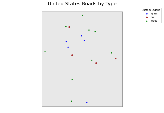
Custom Legends with Geopandas – Optional
While you will likely not get to this in our workshop, below is an example of further customizing your geopandas plot.
Currently there is not a perfect way to create a custom legend in Geopandas although that functionality is being considered. An alternative is to plot your data using loops and a dictionary that provides the various attributes that you want to apply to each point type.
# make it a bit nicer using a dictionary to assign colors and line widths
plot_attrs = {'grass': ['blue', '*'],
               'soil': ['brown','o'],
               'trees': ['green','*']}

# plot the data
fig, ax = plt.subplots(figsize  = (12, 8))

# first setup the plot using the crop_extent layer as the base layer
sjer_crop_extent.plot(color='lightgrey',
                      edgecolor = 'black',
                      ax = ax,
                      alpha=.5)

for ctype, data in sjer_plot_locations.groupby('plot_type'):
    data.plot(color=plot_attrs[ctype][0],
              label = ctype,
              ax = ax,
             marker = plot_attrs[ctype][1],
)

ax.legend(title="Custom Legend")
ax.set_title("United States Roads by Type", fontsize=20)
ax.set_axis_off()
plt.axis('equal')
plt.show()
Share on
Twitter Facebook Google+ LinkedIn
Leave a Comment