Lesson 6. Challenge Yourself Clean coding tidyverse intro
Learning objectives
This activity will test all of the skills that you learned in the previous lessons.
What you need
Follow the setup instructions here:
In the previous lessons, you have learned a set of skills that will allow you to work with tabular data using the tidyverse in R including
- Writing for loops
- Using pipes and
tidyversefunctions to create expressive code that minimizes intermediate outputs - Handling missing data values
Below, find a set of challenges that will test (and add to) your skills.
Challenge 1
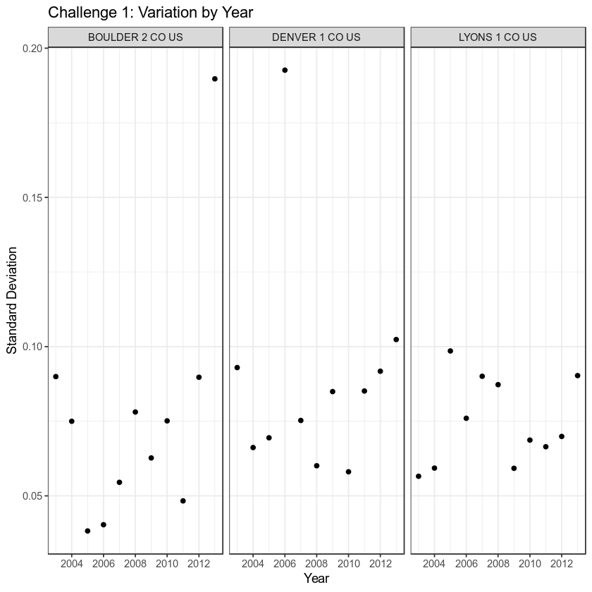
Using the functions: lubridate::year(), mutate(), group_by(), and summarise(), evaluate whether the annual variability in precipitation has increased or decreased at each of the three stations and make a figure that supports your conclusion.
HINTS:
- You can use the scales library and
scale_x_continuous(breaks = pretty_breaks())when you created your plot to create a nicely scaled x axis. year()is a lubridate function, consider column names CAREFULLY if you add a column to your data.
The plot below is one example of how you might exploration this challenge. Feel free to produce other plots that also help explore variability per site!
##
## Attaching package: 'scales'
## The following object is masked from 'package:readr':
##
##     col_factor

Challenge 2
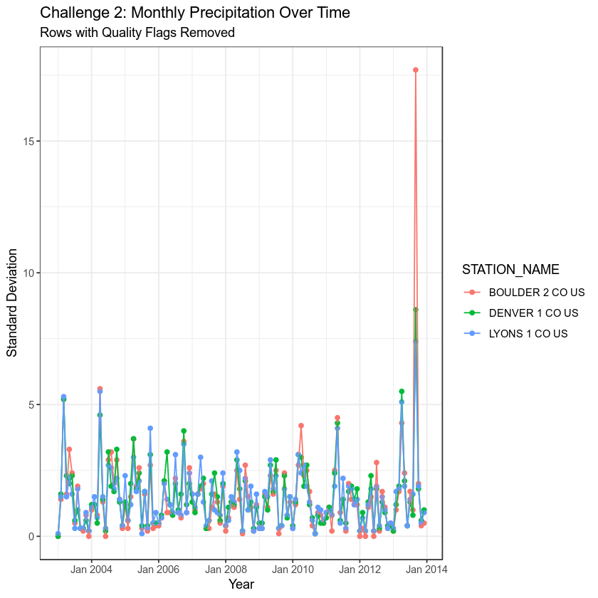
Create a plot that shows total precipitation by MONTH for each station. Color each station using a different color. Remove all rows with a Quality Flag.
HINTS:
The filter() function, allows you to remove certain rows from your data based upon criteria that you specify. For example you may choose to filter all precipitation values that are less than or equal to .1 as follows:
filter(HPCP <= .1)
Use filter() and ggplot(aes(..., color = ...)) + ... to create a scatterplot of HPCP over time. Use a different color for each station. Exclude any observations that are NA OR that have any quality flag associated with them.
the zoo package has the function: as.yearmon that can be used to create a date field with only the year and month in it.
Once the zoo package is loaded, you can then use + scale_x_yearmon() to scale the x axis of your ggplot() plot.
##
## Attaching package: 'zoo'
## The following objects are masked from 'package:base':
##
##     as.Date, as.Date.numeric

Challenge 3
Use count() to calculate the number of observations (rows) that exist for each station.
Does one station have more observations than another? Calculate it for yourself in R. The correct answer is below.
## # A tibble: 3 x 2
## # Groups:   toupper(STATION_NAME) [3]
##   `toupper(STATION_NAME)`     n
##   <chr>                   <int>
## 1 BOULDER 2 CO US          1840
## 2 DENVER 1 CO US           1840
## 3 LYONS 1 CO US            1840
Challenge 4
Explore ggplot! Make a plot that shows monthly mean precipitation at each station that is publication ready. Consider the following when creating this plot:
- Customize axis labels (e.g. display pretty axis labels like Jan instead of 1.0 for month)
- Change the look of the plot using a theme
- Customize the fonts used in the plot and colors.
Customize any aspects of the plot that you wish. Then use ggsave() to save the plot as a pdf file.
Share on
Twitter Facebook Google+ LinkedIn
Leave a Comment