Lesson 2. How to Remove Borders and Add Legends to Spatial Plots in R.
Learning Objectives
After completing this tutorial, you will be able to:
- Remove borders and refine the size of plots in an output rmarkdown report.
- Adjust the aspect ratio of a plot rendered to a pdf using knitr.
- Customize the location of legends in a plot in
R.
What You Need
You will need a computer with internet access to complete this lesson and the data for week 8 of the course.
In the previous lessons, you opened landsat and MODIS data in R. In this lesson, you will learn how to refine your plots in R to make your report look nicer and in turn more professional. First, let’s import some data.
# import landsat data
all_landsat_bands <- list.files("data/week-08/landsat/LC80340322016189-SC20170128091153/crop",
           pattern = glob2rx("*band*.tif$"),
           full.names = TRUE) # use the dollar sign at the end to get all files that END WITH
# create spatial stack
all_landsat_bands_st <- stack(all_landsat_bands)
Titles Using plotRGB()
You can try to add a title but it won’t plot
plotRGB(all_landsat_bands_st,
        r = 4, b = 3, g = 2,
        stretch = "hist",
        main = "title here")
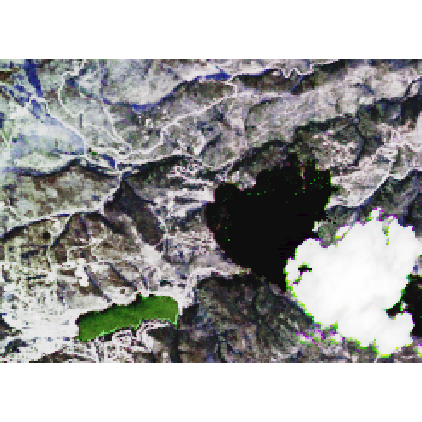
If you add the axes=T argument to your plot, your title plots but you also get the x and y axis in black which doesn’t look nice. You don’t need those. As a work around you can set the x and y axis labels to plot using “white” (col.axis="white"). Also you turn off the tick marks using tck=0.
# adjust the parameters so the axes colors are white. Also turn off tick marks.
par(col.axis = "white", col.lab = "white", tck = 0)
# plot
plotRGB(all_landsat_bands_st,
        r = 4, b = 3, g = 2,
        stretch = "hist",
        main = "title here",
        axes = TRUE)
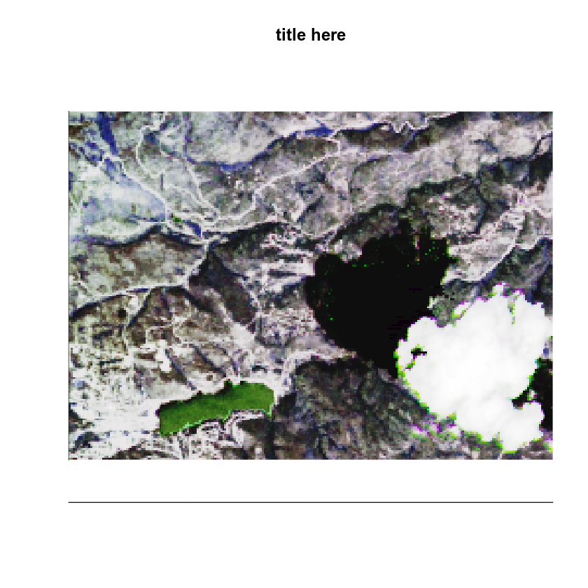
The final step is to turn off box which leaves that annoying line on the left hand side and bottom of the plot.
# adjust the parameters so the axes colors are white. Also turn off tick marks.
par(col.axis = "white", col.lab = "white", tck = 0)
# plot
plotRGB(all_landsat_bands_st,
        r = 4, b = 3, g = 2,
        stretch = "hist",
        main = "title here",
        axes = TRUE)
# set bounding box to white as well
box(col = "white") # turn all of the lines to white

This looks nice, but now the plot itself is too tall. There is extra white space above and below the plot that you don’t need. This is because the dev space where R studio renders plots is set to a particular size based upon how you’ve adjusted it and your monitor resolution. I can account for this too - using the code chunk arguments: fig.width and fig.height.
In my plot below, I used fig.width=7, fig.height=6 in my code chunk arguments. The units are in inches.
My code chunk looks like this: {r plot-rgb4, fig.cap="Adjust figure width and height.", fig.width=7, fig.height=6}
# adjust the parameters so the axes colors are white. Also turn off tick marks.
par(col.axis = "white", col.lab = "white", tck = 0)
# plot
plotRGB(all_landsat_bands_st,
        r = 4, b = 3, g = 2,
        stretch = "hist",
        main = "title here",
        axes = TRUE)
# set bounding box to white as well
box(col = "white") # turn all of the lines to white
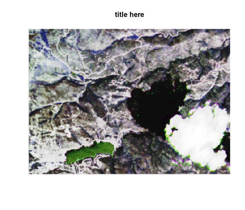
Notice that now my plot has less white space above and below the image. This is because it’s no longer plotting using a square aspect ratio - you’ve adjusted that! You can experiment with different fig width and height values depending upon the aspect ratio of the plot that you are trying to print to your report.
Reset Dev
Any time you modify the parameters, you should consider resetting the dev() space. Why? Because if you plot another plot in R, it will use the parameters that you set previously! In the case above you set the axes to white. This setting will become a global setting until you clear your plot space! To clear the plot dev space programmatically, use dev.off().
# reset dev (space where plots are rendered in RStudio)
dev.off()
Adjusting Legends
Legends can also be trick to figure out in R. Take a look at the plot below. It’s not pretty. For one, you don’t need the x and y axes on this plot.
# plot ndvi with legend
plot(ndvi_classified,
     main = "ndvi plot",
     col = the_colors)
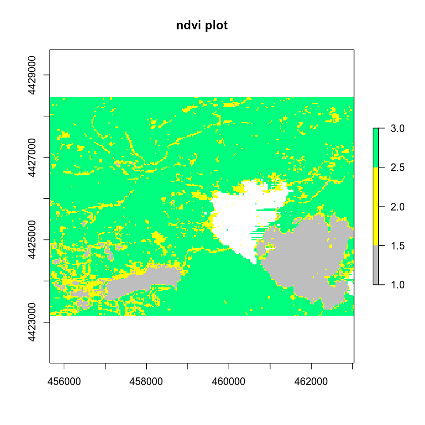 First let’s get rid of the unnecessary axes and turn off the legend. You can remote the axes & box that surrounds your image using:
 axes=F and box=F.
# plot ndvi with legend
plot(ndvi_classified,
     main = "ndvi plot",
     col = the_colors,
     axes = FALSE, box = FALSE)
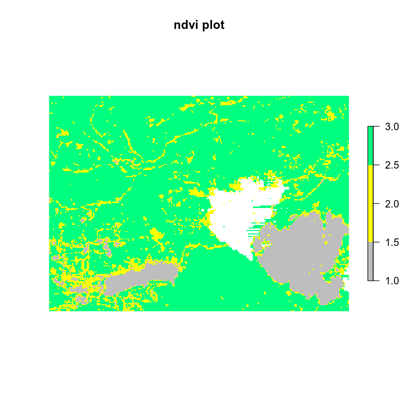
Next, you turn off the legend and add your own legend. However, the legend isn’t exactly where you want it to be here. It’s above the plot and you’d like it to be to the right of the plot.
# plot ndvi with legend
plot(ndvi_classified,
     legend = FALSE,
     main = "ndvi plot",
     col = the_colors,
     axes = FALSE, box = FALSE)
legend("topright",
       legend = c("Healthy vegetation", "Less healthy vegetation", "No vegetation"),
       fill = the_colors)
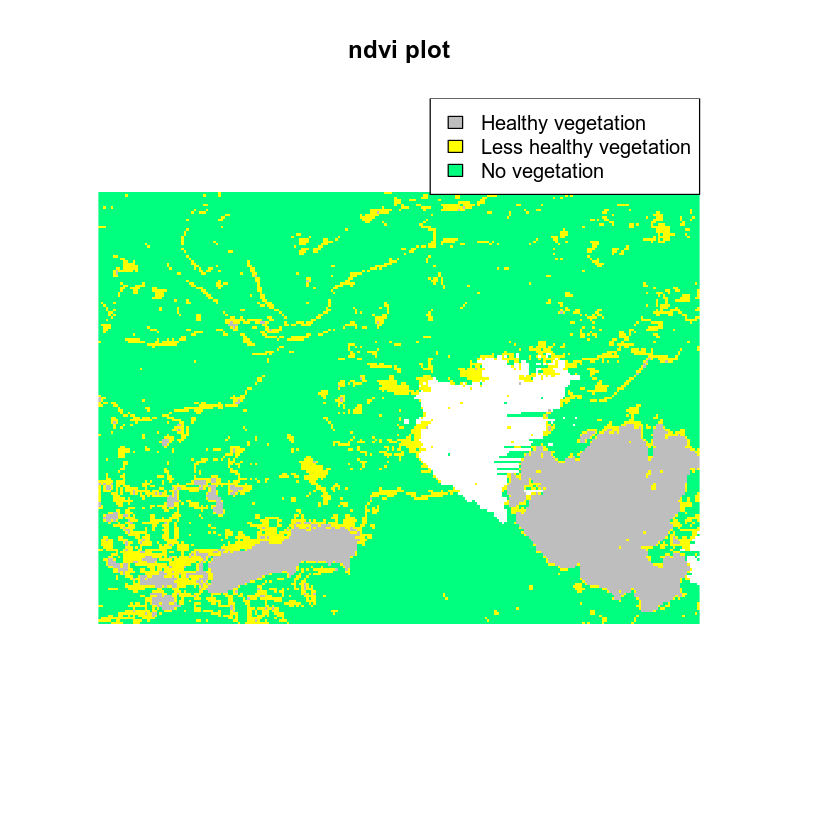
You can force the legend to plot outside of your axes using the parameter xpd=T. You can locate the legend in the upper right hand corner OUTSIDE of your plot by specifying the max x and y values derived from the extent of the spatial object that you are plotting
Here I set the x max value to me the furthest east hand corner of my object extent. x = ndvi_classified@extent@xmax
Here I set the y max value to me the furthest north of my object extent. y = ndvi_classified@extent@ymax
# plot ndvi with legend
plot(ndvi_classified,
     legend = FALSE,
     main = "ndvi plot",
     col = the_colors,
     axes = FALSE, box = FALSE)
# set xpd to T to allow the legend to plot OUTSIDE of the plot area
par(xpd = TRUE)
legend(x = ndvi_classified@extent@xmax, y = ndvi_classified@extent@ymax,
       legend = c("Healthy vegetation", "Less healthy vegetation", "No vegetation"),
       fill = rev(the_colors)) # use rev to reverse the order of colors for the legend

Now, another problem with your legend. The order of your colors is all wrong: Grey should represent “no vegetation” and green should represent health vegetation. You can use rev() on your list of colors to reverse the order of colors drawn on the legend.
# plot ndvi with legend
plot(ndvi_classified,
     legend = FALSE,
     main = "ndvi plot",
     col = the_colors,
     axes = FALSE, box = FALSE)
# set xpd to T to allow the legend to plot OUTSIDE of the plot area
par(xpd = TRUE)
legend(x = ndvi_classified@extent@xmax, y = ndvi_classified@extent@ymax,
       legend = c("Healthy vegetation", "Less healthy vegetation", "No vegetation"),
       fill = rev(the_colors)) # use rev to reverse the order of colors for the legend
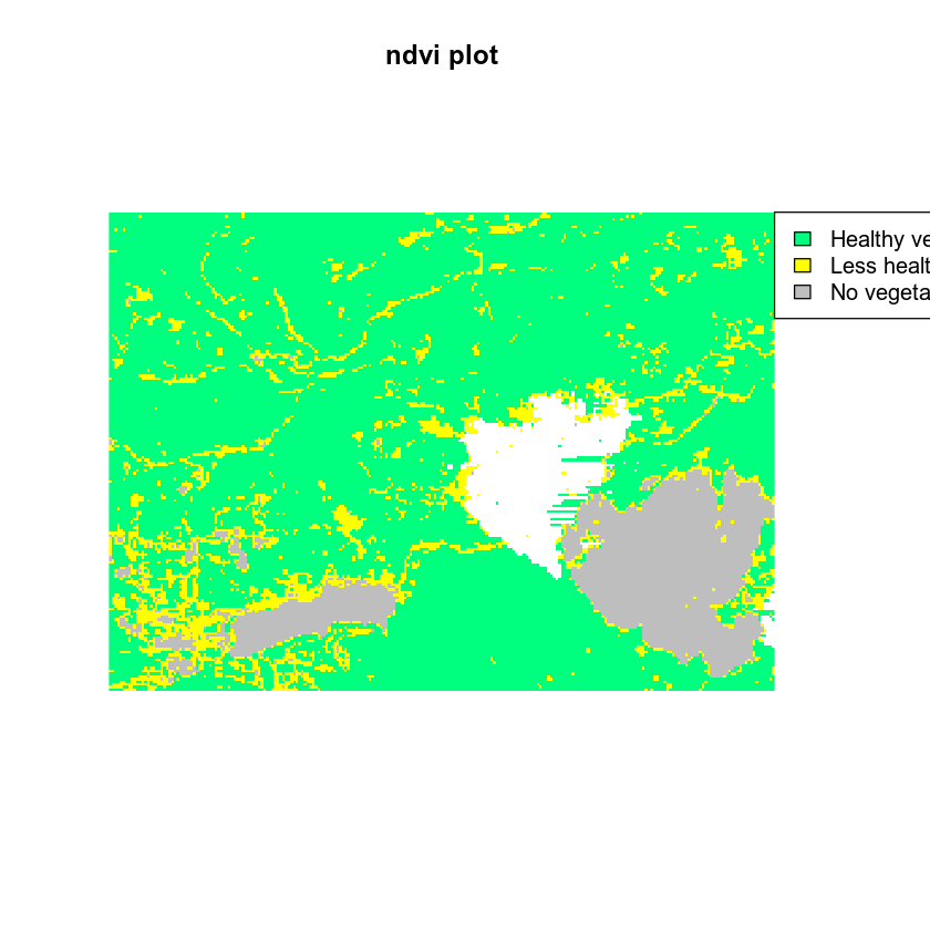
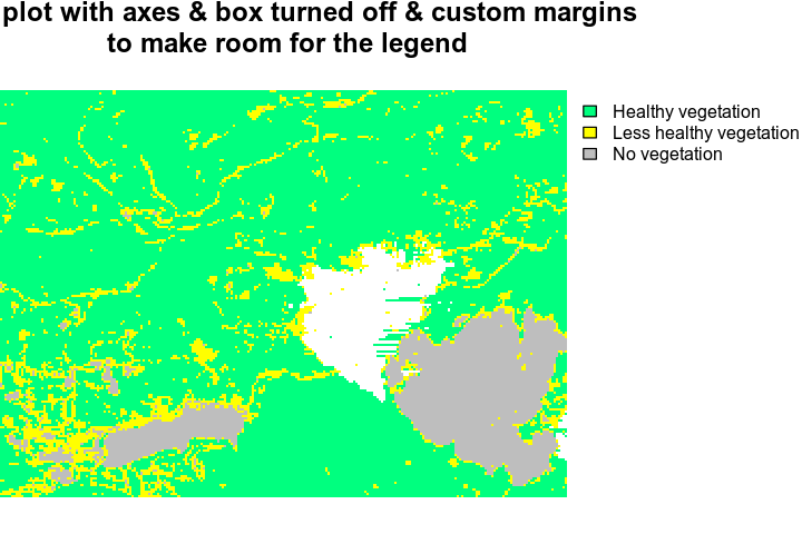
On to the pesky white space on either side of the plot. There are several ways to handle this. One is by specifying margins for out plot.
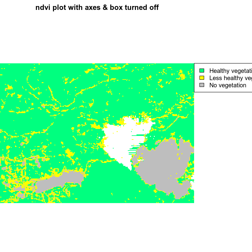
Notice in the plot above that there is too much white space above and below the plot. In the case of my plot, the aspect ratio of width:height is not right. You want the height to be SMALLER to remove some of the white space. The white space is there because R is trying to plot your figure using a 1:1 aspect ratio. You can use the mar argument to adjust the white space on the bottom, left, top, or right sides of the plot. This makes room for your legend.
Below, you adjusted the top margin to 2 and the right margin to 5. This makes space for your legend but also makes a bit of space for your plot title.
# set a margin for your figure
par(xpd = FALSE, mar = c(0,0,2,5))
# plot ndvi with legend
plot(ndvi_classified,
     legend = FALSE,
     main = "ndvi plot with axes & box turned off",
     col = the_colors,
     axes = FALSE,
     box = FALSE)
# set xpd to T to allow the legend to plot OUTSIDE of the plot area
par(xpd = TRUE)
legend(x = ndvi_classified@extent@xmax, y = ndvi_classified@extent@ymax,
       legend = c("Healthy vegetation", "Less healthy vegetation", "No vegetation"),
       bty = FALSE, # turn off legend border
       fill = rev(the_colors)) # use rev to reverse the order of colors for the legend
dev.off()
## null device
##           1
I can do better than that however. That box around the legend is annoying. Let’s remove it using the legend argument: bty = "n". Let’s also make the legend fonts a bit smaller using the argument cex = .9.
# set a margin for your figure
par(xpd = FALSE, mar = c(0,0,2,5))
# plot ndvi with legend
plot(ndvi_classified,
     legend = FALSE,
     main = "ndvi plot with axes & box turned off",
     col = the_colors,
     axes = FALSE,
     box = FALSE)
# set xpd to T to allow the legend to plot OUTSIDE of the plot area
par(xpd = TRUE)
legend(x = ndvi_classified@extent@xmax, y = ndvi_classified@extent@ymax,
       legend = c("Healthy vegetation", "Less healthy vegetation", "No vegetation"),
       fill = rev(the_colors),# use rev to reverse the order of colors for the legend
       bty = "n", # turn off legend border
       cex = .9)  # adjust legend font size

dev.off()
## null device
##           1
If things are still not looking right, you can adjust the size of your output figure. Try adding the arguments fig.width and fig.height to your code chunk. {r fix-plot-legend3, fig.cap="plot with legend in the upper right.", fig.width=6, fig.height=4}
I use these values because i want the HEIGHT of the figure to be smaller. I want the WIDTH of the figure to be “landscape” or wider so i’ll leave that value alone.
Below, I set fig.width=6, fig.height=4 in my code chunk. setting a smaller height pulled the title down closer to my plot. I’ve also decreased the font size of my legend using the cex legend argument. Note that you may have to play with the figure size a bit to get it just right.
HINT: use dev.size()` to figure out the size of your plot dev space in RStudio.
# set a margin for your figure
par(xpd = FALSE, mar = c(0,0,2,6))
# plot ndvi with legend
plot(ndvi_classified,
     legend = FALSE,
     main = "NDVI plot with axes & box turned off & custom margins\n to make room for the legend",
     col = the_colors,
     axes = FALSE,
     box = FALSE)
# set xpd to T to allow the legend to plot OUTSIDE of the plot area
par(xpd = TRUE)
legend(x = ndvi_classified@extent@xmax, y = ndvi_classified@extent@ymax,
       legend = c("Healthy vegetation", "Less healthy vegetation", "No vegetation"),
       bty = "n", # turn off legend border
       cex = .8, # make the legend font a bit smaller
       fill = rev(the_colors)) # use rev to reverse the order of colors for the legend
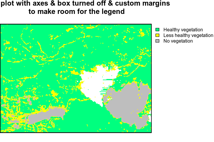
While you are at it, let’s add a border using a crop extent shapefile that was used to clip these data
# import crop extent
crop_ext <- readOGR("data/week-08/vector_layers/",
                    "fire_crop_box_2000m")

# set a margin for your figure
par(xpd = FALSE, mar = c(0,0,2,6))
# plot ndvi with legend
plot(ndvi_classified,
     legend = FALSE,
     main = "NDVI plot with axes & box turned off & custom margins\n to make room for the legend",
     col = the_colors,
     axes = FALSE,
     box = FALSE)

plot(crop_ext,
     lwd = 2,
     add = TRUE)
# set xpd to T to allow the legend to plot OUTSIDE of the plot area
par(xpd = TRUE)
legend(x = ndvi_classified@extent@xmax, y = ndvi_classified@extent@ymax,
       legend = c("Healthy vegetation", "Less healthy vegetation", "No vegetation"),
       bty = "n", # turn off legend border
       cex = .8, # make the legend font a bit smaller
       fill = rev(the_colors)) # use rev to reverse the order of colors for the legend
Again - always reset dev when you’ve been adjusting par() values for plots!
dev.off()
That looks better, doesn’t it? Leave comments below if you find other tricks to make your plot look better!
Share on
Twitter Facebook Google+ LinkedIn
Leave a Comment