Lesson 5. Create Maps of Social Media Twitter Tweet Locations Over Time in R
Learning Objectives
After completing this tutorial, you will be able to:
- Use
ggplotinRto create a static map of social media activity. - Use leaflet to create an interactive map of social media activity.
- Use
GGAnimateto create an antimated gif file of social media activity.
What You Need
You will need a computer with internet access to complete this lesson.
In the previous lesson, you used text mining approaches to understand what people were tweeting about during the flood. Here, you will create a map that shows the location from where people were tweeting during the flood.
Keep in mind that these data have already been filtered to only include tweets that at the time of the flood event, had an x, y location associated with them. Thus this map doesn’t represent all of the tweets that may be related to the flood event.
You need three packages to create your map:
- ggplot: You will use
ggplot()to create your map. - You will use the
mapspackage to automatically access a basemap containing boundaries of countries across the globe. - Finally you use the
ggthemeslibrary which includestheme_map(). This theme turns off all of the extraggplotelements that you don’t need such as the x and y axis.
# load twitter library - the rtweet library is recommended now over twitteR
library(rjson)
library(jsonlite)
# plotting and pipes - tidyverse!
library(ggplot2)
library(dplyr)
library(tidyr)

# animated maps
# to install: devtools::install_github("dgrtwo/gganimate")
# note this required imagemagick to be installed
library(leaflet)
library(gganimate)
library(lubridate)
library(maps)
library(ggthemes)

options(stringsAsFactors = FALSE)
# create file path
json_file <- "data/week-13/boulder_flood_geolocated_tweets.json"
# import json file line by line to avoid syntax errors
# this takes a few seconds
boulder_flood_tweets <- stream_in(file(json_file))
# explore the data
Build a custom data.frame with just the information that you need.
# create new df with just the tweet texts & usernames
tweet_data <- data.frame(date_time = boulder_flood_tweets$created_at,
                         username = boulder_flood_tweets$user$screen_name,
                         tweet_text = boulder_flood_tweets$text,
                         coords = boulder_flood_tweets$coordinates)

# flood start date sept 13 - 24 (end of incident)
start_date <- as.POSIXct('2013-09-13 00:00:00')
end_date <- as.POSIXct('2013-09-24 00:00:00')

# cleanup & and filter to just the time period around the flood
flood_tweets <- tweet_data %>%
  mutate(coords.coordinates = gsub("\\)|c\\(", "", coords.coordinates),
         date_time = as.POSIXct(date_time, format = "%a %b %d %H:%M:%S +0000 %Y")) %>%
  separate(coords.coordinates, c("long", "lat"), sep = ", ") %>%
  mutate_at(c("lat", "long"), as.numeric) %>%
  filter(date_time >= start_date & date_time <= end_date )
# create basemap of the globe
world_basemap <- ggplot() +
  borders("world", colour = "gray85", fill = "gray80")

world_basemap

Below you can see how the theme_map() function cleans up the look
of your map.
# create basemap of the globe
world_basemap <- ggplot() +
  borders("world", colour = "gray85", fill = "gray80") +
  theme_map()

world_basemap

Next, look closely at your data. Notice that some of the location information contains NA values. Let’s remove NA values and then plot the data as points using ggplot().
head(flood_tweets)
##             date_time       username
## 1 2013-09-23 20:27:25  CenturyLinkCO
## 2 2013-09-23 18:08:24 WxTrackerDaryl
## 3 2013-09-23 16:34:05    L_Parquette
## 4 2013-09-23 17:38:58   SausalitoSpy
## 5 2013-09-23 19:03:57      lulugrimm
## 6 2013-09-23 21:49:51   DenelleJarro
##                                                                                                                                tweet_text
## 1                              Download: “CenturyLink Community Flood Impact Report: September 23” --> http://t.co/jhn3xSxs6r #coflood
## 2                                       There's a moose on the loose on Laurel Street @KDVR #MooseOnTheLoose #cowx http://t.co/zsrHeaUoHw
## 3 #Fall really knows how to make an entrance @KeystoneMtn. #Snow #cowx #wintercountdown. Opening Day is November 1 http://t.co/VmeRBBlTr7
## 4                From Boulder, Colorado: Notes on a Thousand-Year Flood - #BoulderFlood Jenny Shank - The Atlantic http://t.co/Ln8mmCOQuk
## 5                               I'd rather be working from here:) #boulder #colorado #latergram #mountains #monday http://t.co/t8cGzQDyVx
## 6              Teaching last minute #Hot #Yoga 6PM tonight yogapodcommunity #Boulder! Join me for this 26 posture… http://t.co/Q4E7e1Qe0U
##   coords.type   long   lat
## 1        <NA>     NA    NA
## 2       Point -104.8 39.59
## 3        <NA>     NA    NA
## 4        <NA>     NA    NA
## 5        <NA>     NA    NA
## 6       Point -105.3 40.02
# remove na values
tweet_locations <- flood_tweets %>%
  na.omit()

head(tweet_locations)
##              date_time       username
## 2  2013-09-23 18:08:24 WxTrackerDaryl
## 6  2013-09-23 21:49:51   DenelleJarro
## 12 2013-09-23 22:25:55  markpmeredith
## 28 2013-09-23 21:25:00   JapangoSushi
## 34 2013-09-23 16:51:29      Gr8_Beard
## 36 2013-09-23 21:26:28     willdayart
##                                                                                                                                     tweet_text
## 2                                            There's a moose on the loose on Laurel Street @KDVR #MooseOnTheLoose #cowx http://t.co/zsrHeaUoHw
## 6                   Teaching last minute #Hot #Yoga 6PM tonight yogapodcommunity #Boulder! Join me for this 26 posture… http://t.co/Q4E7e1Qe0U
## 12 Getting ready to meet up with #coflood victims at tonight's broncos game to see how they're holding up amid this Monday night football game
## 28               We #love you #boulder! #colorado #japangoboulder #beautiful #staystrong #missyouall #remodel #soclose… http://t.co/pkIFpm3roY
## 34                               “@mitchellbyars: #Boulder police officer checking in with the #potgiveaway table. \nجاك الموت يا مدخن الحشيش!
## 36                       "Sailing" #artsy #artslant #artstudio #artinfodotcom #boulder #canvas #colorado #contemporary… http://t.co/7tUt5T9ILO
##    coords.type    long   lat
## 2        Point -104.83 39.59
## 6        Point -105.26 40.02
## 12       Point -105.02 39.74
## 28       Point -105.28 40.02
## 34       Point  -84.18 39.74
## 36       Point -105.27 40.05
Plot the data.
world_basemap +
  geom_point(data = tweet_locations, aes(x = long, y = lat),
             colour = 'purple', alpha = .5) +
  scale_size_continuous(range = c(1, 8),
                        breaks = c(250, 500, 750, 1000)) +
  labs(title = "Tweet Locations During the Boulder Flood Event")

Leaflet Map
Next, let’s create an interactive map of the data using leaflet. This will allow us to explore the tweets. It is particularly interesting that some tweets are not even in the United States.
There is a bug in RStudio with leaflet where the addTiles() function
sometimes produces a blank basemap. To resolve this issue, simply use
another leaflet basetile set.
# plot points on top of a leaflet basemap

site_locations <- leaflet(tweet_locations) %>%
  addTiles() %>%
  addCircleMarkers(lng = ~long, lat = ~lat, popup = ~tweet_text,
                   radius = 3, stroke = FALSE)

site_locations
If you are encountering the bug with RStudio rendering a blank basemap, use the
addProviderTiles() function and specify a different basemap. It should work!
# plot points on top of a leaflet basemap

site_locations_base <- leaflet(tweet_locations) %>%
  addProviderTiles("CartoDB.Positron") %>%
  addCircleMarkers(lng = ~long, lat = ~lat, popup = ~tweet_text,
                   radius = 3, stroke = FALSE)

site_locations_base
Summarize Data by Day
# summarize by day?
# perhaps round the lat long and then do it?
# since it's all in sept
tweet_locations_grp <- tweet_locations %>%
mutate(day = day(date_time),
long_round = round(long, 2),
lat_round = round(lat, 2)) %>%
group_by(day, long_round, lat_round) %>%
summarise(total_count = n())
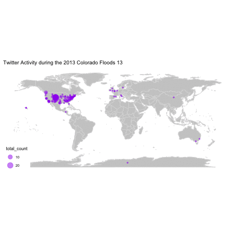
# this also works -- plotting across the world here...
grouped_tweet_map <- world_basemap + geom_point(data = tweet_locations_grp,
aes(long_round, lat_round, frame = day, size = total_count),
color = "purple", alpha = .5) + coord_fixed() +
labs(title = "Twitter Activity during the 2013 Colorado Floods")
grouped_tweet_map

Create Location Animation
You can animate this over time to see what was occuring day by day.
Note that this requires ImageMagick to be installed on your computer.
If you are on a mac and have homebrew installed you can use:
brew install imagemagick
If not, you visit the ImageMagick website to download it and install.
Animate Maps with GGAnimate
# created animated gif file
#gganimate(grouped_tweet_map)

# save the animation to a new file
gganimate_save(grouped_tweet_map,
               filename = "data/week-13/flood_tweets.gif",
               fps = 1, loop = 0,
               width = 1280,
               height = 1024)
Note that the dimensions of the map above are still not quite right. If anyone
has discovered a way to ensure gganimate_save() dimensions actually work, please
leave a comment below!
Share on
Twitter Facebook Google+ LinkedIn
Leave a Comment